Content |
|||||||||||||||||
|
Overview |
|
|
The "Spreadsheet" Control lets you insert a spreadsheet into an ELN/LES Worksheet. This Control uses GrapeCity SpreadJs Spread.Sheets to provide a subset of Microsoft Excel functionality. See https://sphelp.grapecity.com/webhelp/SpreadJSWeb/webframe.html#FormulaFunctions.html for documentation concerning this product.
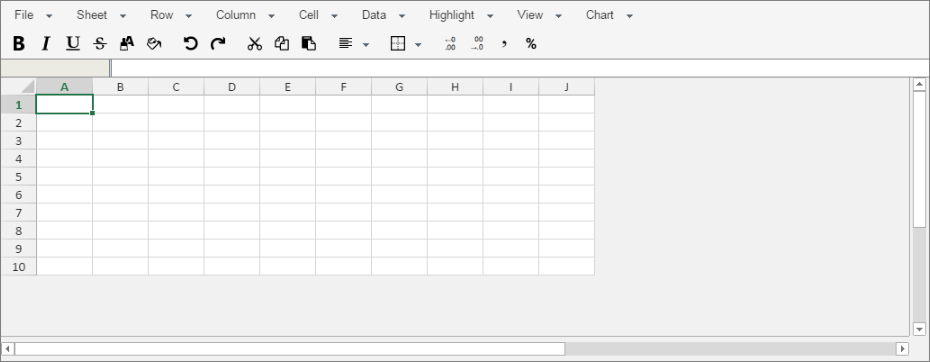 |
Menus |
|
|
The Spreadsheet Control provides these menu functions. The Excel format for all operations is Office 2007 and later (xlsx).
| NOTE: | The Spreadsheet Control has a hardcoded limit of 500 rows and columns. This is enforced when importing a file and adding/inserting rows and columns. |
| File | ||||||||||||||||||||||||||||||||||||
| Export Excel File | Generates and downloads an Excel file to the local machine.
This is currently placed in the User's download directory.
The exported file should be a reasonable representation of the spreadsheet rendered in the Control, retaining features similar to those provided by the Import operations. |
|||||||||||||||||||||||||||||||||||
| Import Excel File | Uploads an Excel file from the client machine and converts
it into a Spreadsheet Control. The following aspects of the imported spreadsheet
should be preserved during the upload:
Items not preserved items include:
|
|||||||||||||||||||||||||||||||||||
| Import Text File | Imports a text file with values delimited by a comma,
tab, or space.
Individual values are trimmed to remove leading and trailing spaces. |
|||||||||||||||||||||||||||||||||||
| Sheet | ||||||||||||||||||||||||||||||||||||
| Protect Sheet
Unprotect Sheet |
When the spreadsheet is protected (using "Protect
Sheet"), cell contents cannot be added, modified, or deleted.
Individual cells (and ranges of cells) can be made editable using the "Cell → Unlock" menu item. |
|||||||||||||||||||||||||||||||||||
| Delete Sheet | This is visible only when the spreadsheet is in "multi-sheet"
mode (see Configuration Properties).
This menu item removes the currently displayed spreadsheet. One spreadsheet must always be visible in the control. Accordingly, the user is blocked from trying to remove the final spreadsheet. |
|||||||||||||||||||||||||||||||||||
| Set Print Area | Uses the selected range of cells to define which cells will be displayed in the ELN (and exported to Word or Excel) after the spreadsheet has been saved. | |||||||||||||||||||||||||||||||||||
| Clear Print Area | Removes the defined print area. This allows the entire spreadsheet to be displayed in the ELN, and subsequently exported. | |||||||||||||||||||||||||||||||||||
| Clear Formatting | Removes all background, foreground, and borders either the selected range or (if a single cell is selected) the entire sheet. | |||||||||||||||||||||||||||||||||||
| Formatted Tables | Choosing one of the preformatted tables shown in the menu applies the corresponding style to the selected range or (if a single cell is selected) the entire sheet. | |||||||||||||||||||||||||||||||||||
| Row | ||||||||||||||||||||||||||||||||||||
| Add Row(s) | Add rows to the bottom of the spreadsheet. You are prompted to enter the number of rows to add. | |||||||||||||||||||||||||||||||||||
| Insert Row | Inserts a row into the current position in the spreadsheet. As is the case with Excel, if multiple rows are selected when executing this function, multiple rows can be inserted in a single operation. | |||||||||||||||||||||||||||||||||||
| Delete Row | Deletes the current row(s). | |||||||||||||||||||||||||||||||||||
| Set Height | Sets the height of the selected rows (in pixels). | |||||||||||||||||||||||||||||||||||
| Column | ||||||||||||||||||||||||||||||||||||
| Add Column | Add columns to the end of the spreadsheet. | |||||||||||||||||||||||||||||||||||
| Insert Column | Inserts a column into the current position in the spreadsheet. As is the case with Excel, if multiple columns are selected when executing this function, multiple columns can be inserted in a single operation. | |||||||||||||||||||||||||||||||||||
| Delete Column | Delete the selected column(s). | |||||||||||||||||||||||||||||||||||
| Set Width | Sets the width of the selected columns (in pixels). | |||||||||||||||||||||||||||||||||||
| Cell | ||||||||||||||||||||||||||||||||||||
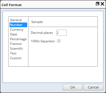
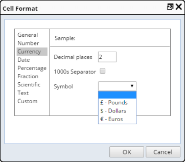
| Format | Applies value formatting to the selected cell(s).
Behavior of the format dialog is similar to the Excel format dialog. Different formatting styles are available for different data types.
The "Custom" mode allows custom formats to be defined. This uses formatting codes similar to those provided by Excel. |
|||||||||||||||||||||||||||||||||||
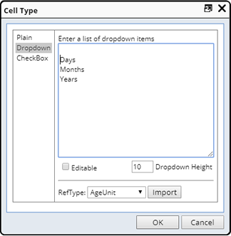
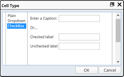
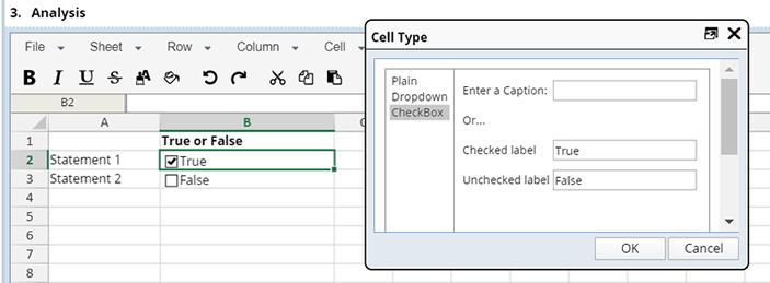
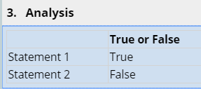
| Cell Type | Configure the information displayed the cell.
|
|||||||||||||||||||||||||||||||||||
| Merge
Unmerge |
Merges two or more cells into a single cell. If two or
more cells have content, the User is warned that information may be lost
by the merge.
Splits merged cells back into single cells. |
|||||||||||||||||||||||||||||||||||
| Wrap Text | Allows the contents of a cell to be wrapped instead of
truncated, provided there is sufficient vertical height to accommodate
it.
The rendered HTML exhibits this behavior:
|
|||||||||||||||||||||||||||||||||||
| Lock Cell
Unlock Cell |
"Lock Cell" works in conjunction with the "Sheet
→ Protect Sheet" menu item. Cells will not be locked until
the spreadsheet has been marked as "Protected".
For your convenience, if a spreadsheet is not currently protected, locking the first cell will automatically mark the sheet as "Protected". "Unlock Cell" makes that cell fully editable. |
|||||||||||||||||||||||||||||||||||
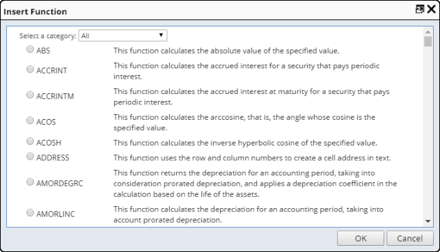
| Insert Function | Opens a dialog that shows the list of available spreadsheet
functions for the User.
For convenience, the functions are grouped by category and can be filtered as such using the dropdown at the top of the page. Hovering over functions provides additional information, including the list of parameters. Selecting a function and clicking "OK" inserts the function into the selected cell in the spreadsheet. For more information concerning specific functions,, see Microsoft's Excel documentation (most of these are Excel functions), or from the SpreadJS site at http://sphelp.grapecity.com/webhelp/SpreadJSWeb/webframe.html#FormulaFunctions.html. |
|||||||||||||||||||||||||||||||||||
| Data | ||||||||||||||||||||||||||||||||||||
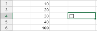
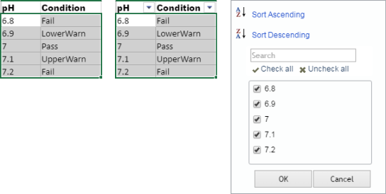
| Filter | Behavior of "Filter" is similar to the Excel
"Filter" function, except that "Filter" operates on a selected
range of cells.
To use this feature, select a range of cells (below left), then use these guidelines:
|
|||||||||||||||||||||||||||||||||||
| Sort Up | Sorts a selection of cells in ascending order. Data are sorted on the first column of the selected range. | |||||||||||||||||||||||||||||||||||
| Sort Down | Sorts a selection of cells in descending order. Data are sorted on the first column of the selected range. | |||||||||||||||||||||||||||||||||||
| Highlight | ||||||||||||||||||||||||||||||||||||
| Above/Below Average
Above/Below n Std Dev Duplicate/Unique Items |
Highlighting (or Dynamic Formatting) operates on a selected
range of cells.
Cell values meeting the selected criteria are highlighted with a specific color (see Configuration Properties to define the color). Highlighting options:
Dynamic Formatting is not visible when the spreadsheet is rendered in the Worksheet or exported to Word/PDF. |
|||||||||||||||||||||||||||||||||||
| Two Color Heatmap
Three Color Heatmap |
This operates on a selected range of cells. A "color
gradient" is applied to the cells depending on their value. The lowest
value defines a color, the highest value defines a different color, and
all other values define a color gradient between the lowest and highest.
A three-color heatmap is also available when a third color is used for the middle range between upper and lower colors. All other cells then have a color gradient between the lower and middle (or middle and upper) colors. The choice of colors for the two heatmaps is defined in the Configuration Properties. |
|||||||||||||||||||||||||||||||||||
| Clear All | Removes all highlighting from the selected spreadsheet. | |||||||||||||||||||||||||||||||||||
| View | ||||||||||||||||||||||||||||||||||||
| Horizontal Gridlines | Shows/hides the horizontal gridlines in the selected spreadsheet. | |||||||||||||||||||||||||||||||||||
| Vertical Gridlines | Shows/hides the vertical gridlines in the selected spreadsheet. | |||||||||||||||||||||||||||||||||||
| Freeze Top Row
Freeze First Column |
Immobilizes the first row or column in the spreadsheet, thus allowing the rest of the spreadsheet to scroll. | |||||||||||||||||||||||||||||||||||
| Freeze Panes | This can be used to immobilize more than one row or column.
Select the cell that should appear in the top-left of the scollable region, then select "Freeze Panes". All rows above and to the left of the selected cell are frozen. |
|||||||||||||||||||||||||||||||||||
| Unfreeze | Reverses the "Freeze Panes" function ("un-freezes" all frozen rows and columns). | |||||||||||||||||||||||||||||||||||
| Chart | ||||||||||||||||||||||||||||||||||||
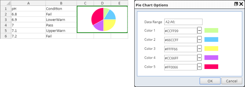
| Insert Pie Chart
Edit Pie Chart |
These are convenience functions provided to build and
manage a PIESPARKLINE function for a cell that generates a Pie Chart.
Sparklines are displayed in a single cell, but that cell is often a merged cell in order to achieve a bigger chart (see the example below). An example PIESPARKLINE function is: =PIESPARKLINE(C3:C7;"#CCFF99";"#66CCFF";"#FFFF66";"#CC66FF";"#FF0066") After selecting the menu item, a dialog shows the list of available options for the chart. If editing an existing chart, the chart's values are displayed (rather than default values).
The "Data Range" property expresses the range of cells whose values will be used to build the Pie Chart. To populate this field, place the cursor in the field, then select the cells in the spreadsheet behind the dialog. The list of default colors for the Pie Chart can be defined in the Configuration Properties. |
|||||||||||||||||||||||||||||||||||
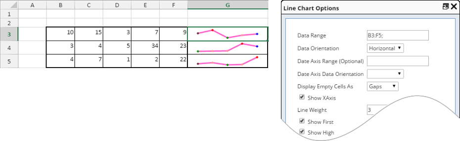
| Insert Line Chart
Edit Line Chart |
These are convenience functions provided to build and
manage a LINESPARKLINE function for a cell that generates a Line Chart.
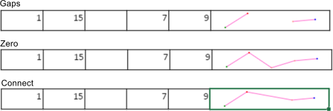
An example LINESPARKLINE function is: =LINESPARKLINE(B3:F3;1) A more complex example is: =LINESPARKLINE(B3:F3;1;;;"{displayEmptyCellsAs:0,displayXAxis:true,showMarkers:true,showFirst:true,showLast:true,showLow:true,showHigh:true,lineWeight:3,seriesColor:'#FF66CC',axisColor:'#FFFF66''}") After selecting the menu item, a dialog shows the list of available options for the chart. If editing an existing chart, the chart's values are displayed (rather default values).
|
|||||||||||||||||||||||||||||||||||
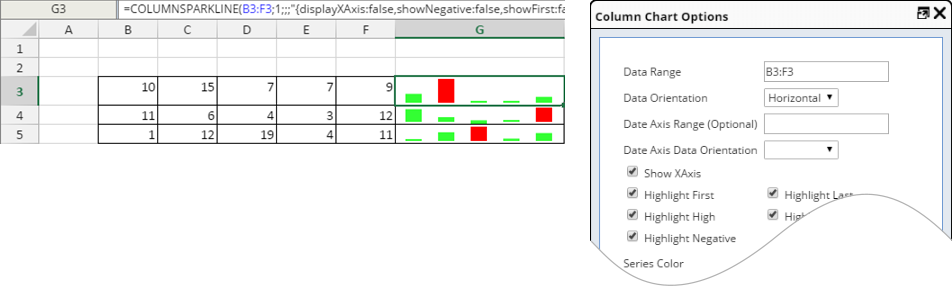
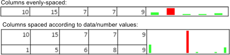
| Insert Column Chart
Edit Column Chart |
These are convenience functions provided to build and
manage a COLUMNSPARKLINE function for a cell that generates a column or
bar chart.
An example COLUMNSPARKLINE function is: =COLUMNSPARKLINE(B3:F3;1;;;"{displayXAxis:false,showNegative:false,showFirst:false,showLast:false,showLow:false,showHigh:false,seriesColor:'#FF6666'}") After selecting the menu item, a dialog shows the list of available options for the chart. If editing an existing chart, the chart's values are displayed (rather than default values).
|
Configuration Properties |
|
|
These properties are available for configuring overall behavior.
| Property | Description | ||||||
| Name | Name of the Control that is displayed in the ELN interface. Leaving this blank defaults to the Control name provided in the OOB configuration. | ||||||
| Allow Multiple Sheets | Configures multiple spreadsheet capability.
|
||||||
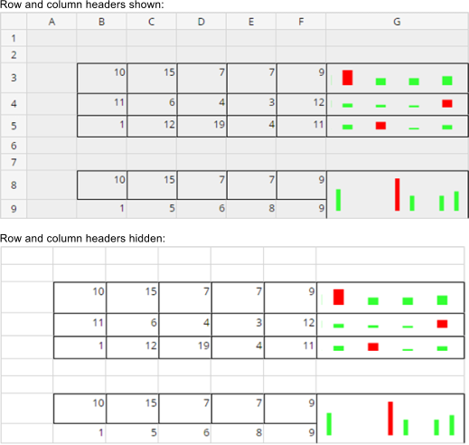
| Show Row and Column Headers | Shows/hides the row (1..2..3..) and column (A..B..C..)
headers:
|
||||||
| Pie Charts | Default colors for Pie Charts. Note that these values map to those in the Pie Chart definitions. | ||||||
| Line Charts | Default colors for Line Charts. Note that these values map to those in the Line Chart definitions. | ||||||
| Column Charts | Default colors for Column Charts. Note that these values map to those in the Column Chart definitions. | ||||||
| Highlighting | Default highlight colors for cells. | ||||||
| Cell Formatting |
Defines miscellaneous cell formatting.
|
Additional Information |
|
|
Named Cells (Fields) |
You can use the cell name box (below left) to give names to individual cells. Select a cell, click this box, then provide a name for the cell (below center). When the spreadsheet is saved, the named cells are added to the list of Fields for the Control in the Worksheet Manager (below right).
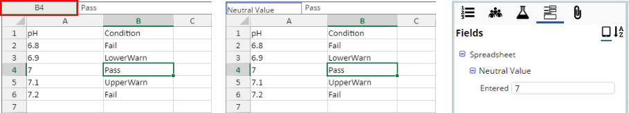 |
Creating named fields in this manner allows the Adhoc Query tool to search for Worksheets using specific spreadsheet values.
Formulas |
A comprehensive set of formulas available with the GrapeCity SpreadJs Spread.Sheets tool can be found at https://spread.grapecity.com/spreadjs/sheets/.
A full list of functions is available at https://sphelp.grapecity.com/webhelp/SpreadJSWeb/webframe.html#FormulaFunctions.html.
View the Change History of a Spreadsheet |
Using the "Diff" operation in the Dock, view a history of changes made to a Spreadsheet. See ELN/LES Worksheet Manager → Diff for more information.