Content |
|
|
storageunitrenderer Element |
|
Description |
The storageunitrenderer Element renders a Storage Unit SDI in graphical format and provides the following operational capabilities:
| • | Inserts an SDI into a Storage Unit. |
| • | Removes an SDI from a StorageUnit. |
| • | Marks a Storage Unit as reserved or empty. |
| • | Moves an SDI between child Storage Units. |
The Element performs these operations client-side (for user interaction); it does not save or otherwise modify data... that is handled by the page and associated JSP framework. Internally, the Element handles interaction between Trackable Items and SDIs.
See Mechanics for more details regarding internal functionality of the storageunitrenderer Element.
Related Topics |
Each Storage Unit is associated with a Storage Unit Type, which defines properties of Storage Units rendered by this Element.
See Storage Unit Types for additional information.
Examples |
| General |
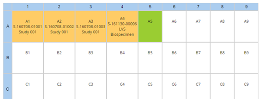
This general example shows how storageunitrenderer displays a Storage Unit defined by the Grid Storage Unit Type (in this case, a 9x9 Box):
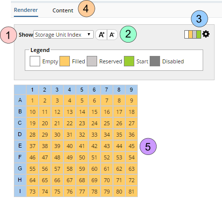
| Property Name | Description |
|
1.
|
Show Determines which Display Format is displays. The Display Format is defined in the Storage Unit Type Grid Properties. |
|
2.
|
Increase or decrease the Font. Click the A- to decrease the Font size or A+ to increase. |
|
3.
|
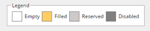
The Legend provides a key to the colors used within the grid. Click the gear open the Options tab. |
|
4.
|
Configured Detail tabs. |
|
5.
|
The rendered cells as determined by the Cell Properties. |
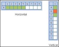
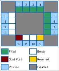
| StorageUnitLayouts |
To render Storage Units, R4 provides the following Storage Unit Layouts defined by Storage Unit Types:
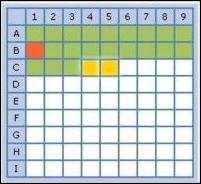
| Grid | Linear | Circular |
|
|
|
|
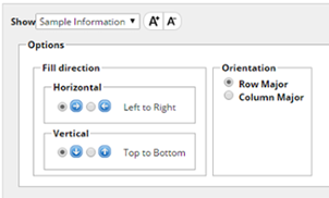
| Options |
The Options tab lets users define features and fill order when assigning Storage:
| Options | Description | ||||||||||||||||||
|
Grid Options shown Legend shows cell status |
|
storageunitrenderer Element Properties |
| Property Name | Description | ||||||||||||||||||||||||||||||||||
| Show | Yes renders the Element. | ||||||||||||||||||||||||||||||||||
| Show Legends | Deprecated. Clicking the Legend Icon shows the legend (see the example above). | ||||||||||||||||||||||||||||||||||
| Mode | Determines the edit/display mode: Edit (editable) or View (read-only). | ||||||||||||||||||||||||||||||||||
| Tab | Properties of the tab that adds the detail items. In the
example above, adding a Limit Type adds detail items to the Parameter Limits
and Parameter Details tabs.
|
||||||||||||||||||||||||||||||||||
| Cell Properties | Determines attributes of cells in the rendered layout:
|
||||||||||||||||||||||||||||||||||
| header Properties | Determines attributes of the header displayed above the rendered layout:
|
Mechanics |
| Internal Functionality |
The storageunitrenderer Element:
| 1. | Gets the StorageUnit Id from the pagedata object. | ||||||||||
| 2. | Gets the StorageUnitType from the StorageUnit SDI (see Storage Unit Types). | ||||||||||
| 3. | Gets the Property Tree Node Id from the StorageUnitType. | ||||||||||
| 4. | Parses the Property Tree value from the node. | ||||||||||
| 5. | Reads the defined Layout class (the element is a wrapper on this class),
which is a custom class instantiated by the Element to render StorageUnit.
The storageunitrenderer Element then:
|