The maint Element lets you view and edit SDI column values and add SDIs.
SDI Information can be presented in a form (single SDI) or
grid (multiple SDIs) style defined by the LabVantage CSS, in editable or view-only
mode, with flexible control over column attributes.
When used to add SDIs, the new SDIs can be based on an SDI
Template.
See Sample
Maintenance Page.
| Property Name |
Description |
| SDC |
Identifier of the SDC for SDIs displayed in the Maintenance Form or Grid. |
| style |
Determines how SDIs are displayed based on page functionality:
| Value | Description | | Form | Generates a Maintenance Form. This is the page style for displaying
a single SDI. | | FormWithFieldGroups | Groups columns to display in specific fieldsets on Maintenance Forms.
Use this with the Group property. See Tab
Groups and Field Groups in Maintenance Forms below. | | FormWithTabGroups | Groups columns to display in specific tabs on Maintenance Forms.
Use this with the Group property. See Tab
Groups and Field Groups in Maintenance Forms below. | | Grid | Generates a Maintenance Grid. This is the page style for displaying
multiple SDIs. | | GridWithCheckbox | Also generates a Maintenance Grid, but adds a checkbox before each
SDI. Use this style if you want to perform an operation only on selected
SDIs. | | GridWithTabGroups | Groups columns to display in specific tabs on Maintenance Grids.
Use this with the Group property. See Tab
Groups in Maintenance Grids below. |
Functionality of the form and grid are identical. This property determines
only which class in the LabVantage CSS renders the style. |
| Form Columns |
Number of columns displayed on each row. This applies only to the Form
style (above). For example, if you are displaying values from the s_sampleid
and createdt columns:
Form Columns = 1 | s_sampleid | S-01 | | createdt | 6/1/01 12:00 AM |
Form Columns = 2 | s_sampleid | S-01 | createdt | 6/1/01 12:00 AM |
|
| Fixed Columns
|
Generates a Maintenance Grid that scrolls horizontally (for display of
multiple SDIs) with left-most columns remaining stationary. Enter the number
of stationary columns here. Selecting cells by clicking and dragging causes
the page to scroll automatically.
If a the content of a Maintenance Grid is larger than the page area,
scrolling the grid (horizontally or vertically) maintains the column and
row headers at the top of the page. |
| View Only |
Yes renders the element to make it viewable only. The user can not interact
with anything in the element. |
| EventNotify |
A value of "true" or "false" either posts or does not post an EventNotify
Action onto the ToDo List when the result set loads. |
| Template Id |
If you are using one of the Maintenance Grid styles (defined by the style
property above), you can specify an SDI Template here. Each time you add
a row to the grid, the row is populated with values from the SDI Template.
The Template Id is passed to the sdirow tag. |
| Columns
|
Specifies attributes of columns on the Maintenance Form or Grid.
| Property Name | Description | | Identifier | Unique identifier for this item, rendered as an ID attribute in
the HTML tag. | | Column Id | Identifier of the SDI column to be displayed in the form or grid. | | title | Text displayed to identify the Column Id. | | Mode | Specifies how the input form control (generated HTML input tag)
works. This tool automatically determines if you have chosen an appropriate
mode to display the data (defined in the third column below). If not,
it selects an appropriate mode. "Mode" supports Expression-Based
Properties. Possible values:
| Value | Description | Designed for use with . . . | | input | Equivalent to type=text attribute of HTML input tag. As an
example, this lets you use the page to add SDIs. | Inputs such as the "description" column of SDCs. | | readonly | Equivalent to readonly attribute of HTML input tag. | All data. | | hidden | Equivalent to type=hidden attribute of HTML input tag. | All data. | | lookup | Text field with capability to open "Lookup Page" and find
a value of "string" data type. | SDC data (such as finding SDI Ids or SDC links). | | dropdowncombo | This is a dropdownlist (equivalent to HTML select tag that
inserts a select form control), but the field is an editable
"input" field. | Typically used for Reference Type data. | | dropdownlist | Equivalent to HTML select tag that inserts a select form
control.
You can also use this property in conjunction with the Dropdown
SQL property (below). This lets you retrieve data resulting
from execution of a SQL script specified by the DropdownSQL
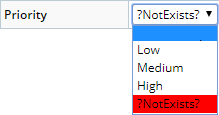
property. | SDC data and Reference Type data. | | dropdownlistvalidated | Explicitly marks an existing Reference Value that does not
exist in the current dropdownlist.
| Reference Values that have been removed. For example, the
Reference Value "NotExists" is added to the "Priority"
Reference Type. The "NotExists" value is selected
for a Sample, then the Sample is saved. After saving, the "NotExists"
value is then removed from the Reference Type. The "NotExists"
value is then rendered in the dropdownvalidated list as shown
below.
| | checkbox | Equivalent to type=checkbox attribute of HTML input tag. | Typically used for Reference Type data. This works the same
as it does in HTML, i.e., you need two values. Therefore, use
a Reference Type having two Reference Values. The first Reference
Value you specify is the "checked" value, the second is the
"unchecked".
When using checkbox mode, set the Display
Value to Y;N (or similar) if the column is not linked
to a Reference Type. | | radiobutton/vertical | Equivalent to type=radio attribute of HTML input tag. This
arranges the radios vertically within the column. | Reference Type data, generally best for choosing
from more than two values. | | radiobutton/horizontal | Equivalent to type=radio attribute of HTML input tag. This
arranges the radios horizontally within the column. | | datelookup | Date field with capability to open a search window and find
a value of "date" data type. | LabVantage "date" data type.
Also see the Date Format property
(below). | | password | Entry field that displays asterisks for each character you
enter. | Entering passwords. | | retrievedata | Retrieves the value in the column but does not render it on
the page. | Use this when you want to replace the value of another column's
property with the value of this column.
For example, if you setup a samplestatus column in retrievedata
mode, then setup a pseudocolumn with the value samplestatus:
[samplestatus], you will see the actual sample status (value
represented by the [samplestatus] variable) in the pseudocolumn.
Without using retrievedata mode, the [samplestatus] variable
would not be replaced with the actual column value. This differs from the hidden property
above... the hidden property renders the value on the page. | | formattedtext | Uses a Formatted Text Editor to edit the column. | See Formatted Text Editor
below. | | iconlookup | Installs an icon lookup. | Use this when you want to lookup an image as shown below.
| | displayicon | Renders an icon configured by a Reference Type.
| Use this when you want to render an icon as shown below.
The icon is defined by the Reference
Type specified by the Dropdown
or Icon RefType property. If an icon is not configured in the Reference Type, you can
use an HTML image tag for the Display
Value. | | coordinatelookup | Uses a map (defined in the Map
Policy)to lookup and return the selected coordinates. | SDCs for which "Allow Coordinates" has been enabled. | | default | Same as not choosing any of these Mode properties.
If you do not choose a Mode property (that is, leave it blank),
nodes that inherit this property will never actually be blank...
they will inherit the previous node's Mode. So, rather than
not choosing any Mode at all, choose "default". |
| | Behavior | These properties provide a declarative column dependency expression
to define if a column is mandatory, visible, or editable based on
other column values. This is supported only in the maint Element.
These properties support a Groovy expression based on other column
values. All respond dynamically when a User changes values of depending
columns on the client-side before saving. | Property Name | Description | | Hide Field | Provides options of "Yes", "No", and "Yes
(Clear Value)". The Groovy expression should return Y,
N or C for the three options (respectively). | | Mandatory | Provides options of "Yes" and "No" to
indicate whether or not the field is mandatory. The Groovy expression
should return a boolean true/false or Y/N. This property supersedes
the "Mandatory" check box in the Validation
editor. | | Read Only | Provides options of "Yes" and "No" to
indicate whether or not the field is read-only. The Groovy expression
should return a boolean true/false or Y/N. |
| | Validation | Client-side validation rules for text entered into input fields.
Non-conformal inputs throw an error when attempting to save. These
default JavaScript functions are in WEB-CORE/elements/scripts/maint.js.
Checking "Mandatory" makes the input a mandatory field. | Validation Type | Description | | Date | LabVantage Date (D) Data Type. This also provides
options for validation on "Past date only", "Future
date only", "Today or past date only", and "Today
or future date only". | | Length | Integer length of the the LabVantage String
(S) Data Type. Specify the "Length" within a "range".
Range values are inclusive. For example, a range of 6 to 12
means that the string length must be 6, 12, or any integer between. | | Number | LabVantage Number (N) Data Type.
Specify the length within a range as you would when specifying
a "Length" (above). | | Integer | | Decimal |
Regarding validation of Date (LabVantage Date (D) Data Type): | • | Date validation is enabled by default in the OOB configuration
if a column is a "Date" Data Type and no validation
is configured. | | • | If Date validation is set to one of the provided options,
Date validation occurs before "Length" range validation. | | • | Date validation handles all valid months and dates except
for differences between leap years and non-leap years. Valid
dates include Jan 31, June 30, Feb 29, etc. Invalid dates include
Jan 32, June 31, Feb 30, etc. Feb 29 in a non-leap year is treated
as valid and rolls forward to Mar 1. | | • | Valid Date formats include the specified default "Date"
and "Date Only" formats, any Java standard Short and
Medium date/time format combinations, and LabVantage date syntax
(such as n or n+3). | | • | Date validation is specific to the User's Locale. |
Regarding validation of Number/Integer/Decimal (LabVantage Number
(N) Data Type): | • | Number validation is enabled by default in the OOB configuration
if a column is a Number Data Type and no validation is configured.
Grouping separators are not allowed in the validation. | | • | Checking the "Do Not Validate" option disables validation
of the Number Data Type. This is provided to allow custom business
rules to process special numeric input. |
If you want to define your own JavaScript validation function,
specify it using the Customjs function (below). | NOTE: | The maint Element has built-in client-side
validation. The following varchar fields are rejected:
Columns Containing
SDI KeyId | All Other
Columns | | ' (single quote) | ; (semicolon) | | " (double quote) | | \ (backslash) | | | (pipe) | | ; (semicolon) | | [] (square brackets) |
|
| | Tip | Tooltip for the column value (supports value substitution). | | Custom JS | If you do not want to use the default validation scripts above,
specify your custom validation JavaScript function. Make certain to
set the Includes property in the Maint
Page Type Properties.
If you are using one of the Maintenance Grid styles (defined by
the style property above), you can also specify one of the JavaScript
Functions for Maintenance Grids described below. If you write your own validation function, we recommend returning
an empty string ("") if the validation passes, and returning a message
if the validation fails. | | Link URL | Specifies attributes of a hyperlinked title, activated by clicking
the text displayed by the title property:
| Property Name | Description | | HRef | Destination of the link, specified as a call to the Request
Controller. For syntax rules and guidelines, see Request
Controller and Variables. | | Target | Name of the window in which the linked page opens. You can
enter any name here, and the new window (browser instance) will
automatically assume that name. If you do not specify a target,
the linked page opens in the current window. | | Tip | Popup text displayed on mouseover. |
| | CSS Class | Class in the CSS defined for the Layout. The default CSS is WEB-CORE/stylesheets/sapphire.css. | | Lookup URL | Defines the Lookup page. This works only if the Mode
property of the column is "lookup".
See Lookup Page Examples for examples
of how to use these properties. | Property Name | Description | | HRef | URL to which the Lookup icon is linked. | | Tip | Help text displayed on mouseover. | | SDC Id | SDC to use for a custom Lookup page.
If you have specified a Lookup Page, this is ignored. If you have not specified a Lookup Page, the SDC is obtained
from the HRef attributes. | | Restrictive Where | Optional restrictive where clause that either combines with
the provided List page's restrictive where clause, or is used
as the primary restrictive where clause on the default Lookup
page. | | Default Query | Default query to apply. | | Query From | From clause for the Lookup page. | | Query Where | Where clause for the Lookup page. | | Selector Type | Checkboxes or radio buttons.
You need an Accept button to return these. If you do not specify a value, the Lookup page uses either
the provided List page's set value, or the new List page's
defaults. Multiple items are returned semicolon-delimited. | | Lookup Columns | Columns that are either merged with the List page specified
by the HRef property, or (if not specified by the HRef property)
used to define a new List page:
| Property Name | Description | | Identifier | If you are overriding/merging with an existing List
page, specify the same identifier as the column on the
List page. Otherwise, this creates a new column. | | Column Id | If merging with an existing List page, if no match can
be found for the identifier, this tries to match on a
column id. If a match is still not found, a new column
is created. | | title | title of the column. | | Mode | Specifies how the column is populated:
| Display Only | Show the value, but do not populate
the column. | | Return Only | Populate the column, but do not show the value. | | Display and Return | Show the value and populate the column. | | Hidden Only | Hidden fields. |
| | Display Value | Value displayed in place of the corresponding retrieved
value (see Display Value below
for example). | | Pseudo Column | See Pseudo Column below
for example. | | Map to Column | If you return more than one column, use this to specify
the destination of the returned values. | | Width | Column width in pixels. | | Searchable | Determines if the value in the Dynamic Lookup is searchable.
See Dynamic Lookups. |
| | Dialog Type | LabVantage modal dialog or the browser's default dialog. | | Dynamic Lookup | Enables the field for Dynamic Lookup. See Dynamic
Lookups. | | Allow Create New on Dynamic Lookup | Determines if the field supports Create
New SDI functionality. | | Create New Options | If "Allow Create New on Dynamic Lookup" is "Yes",
this defines QuickCreateSDI
page.
| Property Name | Description | | Create New Text | title displayed on the page header. | | QuickCreateSDI Page | QuickCreateSDI Page | | Template | Optional Template to use for the page. |
|
| | Display Value | Values displayed in place of the corresponding retrieved values.
Separate each with a semicolon. For example, if you retrieve values
from the createby column, you could specify JDrake=JD. All values
retrieved as JDrake would then be displayed as JD. This works only
if you replace the entire retrieved string (it does not work on partial
strings). | | Pseudocolumn | A "pseudocolumn" is a column that is rendered on the page, but
does not exist in the SDC. Do not choose a database columnid when
specifying a pseudocolumn. If you want to access this pseudocolumn
using a JavaScript function or another pseudocolumn, specify an identifier
of your own choice.
This value you enter can be HTML or a Variable.
For example: | • | If you enter an HTML image tag, then specify a link (using
the Link URL property above), the image becomes a hyperlink. | | • | If you use a variable, the variable must point to one of the
columns defined by the Column
Id property. In this case, you can hide the actual column
so that only the pseudocolumn is displayed. For example, you
could specify Date: [moddt] to display the date and time
a Sample was last modified (such as Date: 8/1/2003 15:36:24),
but only if you have previously chosen moddt as one of
the columns to be rendered. |
| | Column Span | Number of columns over which the current column spans (must be less
than or equal to the total number of columns). | | Start New Row | When using a Form style, "Yes" always
place the column at the start of a new row. | | Size in Grid | Size of the input field when using the Maint Grid format. | | Events | JavaScript function to execute in response to an event occurring
on the form control:
| Property Name | Description | | Identifier | Unique identifier for this item, rendered as an ID attribute
in the HTML tag. | | Event | DHTML event that executes the JavaScript function. If you
specify an onChange event, see Behavior
of onChange Events in maint Elements below.
This also supports an OnKeyUp event. | | JavaScript | JavaScript function to execute in response to the event. Your
function can be in a *.js file referenced from the page, or
in the page itself. |
| | Date Format | Format in which date/time is displayed, as determined by the user's
Locale. For information about how LabVantage handles Locale, see Locale
and Time Zone in the topic Internationalization
and Localization.
The popup calendar and all date validation routines recognize and
function with the chosen format. If you choose a format that specifies only date (without time),
the time defaults to midnight in your time zone. Be advised that
this could be a day earlier for a user in a different time zone.
| | Dropdown SQL | SQL script that retrieves data when the Column Mode property (above)
is set to dropdownlist. If two columns
are selected, the first column is used as the actual data, and the
second column is used as the Display Value.
For example, if you setup a sampledesc column in dropdownlist
mode, then specify the DropdownSQL script select s_productid, productdesc from s_product the maint Element should render a dropdown list of productdesc
for the sampledesc field. If the query is select s_productid from s_product the Element should render a list of Product SDIs. "Dynamic Dropdowns" can also be created to alter the
contents of a dropdown based on the selection made in another dropdown.
See Dynamic Dropdowns below. | | Dropdown or Icon RefType | If the Mode is dropdownlist, this is the Reference
Type that defines the selectable values.
| NOTE: | Reference Values will be automatically translated
unless the "Translate Value" property (below) is explicitly
set to "No". |
If the Mode is displayicon, this is the Reference
Type that defines the icon to display. | | Dropdown Values | If the Column Mode property is dropdownlist or dropdowncombo, these
are the selectable values. | | Dropdown Definition | If the Mode is dropdownlist, this retrieves
data based on an SDC definition:
| Property Name | Description | | SDC Id | The SDC for which data is retrieved. | | Query From | Value of the From clause for the query. | | Query Where | Value of the Where clause for the query. | | Query Order By | Value of the Order By clause for the query. | | Value Column | Actual column value. | | Display Column | Column value displayed to users. |
"Dynamic Dropdowns" can also be created to alter the
contents of a dropdown based on the selection made in another dropdown.
See Dynamic Dropdowns below. | | Translate Value | See Translating Properties
in section 2 Properties Overview for details
regarding property translation. In general:
| • | "Yes" translates all values in the column regardless of context. | | • | "No" does not translate any values. | | • | "No (Allow Edit Translations)" adds an icon to to
the field which (onClick) opens a Translation Maintenance page.
This is supported only for column modes input, readonly, lookup,
dropdownlist, dropdowncombo, and radiobutton. |
| | Default Value | Default value to use when creating new SDIs.
If creating the new SDIs from an SDI Template, the Default Value
overrides the value in the Template. For columns accepting text input, you can specify variables such
as [currentuser] (the current user). For columns accepting the date,
you can specify relative date format such as [today] or (N+3),
the latter meaning "now plus 3 days". When the Element style is set to render as a Maint Grid, the Default
Values are applied to each SDI as you add rows to the grid. | | Group | Column where you want to insert a tab or field break. For example,
suppose you have defined three columns...
column A
column B
column C If you want two tab groups, with columns A and B in the group and
column C in the second, enter column C. See Tab Groups and Field Groups. | NOTE: | You can use the "Group" property to hide a
Tab Group.
Suppose your Element has a "tab01" and "tab02", and you want
to hide "tab02" in "Edit" mode. You could return "tab01",
and set the "Mode" to "hidden". |
| | Language Direction | Determines the Language direction for this specific field.
"LTR" and "RTL" force this field to always
be presented left-to-right or right-to-left, respectively. When
set to "Default" (or left blank), the column uses the
direction defined by the current User's Language. This can be used to override the Language for fields that continue
to display English text regardless of the User's Language (such
as Groovy or Calculation Expressions). | | Phrases for Formatted Text | If this column uses the Formatted
Text Editor and you want to use Phrases,
this defines the Phrase Type.
| Property Name | Description | | Phrase Type | Phrase Type used for the Formatted Text Editor. | | Phrase Lookup | Lookup page for the Phrase Type. |
|
|
| Texts |
Substitutes your text in place of the default text rendered on the page.
All of this text is displayed in response to failure of client-side validation
according to rules set by the Validation
property (above).
| Property Name | Description | | Validation Fail | Validation failure. | | Mandatory Not Filled | A mandatory field has not been populated. | | Not a Number | Returned Data Type does not match validation rule. | | Not an Integer | | Not a Decimal | | Not a Date | | Value Not In Range | Returned data does not pass Number/Integer/Decimal range validation
rules. | | Length Not In Range | Returned data does not pass Length range validation rules. |
|
| Tab Text |
Alternate text to display on the tab instead of the default, which uses
the singular or plural SDC name. |
| Show |
Determines whether or not to display the Element on the page. |
| Enable Dynamic Audit |
Determines if "Dynamic Auditing" is enabled for the Page Type.
See Dynamic
Auditing for a complete description of this feature with examples.
Alternatively, this property can be left blank, in which case the "Enable
Dynamic Audit" property setting in the MaintenanceForm
Page Type is used. |
LabVantage locks data being accessed by another user.
For current data locking strategy, see Data Locking Strategy
in section 2 Properties Overview.
The following JavaScript functions deal with Maintenance Grids.
These are in WEB-CORE\elements\scripts\maint.js. See WEB-CORE\pagetypes\maint\scripts\mainpage.js
for examples. Note that the elementid parameter lets you work with multiple
grids on the same page.
| Function
|
Description
|
| deleteGridRows( elementid ) |
Removes a row from a Maintenance Grid identified by elementid. This does
not delete the SDI. |
| addGridRows( elementid, copies ) |
Adds rows to a Maintenance Grid:
| Parameter | Description | | elementid | Identifier of the Maintenance Grid Element (defined in the sdimaint
tag). | | copies | Number of rows to add to the Maintenance Grid. |
|
| removeGridRowsFromLink( elementid, linkcolid, newvalue ) |
Removes rows from the Grid, or reassigns them to another column. This
is designed for use with linked SDIs:
| Parameter | Description | | elementid | Identifier of the Maintenance Grid Element (defined in the sdimaint
tag). | | linkcolid | If you do not specify a "newvalue", this
removes the row for the SDI specified by "linkcolid".
If you specify a "newvalue", this removes the row for
the SDI specified by "linkcolid", then sets the column
identified by "linkcolid" to the value "newvalue". | | newvalue |
|
In Maintenance Grids, right-clicking in a cell opens a Shortcut
Menu, which provides the functionality described below. Clipboard shortcut keys
are also supported. See Navigator
Policy → Using the Edit Set Navigator (Step 6) for more information.
| Menu Item
|
Description
|
| Cut |
Cuts the contents of the cell that currently has focus. This behavior
is subtly different in Chrome and Internet Explorer (see Navigator
Policy → Using the Edit Set Navigator (Step 6)). |
| Copy |
Copies the contents of the cell that currently has focus. This behavior
is subtly different in Chrome and Internet Explorer (see Navigator
Policy → Using the Edit Set Navigator (Step 6)). |
| Paste |
Copies the contents of a cell that has been Cut or Copied to the cell
that currently has focus. This behavior is subtly different in Chrome and
Internet Explorer (see Navigator
Policy → Using the Edit Set Navigator (Step 6)). |
| Fill Down |
Copies the contents of the cell that currently has focus to all selected
cells in the same column of the rendered Element. To use:
| a. | Put the cell to be copied in focus (click or tab). | | b. | Select all cells to which you want to copy the value. These must
be in the same column of the rendered Element. | | c. | Select Fill Down from the Shortcut Menu. |
|
| Fill Across |
Copies the contents of the cell that currently has focus to all selected
cells in the same row of the rendered Element. To use:
| a. | Put the cell to be copied in focus (click or tab). | | b. | Select all cells to which you want to copy the value. These must
be in the same row of the rendered Element. | | c. | Select Fill Across from the Shortcut Menu. |
|
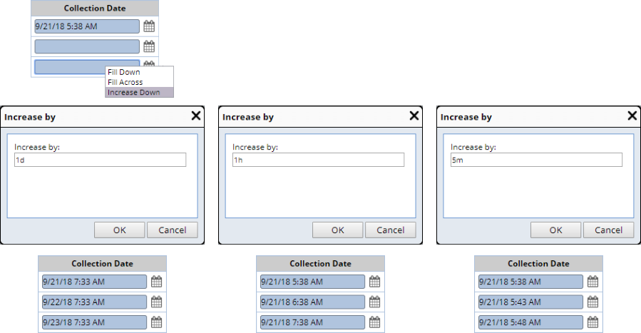
| Increase Down |
"Increase Down" works with text, numeric, and date fields.
Text and numeric fields can be increased by integer. Date fields can be
increased by days, hours, or minutes as shown below.
|
These features are also provided:
| Feature
|
Description
|
| Select Column |
Clicking the header of a column selects all fields in that column. |
| Related Fill-Down |
Based on the columns defined in the Lookup Columns collection, a lookup
column will fill-down any related columns when the primary column is filled-down.
For example, if you look up a ProductId on the Sample Maintenance page that
returns the Product Version and Product Description as well (defined in
the "Lookup Columns" collection and "Map to Column"
property), filling-down the ProductId also fills-down the Product Version
and Description even if they are read-only. |
In response to an onChange event, the maint Element (as well
as Data Entry Elements) execute a default JavaScript function. You can substitute
your own function, or execute yours in addition to the default function.
For the syntax required to do this, see the onchange
attribute of the LabVantage Custom Tag sdiinput
(LabVantage uses this tag to render HTML input form controls).
The style property contains the "FormWithTabGroups" and
"FormWithFieldGroups" options. In Maintenance Forms, these tell the Element
how to interpret the Group property, i.e., whether it is
rendering columns in groups of tabs or fieldsets.
For each Columns property collection, the Group property defines breaks between
each Tab Group or Field Group. For example, if you are rendering tabs, three
Groups defined as A, A, and B renders two groups of columns on Tab A, and one
group of columns on Tab B.
Tab Groups define groups of tabs rendered by the <sapphire:
tabgroup> tag. Field groups do not require a tag.
Tab Groups (implemented with either the <sapphire:
tab> or <sapphire: tabgroup>
tag) re-select the selected tab after a save. This "memory"
of the selected tab should reset when a user first enters a MaintenanceForm
page.
If a Column Id is not specified in the Group property,
the primary key is used as shown below.
| NOTE:
|
PK indicates primary key (SDI KeyId1)
- indicates no value |
| Column Id |
Group |
Form with Tab Groups |
Form with Field Groups |
|
1
2
3
4
|
A
A
B
B
|
|
A
B
|
|
1
2
3
4
|
A
-
B
-
|
|
PK
A
B
|
|
1
2
3
4
|
-
-
B
B
|
|
PK
B
|
|
1
2
3
4
|
A
A
A
A
|
|
A
|
|
1
2
3
4
|
-
-
-
-
|
|
PK
|
|
1
2
3
4
|
B
A
-
B
|
|
PK
A
B
|
Tab Groups in Maintenance Grids are configured in a manner similar to Tab
Groups and Field Groups in Maintenance Forms. The style
property contains the "GridWithTabGroups" option. In Maintenance Grids, this
tells the Element how to interpret the Group property to
allow columns to be separated into tab groups.
As an example, consider the maint Element on the Sample Maintenance page with
three Product columns in a single "Product" Group:
This inserts the Tab Group into the Grid:
Note that if you set the Mode to "FormWithTabGroups", selecting more
than one row in the Navigator or SDI List page dynamically switches to the "GridWithTabGroups"
mode. In other words, your Tab Group will appear on both the Maintenance Form
and the Maintenance Grid as shown below.
The Fixed Columns property determines columns that
are fixed across all tabs. For example, if "Fixed Columns" is 1 and
s_sampleid (keycolid1) is the first column, it will appear on all tabs. If you
do not set a Group property for a column, that column uses the SDC Id (which
is the default Group). This is consistent with "FormWithTabGroups"
behavior. Additionally, the scroll grid is automatically activated if the "Fixed
Columns" property is applied, and will work across all tabs.
| NOTE:
|
All columns and fields are actually rendered. Selecting
a tab simply hides and shows the relevant columns in the table. Therefore,
any JavaScript or code that accessed columns or fields in previous LabVantage
versions will continue to work as it did previously. |
| NOTE: |
|
The behavior described in this section applies to LabVantage
8.4.1 and higher LabVantage 8.4.x Maintenance Releases. |
As provided in the OOB configuration, the maint Element for selected SDI Maintenance
pages is configured to automatically render in view-only mode if the Status
of the SDI indicates completion a life cycle. This is done for the following
SDCs:
| SDC |
Renders View-Only if Status is: |
| Sample |
Completed (when Review is not required) or Reviewed |
| Batch |
Released |
| Request |
Released |
| QCBatch |
Completed or Reviewed |
| MonitorGroup |
Released |
| StudySDC |
Completed |
| Study |
Completed |
| Incident |
Completed or Closed |
| Action Plan |
Closed |
| Rendering a Formatted Text Editor
|
The formattedtext Column Mode lets you render
a Formatted Text Editor in an SDI Maintenance
page.
To print a Jasper Report containing text from the Formatted Text Editor:
| • |
Format the column using the format method of the scriptlet class, e.g.,
$P{REPORT_SCRIPTLET}.format($F{CLOBCOLUMN}). |
| • |
Set the "Markup" property to "HTML". |
| • |
Enable the "Stretch With Overflow" property. |
| • |
Set the "Field Class" property on the database field to "Java.Lang.String". |
Foreign key (FK) columns can be edited by adding (or selecting an existing)
FK column, then selecting an appropriate "Mode" for the column. If
"Mode" is left blank, the column is rendered as read-only (primarily
for backward-compatibility).
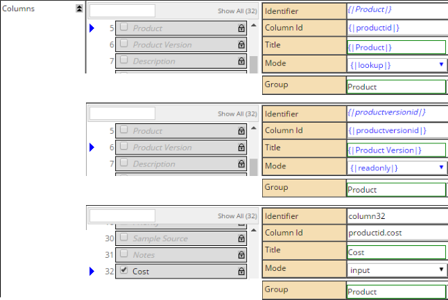
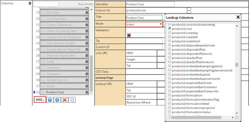
The example below shows the maint Element in the Sample List page, which defines
a FK reference to the Product SDC. In this example, we add a "Product Cost"
column rendered in "input" Mode.
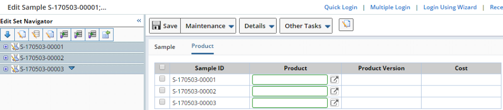
To see the FK column, associate the primary key (Product) with the Sample.
After saving, the editable FK column is rendered. After entering a value for
the FK column and saving, the primary and any related FK column data are also
updated. The retrieval of the related FK fields (such as Product data) creates
another RSet and stores it with the primary RSet. The FK RSet is pinged and
released with the primary RSet. Clearing the primary key for the FK (Product)
also clears and disables related FK fields.
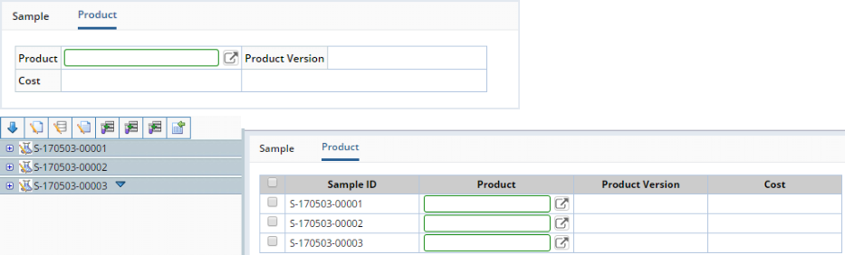
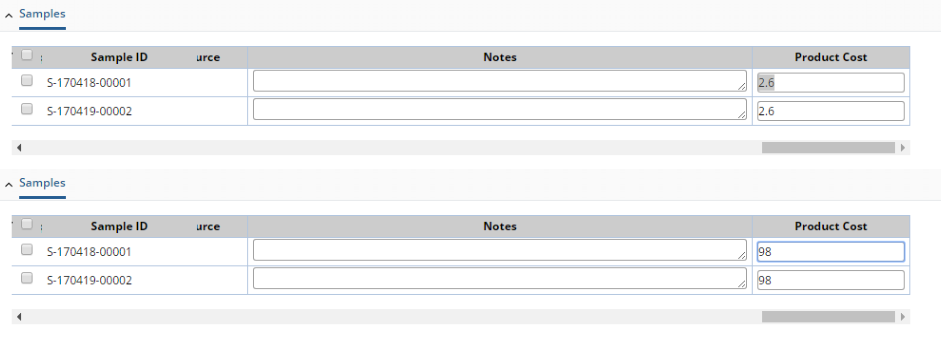
When editing multiple SDIs in a Maintenance Grid, related FK columns are connected.
In the example below, both Samples are associated with the same Product. If
you change the Product Cost in one Sample, all Samples associated with the same
Product also change accordingly. Visually, the values are automatically updated
as you type.
This functionality is currently available (hardcoded) only for the Sample SDC.
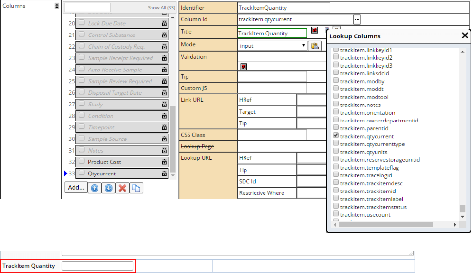
Editable TrackItem (Trackable
Items) columns can be configured in a manner similar to editable
foreign key columns, ie., add the column and select the Mode. Trackitem
columns are available if the SDC is Trackable. As with FK columns, the value
of the TrackItem column is retrieved with the primary data, and an RSet is created
for the TrackItem record.
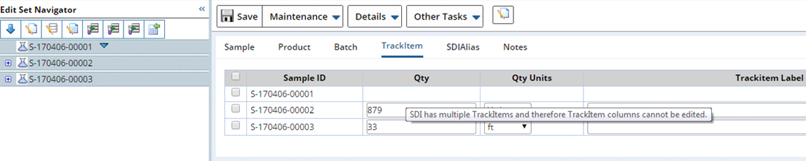
Unlike FK columns, the Sample does not have to be associated with a TrackItem,
and the field is always available to edit. After saving, a TrackItem record
is created for the Sample if none exists. If the Sample already has a TrackItem
record, it is updated.
If multiple TrackItems are found for a single Sample SDI, the Maintenance page
prevents editing of the TrackItem columns for that SDI. Hovering over the read-only
TrackItem columns opens a tooltip stating that the SDI has multiple TrackItems
and cannot be deleted. An RSet is not obtained for those TrackItems.
This functionality is currently available (hardcoded) only for the Sample SDC.
Editable SDI Alias columns can be configured in a manner similar to editable
foreign key columns, ie., add the column and select the Mode.
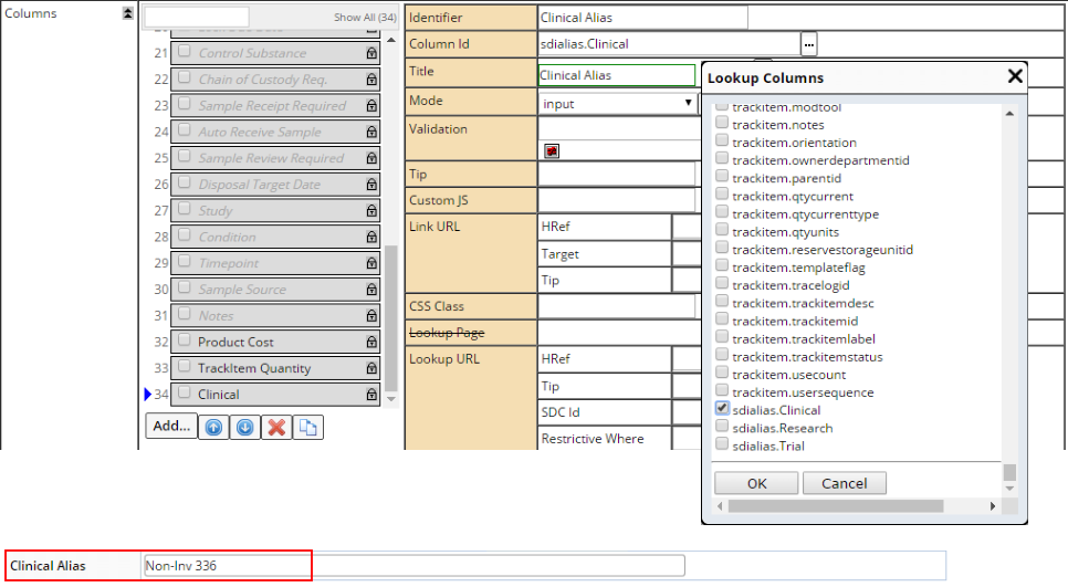
When selecting the column in the maint Element, existing Alias Types (defined
by the AliasType Reference Type) are available in the column lookup. The format
is sdialias.xxx, where xxx is the case-sensitive Alias Type.
Because Alias Types are case-sensitive and can have spaces, the ColumnId for
an Alias Type cannot itself have a column alias. For example, sdialias.Clinical
"ClinicalColumn" would not be a valid ColumnId.
If no Alias Types are defined, you can manually enter sdialias.yyy (where yyy
is the desired Alias Type) in the ColumnId field (i.e. an Alias Type is not
required to be defined in the reftype).
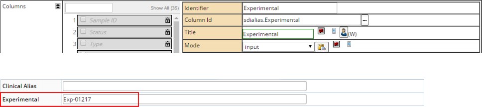
As with editable TrackItem columns,
SDIAlias columns are editable at any time and do not require an SDIAlias for
the SDI to be defined. The SDIAlias record is created the first time you specify
an AliasId for the Alias Type. If the SDI Alias record already exists, it is
updated. This mechanism lets you maintain multiple SDIAliasId's for multiple
Alias Types on a single Maintenance page.
"Dynamic Dropdowns" can be created to alter the contents of a dropdown
(the "target column") based on the selection made in another dropdown
(the "source column"). This functionality is currently available for
the maint Element and sdclinkmaint Element.
To create a Dynamic Dropdown, the "Columns → Dropdown SQL"
or "Columns → Dropdown Definition → Query Where" property
for a target column is configured with the token '[columnid]', which is the
column id of the source column. If both the "Dropdown SQL" and the
"Dropdown Definition" are configured in this manner, the "Dropdown
Definition" is used and "Dropdown SQL" is ignored. A target column
can have one or more source columns, and a source column can have one or more
dependent target columns.
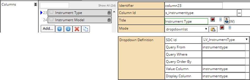
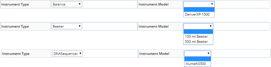
In the following example, a custom Parameter List is created. The maint Element
is configured with two columns in "dropdownlist" mode: an s_instrumenttype
column (foreign key link to the LV_InstrumentType SDC) and an s_instrumentmodel
column (foreign key link to the LV_InstrumentModel SDC). The goal is to choose
an Instrument Type and have the Instrument Models change accordingly. This example
uses the "Dropdown Definition → Query Where". Instrument Type
is configured as the source column as shown below.
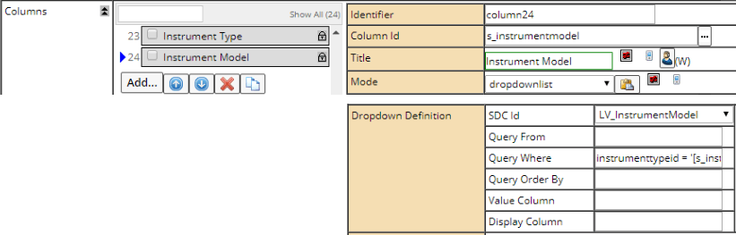
Instrument Model is configured to be the target column as shown below. The
"Dropdown Definition → Query Where" is instrumenttypeid = '[s_instrumenttype]',
thus referencing the source column.
Changing the Instrument Type then shows the Instrument Models of that type.
If the current value of the dependent target column exists in the updated dropdown,
the value will be preserved. Otherwise, the dependent target dropdown list will
be blank.
When configured in a Maintenance Grid, changing the source column on the same
row updates the dropdown of all dependent target columns.
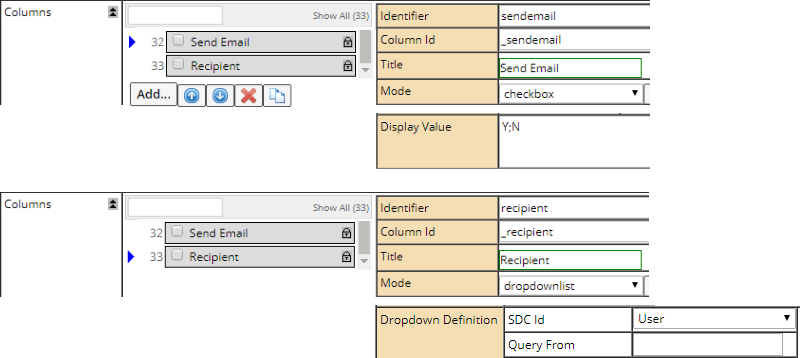
You can define editable "virtual columns" that are passed in with
Action properties. A "virtual column" is a column that does not actually
exist for the SDI, but can nevertheless be populated (by manual entry, JavaScript,
or lookup) and passed to an Action as a property. Although the Action itself
ignores the virtual columns, they can be passed on to SDC
Rules.
To specify a virtual column, prefix the column name with an underscore (such
as _mycolumn), and use it with a column mode other than the default. On save,
the virtual column will be passed in with the Action and on to any SDC Rules.
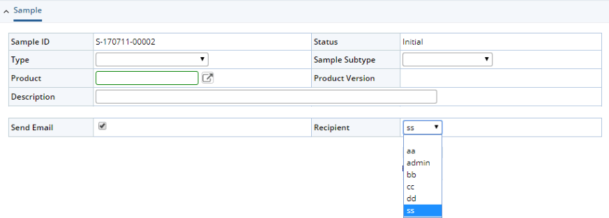
In the example below, the Maintenance Form is configured to render a "Send
Email" checkbox with a dropdown of recipients, and create custom properties
that will be passed to the EditSDI Action when the Maintenance page is saved.
This can be done by configuring two virtual columns as shown below.
This renders the controls shown below.
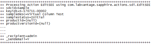
When the page is saved, the properties are passed into the EditSDI Action and
any associated SDC Rules as shown below.
This also works for foreign-key related columns, i.e., you can use the virtual
column to pass values through to the foreign-key "save" Actions and
their SDC Rules. For example, you can use "productid._mycolumn" with
the Sample SDC, and when the EditSDI Action is executed on the Product SDC by
the "save", it will pass the value as _mycolumn to the EditSDI Action.
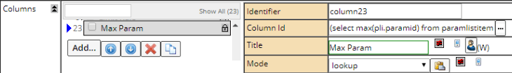
You can create editable nested select columns, set the mode to any input type
(including dropdownlist and lookup), and it will be rendered as an input. For
backward-compatibility with previous LabVantage versions, the mode must not
be empty or default. The Alias for the nested select uses an underscore prefix
similar to Virtual Columns (such as _mycolumn).
The underscore prefix flags the nested select as a Virtual
Column that is passed to the executing Action and any SDC Rules.
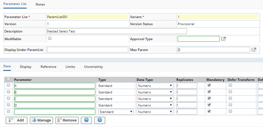
For example, assume the maint Element for a Parameter List contains the following
nested select for the Column Id:
(select max(pli.paramid) from paramlistitem pli where pli.paramlistid= paramlist.paramlistid
and pli.paramlistversionid = paramlist.paramlistversionid and paramlist.variantid
= pli.variantid) _maxParam
The _maxParam is evaluated as "D".
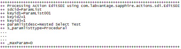
When the page is saved, _maxParam is passed into the EditSDI Action and any
associated SDC Rules as shown below.