The example below is the Specification Maintenance page, which uses details
from (among others) the SpecParamItems, SpecParamList, SpecLimtType, and SpecParamLimits
tables. Choosing a Limit Type loads the associated details into the Parameter
Limits and Parameter Details tabs.
sdclinkmaint
Element Properties
|
| Property Name |
Description |
| Primary SDC |
Identifier of the Primary SDC. This is a mandatory field. |
| Link Definition |
Defines the link:
| Property Name | Description | Normal Detail and
Many to Many Links | Defines detail (D) and many-to-many (M) links originating from
the Primary SDC:
| Property Name | Description | | Link Id | Value of the LinkId column in the SDCLink table. |
| | Reverse Foreign Key Links | Defines foreign key links pointing to the Primary SDC and originating
from a different SDC ("To SDC" below):
| Property Name | Description | | To SDC | The foreign key originates from this SDC (value of the LinkSDCId
column in the SDCLink table). | | Link Id | Value of the LinkId column in the SDCLink table. |
|
This is how you setup these links: | Link
Type | Property Setup | | Detail (D)
and Many to Many (M) | Set the "Primary SDC", then click "Save".
Set the "Link Id" for "Normal Detail and Many to Many Links". | | Foreign Key (F) | From this Element, the F-type link defines
a reverse foreign key:
Set the "Primary SDC", but do not click
Save. Set the "To SDC" for "Reverse Foreign
Key Links", then click "Save". Set the "Link Id" for "Reverse Foreign
Key Links". |
|
SDC Link Id
(Deprecated) |
Identifier of the link. This is the value of the LinkId column in the
SDCLink table (detail of the SDC table). Supports only detail links. |
| style |
Determines if the Element is rendered as a Maintenance Form, Maintenance
Grid, or a Maintenance Grid with checkbox row selection. |
| View Only |
Determines if the linked data are editable or read-only. |
| Show in Add Mode |
Determines if the Element is shown when adding an SDI. |
| Tab |
Properties of the tab that adds the detail items. In the example above,
adding a Limit Type adds detail items to the Parameter Limits and Parameter
Details tabs.
| Property Name | Description | | Show | Yes (default) displays the Element. | | Text | Text displayed in the tab header. | | Width | Width of the tab in pixels (defaults to the size of the tab). | | body Width | Width of the content body (text area beneath the tab). The default
is 100%. | | body Height | Fixed height of the content body. A scrollbar is added as required. | | Expandable | Yes (default) allows the tab to be expanded and collapsed. No disables
this feature and the tab is always expanded. | | Expanded | Yes (default) initially expands the tab if Expandable property is
set to Yes. | | Highlight | Yes (default) highlights the tab on a mouseover event. The CSS defines
this. | | Tip | Help text to appear on mouseover. | | Id | Identifier of the Element (defaults to the Element name). | | Function | Optional JavaScript function to execute. | | Group | Defines a tab group. See Tab
Groups and Field Groups in the maint
Element. |
|
| New Item Details |
Properties defining how the detail items will be added and displayed.
See Lookup Page Examples for examples
of how to use these properties. | Property Name | Description | | Addition Type | Determines how a new detail item will be selected:
Add Blank Row inserts an unpopulated
row. Use Lookup opens a Lookup page. The next six properties apply if you choose Use Lookup. | | Lookup Page | Lookup page (defaults to WEB-CORE/lookup/lookup.jsp). | | Merge with Lookup Page | If you are using a custom Lookup page, "Yes" merges/overrides the
columns and mapping with the page.
The default is "No". | | Lookup Callback | Optional JavaScript function to call from the Lookup page. This
overrides the standard lookup return. | | SDC Id | Identifier of the SDC to pass to the Lookup page. | | Table Id | If you want to pass a table name to the Lookup page rather than
an SDC, this is the identifier of the table. | | Multiple Select | "Yes" renders checkboxes. "No" renders radio
buttons. | | Query Where | Query WHERE clause by which to filter the detail data. | | Restrictive Where | Additional where clause to further restrict data retrieval. This
additional criteria is either merged with the custom Lookup page (it
provided) or used on the default Lookup page. | | Lookup Page Columns | Columns passed to the Lookup page:
| Property Name | Description | | Identifier | Unique identifier for this item, rendered as an ID attribute
in the HTML tag. | | Column Id | Identifier of the column.
If merging with columns in a custom Lookup page, either the
Column Id or the title (below) must match the Lookup page. | | title | title displayed to identify the column.
If merging with columns in a custom Lookup page, either the
title or the Column Id (above) must match the Lookup page. | | Mode | Specifies how the Lookup page populates detail
columns:
| Display
Only | Show the value, but do not
populate the detail column. | | Return Only | Populate the detail
column, but do not show the value. | | Display and Return | Show the value and populate the detail
column. | | Hidden Only | Hidden fields. |
| | Display Value | Value displayed in place of the corresponding retrieved value
(see Display Value below for example).
Use this only if merging with a custom Lookup page. | | Pseudo Column | See Pseudo Column below for example.
Use this only if merging with a custom Lookup page. | | Map to Column | If the Mode is "Return
Only" or "Display and Return", this is the identifier of the
detail column that will be popluated. | | Part of Unique Key | Yes filters duplicate records.
If this property is not set to Yes for at least one detail
column, duplicate records can be selected. |
| | Dialog Type | Specifies modal dialog to use: LabVantage
dialog or the browser's dialog. | | Auto Add New Row | "Yes" automatically adds a new row when the page is opened
and when the last row is modified. |
|
| Edit Item Details |
Properties that build the Edit button for reverse foreign key links:
| Property Name | Description | | Edit Page | Page to open when editing an item. This is required. | | Edit Window | Specifies the Window for the edit page (the current browser window,
a LabVantage dialog, or a new browser window). |
|
| Button Placement |
Position of the button within the tab. If you leave this blank, buttons
will not be displayed. |
| Buttons |
Properties of the buttons:
| Property Name | Description | | Identifier | Unique identifier for this item, rendered as an ID attribute in
the HTML tag. | | Show | Yes (default) shows the button. | | Text | Text displayed on the button. | | Width | Width of the button in pixels (defaults to the width of the text
on the button). | | Function | JavaScript to execute for an onclick mouse event. | | Tip | Help text to display for an onmouseover button event. | | Image | URL of the image displayed on the button. | | Appearance | Options to select the appearance of the button. If you leave this
blank, it defaults to standard. | | Margin | Margin of the button in pixels. | | style | Choose a style, or specify a CSS if you need to define button style
using a stylesheet. | | Highlight | Yes (default) highlights the button on mouseover. The CSS defines
this. |
|
| Columns |
Properties of the detail columns:
| Property Name | Description | | Identifier | Unique identifier for this item, rendered as an ID attribute in
the HTML tag. | | Column Id | Identifier of the column in the Primary SDC. | | title | title displayed as the column header. | | Mode | Specifies how the input form control (generated HTML input tag)
works.
| Value | Description | Designed for use with . . . | | input | Equivalent to type=text attribute of HTML input tag. As an
example, this lets you use the page to add SDIs. | Inputs such as the "description" column of SDCs. | | readonly | Equivalent to readonly attribute of HTML input tag. | All data. | | hidden | Equivalent to type=hidden attribute of HTML input tag. | All data. | | lookup | Text field with capability to open "Lookup Page" and find
a value of "string" data type. | SDC data (such as finding SDI Ids or SDC links). | | dropdowncombo | This is a dropdownlist (equivalent to HTML select tag that
inserts a select form control), but the field is an editable
"input" field. | Typically used for Reference Type data. | | dropdownlist | Equivalent to HTML select tag that inserts a select form
control.
You can also use this property in conjunction with the Dropdown
SQL property (below). This lets you retrieve data resulting
from execution of a SQL script specified by the DropdownSQL
property. | SDC data and Reference Type data. | | checkbox | Equivalent to type=checkbox attribute of HTML input tag. | Typically used for Reference Type data. This works the same
as it does in HTML, i.e., you need two values. Therefore, use
a Reference Type having two Reference Values. The first Reference
Value you specify is the "checked" value, the second is the
"unchecked".
When using checkbox mode, set the Display
Value to Y;N (or similar) if the column is not linked
to a Reference Type. | | radiobutton/vertical | Equivalent to type=radio attribute of HTML input tag. This
arranges the radios vertically within the column. | Reference Type data, generally best for choosing
from more than two values. | | radiobutton/horizontal | Equivalent to type=radio attribute of HTML input tag. This
arranges the radios horizontally within the column. | | datelookup | Date field with capability to open a search window and find
a value of "date" data type. | LabVantage "date" data type.
Also see the Date Format property
(below). | | password | Entry field that displays asterisks for each character you
enter. | Entering passwords. | | inputarea | Installs multi-line text input control. | Use this when you require a multi-line input. | | iconlookup | Installs an icon lookup. | Use this when you want to lookup an image as shown below.
| | displayicon | Renders an icon configured by a Reference Type. | Use this when you want to render an icon as shown below.
The icon is defined by the Reference
Type specified by the Dropdown
or Icon RefType property. If an icon is not configured in the Reference Type, you can
use an HTML image tag for the Display
Value. | | retrievedata | Retrieves the value in the column but does not render it on
the page. | Use this when you want to replace the value of another column's
property with the value of this column.
For example, if you setup a samplestatus column in retrievedata
mode, then setup a pseudocolumn with the value samplestatus:
[samplestatus], you will see the actual sample status (value
represented by the [samplestatus] variable) in the pseudocolumn.
Without using retrievedata mode, the [samplestatus] variable
would not be replaced with the actual column value. This differs from the hidden property
above... the hidden property renders the value on the page. | | default | Same as not choosing any of these Mode properties.
If you do not choose a Mode property (that is, leave it blank),
nodes that inherit this property will never actually be blank...
they will inherit the previous node's Mode. So, rather than
not choosing any Mode at all, choose "default". |
| | Validation | Client-side validation rules for text entered into input fields.
Non-conformal inputs throw an error when attempting to save. These
default JavaScript functions are in WEB-CORE/elements/scripts/maint.js.
Checking "Mandatory" makes the input a mandatory field. | Validation Type | Description | | Date | LabVantage Date (D) Data Type. This also provides
options for validation on "Past date only", "Future
date only", "Today or past date only", and "Today
or future date only". | | Length | Integer length of the the LabVantage String
(S) Data Type. Specify the "Length" within a "range".
Range values are inclusive. For example, a range of 6 to 12
means that the string length must be 6, 12, or any integer between. | | Number | LabVantage Number (N) Data Type.
Specify the length within a range as you would when specifying
a "Length" (above). | | Integer | | Decimal |
Regarding validation of Date (LabVantage Date (D) Data Type): | • | Date validation is enabled by default in the OOB configuration
if a column is a "Date" Data Type and no validation
is configured. | | • | If Date validation is set to one of the provided options,
Date validation occurs before "Length" range validation. | | • | Date validation handles all valid months and dates except
for differences between leap years and non-leap years. Valid
dates include Jan 31, June 30, Feb 29, etc. Invalid dates include
Jan 32, June 31, Feb 30, etc. Feb 29 in a non-leap year is treated
as valid and rolls forward to Mar 1. | | • | Valid Date formats include the specified default "Date"
and "Date Only" formats, any Java standard Short and
Medium date/time format combinations, and LabVantage date syntax
(such as n or n+3). | | • | Date validation is specific to the User's Locale. |
Regarding validation of Number/Integer/Decimal (LabVantage Number
(N) Data Type): | • | Number validation is enabled by default in the OOB configuration
if a column is a Number Data Type and no validation is configured.
Grouping separators are not allowed in the validation. | | • | Checking the "Do Not Validate" option disables validation
of the Number Data Type. This is provided to allow custom business
rules to process special numeric input. |
If you want to define your own JavaScript validation function,
specify it using the Customjs function (below). | NOTE: | The maint Element has built-in client-side
validation. The following varchar fields are rejected:
Columns Containing
SDI KeyId | All Other
Columns | | ' (single quote) | ; (semicolon) | | " (double quote) | | \ (backslash) | | | (pipe) | | ; (semicolon) | | [] (square brackets) |
|
| | Custom JS | Custom validation JavaScript function executed after form submission. | | Link URL | Specifies attributes of a hyperlinked column:
| Property Name | Description | | HRef | URL specifying the destination of the hyperlink (page to open
when clicked). | | Target | Name of the window in which the child page opens in response
to an onclick (default is _self):
| Value | Opens in... | | _self | Same window | | _parent | Caller window | | _blank | New window | | _top | Browser window |
| | Tip | Help text displayed on mouseover. |
| | CSS Class | CSS class to use in place of the default in sapphire.css. | Lookup Page | Deprecated. | | Lookup URL | Defines the Lookup page. This works only if the Mode
property of the column is "lookup".
See Lookup Page Examples for examples
of how to use these properties. | Property Name | Description | | HRef | URL to which the Lookup icon is linked. | | Tip | Help text displayed on mouseover. | | SDC Id | SDC to use for a custom Lookup page.
If you have specified a Lookup Page, this is ignored. If you have not specified a Lookup Page, the SDC is obtained
from the HRef attributes. | | Selector Type | Checkboxs or radio buttons.
You need an Accept button to return these. If you do not specify a value, the Lookup page uses either
the provided List page's set value, or the new List page's
defaults. Multiple items are returned semicolon-delimited. | | Restrictive Where | Optional restrictive where clause that either combines with
the provided List page's restrictive where clause, or is used
as the primary restrictive where clause on the default Lookup
page. | | Lookup Columns | Columns that are either merged with the List page specified
by the HRef property, or (if not specified by the HRef property)
used to define a new List page:
| Property Name | Description | | Identifier | If you are overriding/merging with an existing List
page, specify the same identifier as the column on the
List page. Otherwise, this creates a new column. | | Column Id | If merging with an existing List page, if no match can
be found for the identifier, this tries to match on a
column id. If a match is still not found, a new column
is created. | | title | title of the column. | | Mode | Specifies how the column is populated:
| Display
Only | Show the value, but
do not populate the column. | | Return Only | Populate the column, but do not
show the value. | | Display and Return | Show the value and populate the
column. | | Hidden Only | Hidden fields. |
| | Display Value | Value displayed in place of the corresponding retrieved
value (see Display Value below
for example). | | Pseudo Column | See Pseudo Column below
for example. | | Map to Column | If you return more than one column, use this to specify
the destination of the returned values. | | Width | Column width in pixels. | | Searchable | Determines if the value in the Dynamic Lookup is searchable.
See Dynamic Lookups. |
| | Dialog Type | LabVantage modal dialog or the
browser's default dialog. | | Dynamic Lookup | Enables the field for Dynamic Lookup. See Dynamic
Lookups. | | Allow Create New on Dynamic Lookup | Determines if the field supports Create
New SDI functionality. | | Create New Options | If "Allow Create New on Dynamic Lookup" is "Yes",
this defines Create
New SDI page.
| Property Name | Description | | Create New Text | title displayed on the page header. | | QuickCreateSDI Page | QuickCreateSDI Page | | Template | Optional Template to use for the page. |
|
| | Display Value | Values displayed in place of the corresponding retrieved values.
Separate each with a semicolon. For example, if you retrieve values
from the createby column, you could specify JDrake=JD. All values
retrieved as JDrake would then be displayed as JD. This works only
if you replace the entire retrieved string (it does not work on partial
strings). | | Pseudo Column | A pseudocolumn is a column that is rendered on the page, but does
not exist in the SDC. Do not choose a database columnid when specifying
a pseudocolumn. If you want to access this pseudocolumn using a JavaScript
function or another pseudocolumn, specify an identifier of your own
choice.
This value you enter can be HTML, a Variable, or an Expression
(see Variables). For example: | • | If you enter an HTML image tag, then specify a link (using
the Link URL property above), the image becomes a hyperlink. | | • | If you use a variable, the variable must point to one of the
columns defined by the Column
Id property. In this case, you can hide the actual column
so that only the pseudocolumn is displayed. For example, you
could specify Date: [moddt] to display the date and time
a Sample was last modified (such as Date: 8/1/2003 15:36:24),
but only if you have previously chosen moddt as one of
the columns to be rendered. |
This applies if no Mode is specified, or the
Mode is readolny. | | Column Span | Number of columns over which the current column spans (must be less
than or equal to the total number of columns). | | Size in Grid | Size of the input field when using the Maint Grid format. | | Events | JavaScript function to execute in response to an event occurring
on the form control:
| Property Name | Description | | Identifier | Unique identifier for this item, rendered as an ID attribute
in the HTML tag. | | Event | DHTML event that executes the JavaScript function. If you
specify an onChange event, see Behavior
of onChange Events in maint Elements. | | JavaScript | JavaScript function to execute in response to the event. Your
function can be in a *.js file referenced from the page, or
in the page itself. |
| | Date Format | Format in which date/time is displayed, as determined by the user's
Locale. For information about how LabVantage
handles Locale, see Locale
and Time Zone in the topic Internationalization
and Localization.
The popup calendar and all date validation routines recognize and
function with the chosen format. If you choose a format that specifies only date (without time),
the time defaults to midnight in your time zone. Be advised that
this could be a day earlier for a user in a different time zone.
| | Dropdown SQL | SQL script that retrieves data when the Mode
property (above) is set to dropdownlist. If two columns are
selected, the first column is used as the actual data, and the second
column is used as the Display Value.
For example, if you setup a sampledesc column in dropdownlist
mode, then specify the DropdownSQL script select s_productid, productdesc from s_product the maint Element should render a dropdown list of productdesc
for the sampledesc field. If the query is select s_productid from s_product the Element should render a list of Product SDIs. "Dynamic Dropdowns" can also be created to alter the
contents of a dropdown based on the selection made in another dropdown.
See maint Element → Dynamic Dropdowns. | | Dropdown or Icon RefType | If the Mode is dropdownlist, this is the identifier
of the Reference Type defining the selectable values.
| NOTE: | Reference Values will be automatically translated
unless the "Translate Value" property (below) is explicitly
set to "No". |
If the Mode is displayicon, this is the Reference
Type that defines the icon to display. | | Dropdown Definition | If the Mode is dropdownlist, this retrieves
data based on an SDC definition:
| Property Name | Description | | SDC Id | The SDC for which data is retrieved. | | Query From | Value of the From clause for the query. | | Query Where | Value of the Where clause for the query. | | Query Order By | Value of the Order By clause for the query. | | Value Column | Actual column value. | | Display Column | Column value displayed to users. |
"Dynamic Dropdowns" can also be created to alter the contents
of a dropdown based on the selection made in another dropdown. See
maint Element →
Dynamic Dropdowns. | | Dynamic Dropdown | Allows a dropdown list to be generated from values of a field in
another sdclinkmaint Element.
| Property Name | Description | | Element Id | Identifier of the sdclinkmaint Element from which to get the
value. | | Value Column | Column Id in the sdclinkmaint Element from which to get the
value. | | Display Value Column | Column Id in the sdclinkmaint Element from which to get the
display value. | | Filter | Imposes a restrictive where clause to filter the dropdown
values based on other column values.
| Property Name | Description | | Column | Column by which to filter. | | Operator | Operator for the restrictive where clause ("is"
or "is not"). | | Value | Value of the "Column" property. |
As an example, consider the "Consumable Types" sdclinkmaint
detail in the Test Method
Maintenance page. The "Linked To" dynamic dropdown
shows only Parameter Lists. This is configured as follows: | Column | sdcid | | Operator | is | | Value | ParamList |
|
| | Translate Value | See Translating Properties
in section 2 Properties Overview for details
regarding property translation. In general:
| • | "Yes" translates all values in the column regardless of context. | | • | "No" does not translate any values. | | • | "No (Allow Edit Translations)" adds an icon to to
the field which (onClick) opens a Translation Maintenance page.
This is supported only for column modes input, readonly, lookup,
dropdownlist, dropdowncombo, and radiobutton. |
| | Default Value | Default value to use when creating new SDIs.
If creating the new SDIs from an SDI Template, the Default Value
overrides the value in the Template. For columns accepting text input, you can specify variables such
as [currentuser] (the current user). For columns accepting the date,
you can specify relative date format such as [today] or (N+3),
the latter meaning "now plus 3 days". When the Element style is set to render as a Maint Grid, the Default
Values are applied to each SDI as you add rows to the grid. | | Disable on Save | Sets the field to read-only after a Save operation. | | Disable | Disables the field while preserving the original mode. | | Group | Column where you want to insert a tab or field break. For example,
suppose you have defined three columns...
column A
column B
column C If you want two tab groups, with columns A and B in the group and
column C in the second, enter column C. See Tab Groups
and Field Groups. | | Language Direction | Determines the Language direction for this specific field.
"LTR" and "RTL" force this field to always
be presented left-to-right or right-to-left, respectively. When
set to "Default" (or left blank), the column uses the
direction defined by the current User's Language. This can be used to override the Language for fields that continue
to display English text regardless of the User's Language (such
as Groovy or Calculation Expressions). |
|
| Show Progress Dialog |
Yes shows a progress dialog when you add, remove, or move an item. |
| Custom Separator |
A semicolon is used by default to separate each detail Action. If you
want to use a different separator, specify it here. |
| Data Filter |
Filters data from the linked data before they are rendered:
| Property Name | Description | | Column Id | Column to filter. | | Column Value | Value to filter. For example, a value of 1234 results in display
of only rows with Column Id having a value of 1234. |
|
| FK Where Clause |
Optional where clause used only for reverse foreign key links. |
| FK Show Templates |
When set to Yes, this allows the SDI request to return SDI Templates
when a reverse foreign key link is defined. For example, suppose an sdclinkmaint
Element with Primary SDC = Request is added to a Request Maintenance page.
The sdclinkmaint Element has a Link Definition = Reverse Foreign Key Links
(To SDC = Sample, Link Id = RequestId). Setting "FK Show Templates"
to Yes will allow a Sample Template associated with the Request to be visible
in the sdclinkmaint Element on the Request Maintenance page. |
| Sort By |
Column sort function that overrides the default usersequence ordering,
thereby disabling the "move up" and "move down" controls:
| Property Name | Description | | Id | Unique identifier for this item, rendered as an ID attribute in
the HTML tag. | | Column | Column by which to sort. | | Order | Ascending or Descending. |
|
| Enable Dynamic Audit |
Determines if "Dynamic Auditing" is enabled for the Page Type.
See Dynamic
Auditing for a complete description of this feature with examples.
Alternatively, this property can be left blank, in which case the "Enable
Dynamic Audit" property setting in the maint
Element or MaintenanceForm
Page Type is used. |
Select Column and Related Fill-Down
|
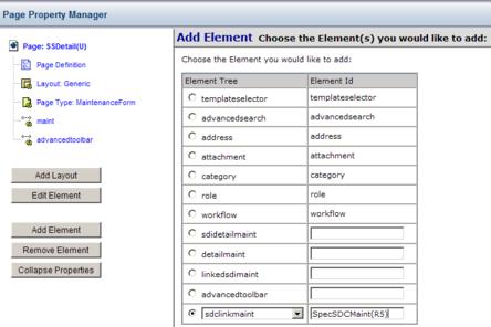
Adding an sdclinkmaint Element
|