This topic provides a high-level overview of the LabVantage User Interface.
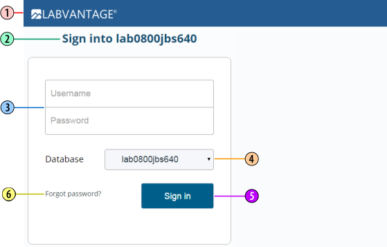
The LabVantage Logon page is loaded immediately after accessing the LabVantage
application through the appropriate URL:
| 1. |
The "Application header" contains an image and title that
identifies the deployed application. |
| 2. |
The "Logon title" shows the database you are accessing. The
database updates when you change the "Active Database" (see
4 below). |
| 3. |
The "Username" and "Password" fields are not case-sensitive.
A User is "disabled" after three unsuccessful logon attempts. The User
can be "enabled" by the System Administrator in LIMS → SystemAdmin
→ Users.
See Password Validation
to determine how passwords are validated. |
| 4.
|
The "Active Database" dropdown lets you select the logon database
from a list of currently Active databases. |
| 5. |
"Sign In" logs onto the selected "Active Database". |
| 6. |
If you have forgotten your pasword, click "Forgot Password?"
to obtain a new one (see Obtaining a New
Password). |
The text on these pages is configurable in LabVantage Console and through
a property file. See the LabVantage Installation Documentation for details.
If you have forgotten your pasword, this feature lets you get a new one.
This is supported only for Users with LabVantage internal passwords. It
is not supported for Users with External
Authentication (LDAP).
In order to use this feature, you must have an "SMTP Host" and
"Email From Address" defined in LabVantage Console (this is described
in the LabVantage Installation Documentation). The text on these pages is
also configurable in LabVantage Console. See the LabVantage Installation Documentation
for details.
|
|
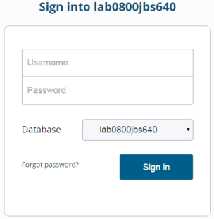
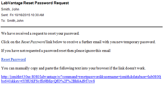
Click "Forgot your password?".
|
|
|
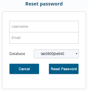
Enter your Username and Email address, then click "Reset Password".
|
|
|
After verifying your Username and Password, an email is sent to you
containing a link to reset your password:
|
|
|
A confirmation of this process is also displayed, stating that LabVantage
has sent you an email with a link to confirm the request to reset your
password.
|
|
|
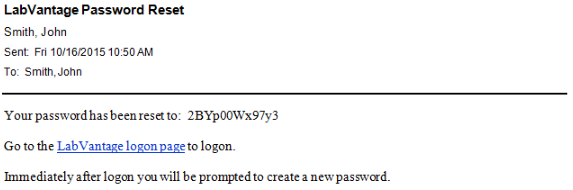
A confirmation of this second process is displayed, stating that LabVantage
has sent you an email with a new temporary password.
|
|
|
Click the LabVantage logon page link in the second email. This takes
you to the standard LabVantage Logon page. Logon with your Username
and new Password.
You are immediately forced to change the password. Enter your old
password and new password, then confirm your new password. Click "Change
Password". After changing your password, the reset process is complete.
|
System Administrators can change User passwords in the User
Maintenance page.
|
|
|
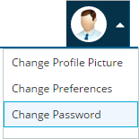
Users can also change their password using the "Change Password"
menu item in the upper right of the screen. System Administrators can hide
this using the "Hide Change Password" property of the GUIPolicy. |
|
|
|
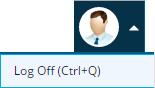
Logoff by clicking "Log Off" in the upper right of the screen.
System Administrators can hide this using the "Hide Log Off Profile
Item " property of the GUIPolicy.
Note that LabVantage uses a Timeout
Handling mechanism to determine when a database connection is cleared. |
Most of the LabVantage GUI layout is driven by Gizmos. These let you create
dynamic object-orientated blocks of functionality that can be plugged into various
areas of the application to show and expose functionality. Many Gizmos are preconfigured
OOB to provide functionality that would otherwise (without using Gizmos) require
complex server-side and client-side coding. For more information, see Introduction
to Gizmos and Dashboards.
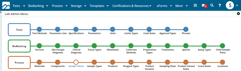
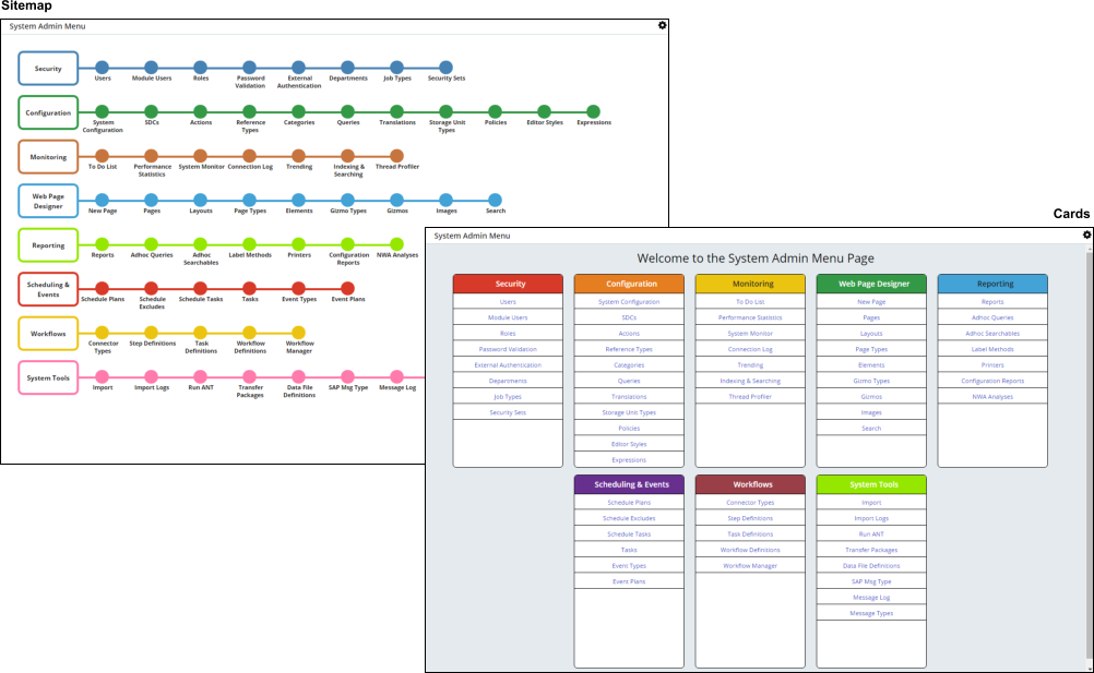
LabVantage offers two types of Full Screen Menus: "Sitemap" and "Cards".
Sitemap is similar to the pre-LabVantage 8.x Sitemap. Cards displays a responsive
set of panels that let you view related features as a group.
The style of the Sitemap can be changed using the "Rendering styles"
property of the TramlineSitemap
Page Type. The Full Screen Menus are rendered by "Menu Gizmos",
which are configured instances of the menugizmo
Gizmo Type (see Gizmos). The Full Screen Menus therefore
render according to which Menu Gizmo is pointing to the Tramline Sitemap page.
Additionally, navigation is handled through a Menu Gizmo.
The colors of the Sitemap nodes/lines and the Card headers are governed by
the "Color" property on the Menu definitions in the Menu Gizmo. If
no colors are provided, the pages use a random color choice. If you do not want
to display the page in color, you can disable the coloring using the Advanced
property "Ignore Color" on the menugizmo properties.
The Sitemap page is opened whenever you change Menus, which is controlled by
a "Menu Picker Gizmo" (a configured instance of the menupickergizmo
Gizmo Type). Configuring Menu selection using a Menu Picker Gizmo lets you change
the top Menu without changing the content page.
|
|
|
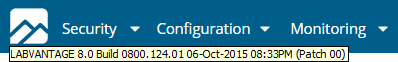
At the top of the Layout, the Menu Bar contains a fixed logo.
Hover over this logo to obtain information concerning the LabVantage
build that is currently deployed. |
|
|
|
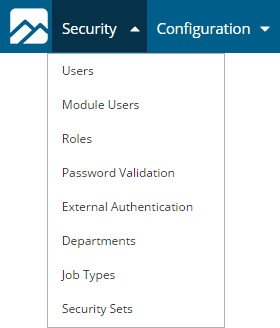
Click a Menu to drop down the Menu Items.
Once a dropdown Menu is activated through a click, you can move your
mouse to another Menu without further clicking.
This operation eventually times out when focus moves away from the Menu.
|
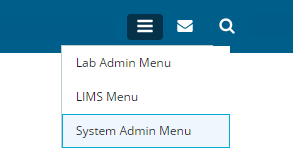
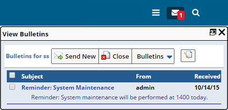
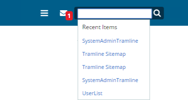
To the right of the Menu Bar, the fixed top bar Gizmo
provides specialized controls and operations. For the purpose of introducing
general OOB functinality, the example below shows a menupickergizmo (allows
selection of the current Menu), a bulletingizmo (shows Bulletins) and a searchgizmo
(uses a Lucene search engine to query the LabVantage database).
| Menu Picker Gizmo |
|
Bulletin Gizmo |
|
Search Gizmo |
To maximize efficiency, Menus are swapped without reloading the entire Layout.
When selected, the Menu Bar is updated and the full screen representation of
the Menu is displayed as shown in the example below.
 |
|
|
|
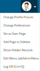
On the far right of the Menu Bar, the Profile Menu shows the current
User's initials by default. This is set by the "Initials" field
on the User Maintenance page.
The Profile menu also allows the current User to change the Profile
image, i.e., replace your initials with a picture. Users can also customize their User Preferences (such as change logon
process or initials), set the current page into the Sidebar,
and set the current page as the Start Page. Setting the current page as the Start Page also sets the current Menu
and Sidebar as the "Start Menu" and "Start Sidebar",
and is available only if the User has a customizable startup setting. If you are in System Administration mode and have access to the correct
Modules, the Profile Menu also lets you quickly edit the current page.
This switches to edit current Menu, current Gizmo and current Group, depending
on what is rendered in the navigation frame. The Profile Menu also contains the Log Off link described in Logging
Off. Some of these menu items can be added or removed by configuring the GUI
Policy. |
|
|
|
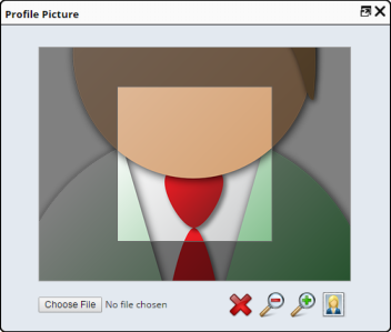
To change your profile picture select the "Change Profile Picture"
Menu Item. In the resulting page, select an image (which can be any local
image file), use the tool to crop to correct dimensions, and click the
icon of a portrait to set the image for the User. This image is attached
to the User SDI as the Attachment Class "Profile Picture".
System Administrators may choose to assign images to a User SDI themselves
by adding an SDI Attachment to the User SDI and setting the Attachment
Class to "Profile Picture". See Attachments
for more information.
In the Change Profile Picture dialog, you can revert back to initials
by clicking the red cross ("reset icon").
|
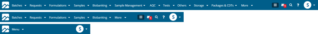
The Menu Bar accommodates changes in screen resolution, including truncating
the Menu into a Sub-Menu such that Menu items are still accessible (also truncates
into a single Menu for mobile devices), and hiding areas of the Menu Bar on
very small resolutions.
The Navigation Bar is directly beneath the top Menu Bar. This has several modes
that are configurable using the "Navigation Bar" collection in the
GUI Policy.
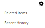
|
|
Recent History
As you navigate through the application, your last 6 recent items are
shown. Clicking any of these takes you back to them. The list of recent
items is unique for each tab (or window). The title for the current page
is shown in black at the end of the Recent Items. Collapsing the window
resolution collapses from the left, so the current page is always shown. |
|
|
Related Items
As you navigate using the top Menu and full page Menu, the Related Items
shows other items that are in the same sub-menu (and are therefore related).
The current page title is shown in black on the left, and the current
Menu loaded into the page is highlighted. As the window resolution collapses,
the Related Items collapse from the right. |
|
|
|
As provided in the OOB configuration, the "Navigation Bar"
collection in the GUI Policy is
set to allow choosing the mode of operation by clicking the cog in the Navigation
Bar and selecting the relevant Menu item. |
The Status Bar is at the lower right of the Layout. This shows session information
(such as Username, database, time zone, Job Type). The Status Bar is configurable
as to what session information to show and the color used to display. It can
also be moved to the top of the window or hidden completely. This configuration
is done in the GUI Policy. The sapphire.statusMsg(message)
call in the JavaScript API allows messages to be shown on the status bar, e.g.,
sapphire.statusMsg('Hello World').
The Sidebar allows groupgizmos (a
collection of Gizmos) to be displayed. The Sidebar lists the Gizmos and allows
different operations to be performed when the Gizmo is selected (such as navigation
or processing logic). Like the Menu Bar Gizmos, the Sidebar Gizmos can also
show counter information.
|
|
|
There are several display versions of the Sidebars (such as large icons,
small icons, and text only) that can be configured in the GUI
Policy or for the Group Gizmos
themselves.
You can switch Sidebars by selecting the cog at the top of the Sidebar. The Sidebar can also be resized and collapsed and on mobile touch devices
with a swipe. The Sidebar is vertically responsive (if the vertical space
reduces, a scrollbar is shown when you hover over the Sidebar). |
|
|
|
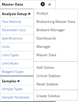
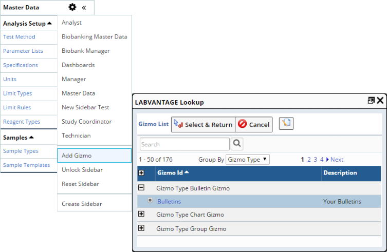
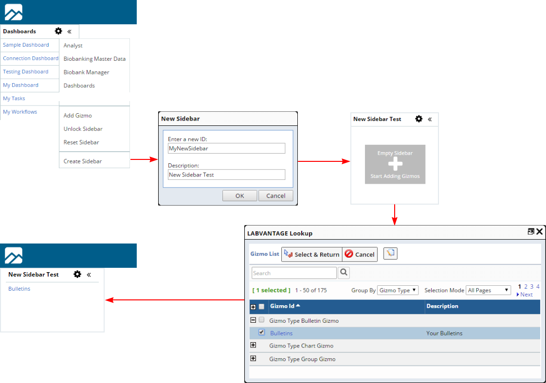
If you have the correct permissions and the Group Gizmo can be customized,
you can dynamically add and remove Gizmos to your Sidebar. Add Gizmos by
selecting "Add Gizmo" in the cog menu. You can then select from
configured Gizmos to which you have access. Selecting Gizmos pushes them
to the end of your Sidebar.
To change the order of the Sidebar Gizmos, select "Unlock Sidebar"
from the Cog menu. You can then drag-and-drop the Gizmos into position.
To remove a Gizmo, drag it off the Sidebar and confirm in the confirmation
dialog. When finished rearranging, you can select "Lock Sidebar"
to set the positions. You can also use "Reset Sidebar" to reset
back to administrator defaults. The Sidebar shows only Gizmo Groups that are public (default), owned
by the current User, or when the current User has Role-Level Access as
defined by the "Group Creation Role" in the GUIPolicy. When placed in the Sidebar or Top Bar, a Group Gizmo is used to simply
show a popup containing the contents of the Gizmo Group. If the Gizmo
Group defines a Dashboard, the Gizmo Group will open as a Dashboard. If
the Gizmo Group is neither a Sidebar item or a Dashboard, it displays
as a collapsible group. Dashboards can be inserted into the Sidebar
as Gizmo Groups. |
If you are defined by the "Group Creation Role" in the GUIPolicy
as previously described, the "Create Sidebar" menu item lets you add
new Sidebars as shown below.
"Dashboards" are Gizmo-driven mechanisms that can display discrete
collections of information within a single page. See Dashboards
for more information.
The Layout for the LabVantage application is controlled at the system level
by the GUI Policy.
"Notifications" is a technology that allows Web browser clients to
listen for Notifications of Events without using a polling mechanism, thus automatically
triggering a server-side Event in response to an HTTP request. This technology
is described in Introduction to Gizmos.
For the purpose of this discussion, it is sufficient to note that the LabVantage
OOB implementation of this technology is used in these areas of the application:
|
|
|
|
List and Maintenance Pages
|
|
|
|
|
|
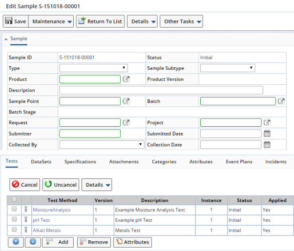
SDI List pages and SDI Maintenance pages are the backbone of LabVantage. They
are commonly referred to as simply "List" and "Maintenance"
pages.
In general, List pages are the point of departure for working with SDIs. The
example below shows the Sample List page, which lists Sample SDIs.
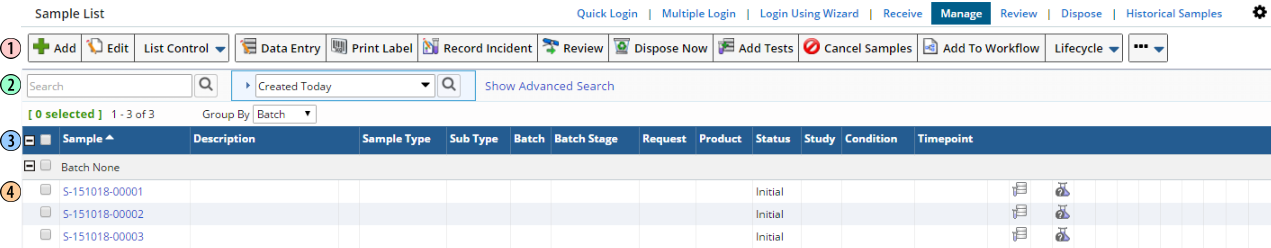 |
| 1. |
Toolbar |
Toolbars (configured by the advancedtoolbar
Element) consist of major operations triggered through large buttons,
with other operations triggered through small buttons that are collapsed
down into dropdown buttons in each operational group. The Toolbar is responsive,
in that if the number of buttons is excessive and do not fit single-file
within the browser window, the excess buttons are collapsed from the right.
The collapsing/expanding excess buttons dynamically respond to window width
or changes while in List/Maint Mode.
The "Drop Down Group" property of the advancedtoolbar Element
can also be used to add a button to a dropdown button, with the button
labelled as specified in the property. By default, the visual appearance
of the buttons is "Text with Icon". However, you can use the
GUI Policy or the individual button
properties to change this to Text Only. You can also specify a "flat
image" for use as a scalable button image rather than using the normal
icons. Functionality such as Navigators,
Other Tasks, and SDI Details are in the ellipsis (...) button. These appear
only if the page contains these items. |
| 2. |
Search Bar |
The Search Bar lets you find SDIs by querying. "Basic
Search" and "Query Search" options are displayed on the list
itself. The "Advanced Search" (configured by the advancedsearch
Element) can be opened using the hyperlink above the list. This allows
most searching to be done with the Advanced Search collapsed. This option
is configurable using the "Display Option" property and "Top
Search Option" property of the advancedsearch Element. The last search
executed is highlighted. This immediately shows the search that was executed
to retrieve the current list.
The Query Maintenance page lets you specify a label for the Query. The
"Use Query Label" property on the advancedsearch Element can
then be set to show the "Query Label" instead of the Query Id.
The full description of the Query is available in a tooltip over the Query
Id. |
| 3. |
header |
List pages allow the header to be fixed. SDIs can be "Grouped"
using the "Group By" dropdown. In "ungrouped" mode (as
configured by the list Element),
the List header is fixed when the list scrolls. The header columns align
with the list columns during window resizing and the horizontal scroll bar
appears only when the table can no longer be condensed after wrapping. In
"grouped" mode, the header fixed when the list scrolls. The group
header spans the entire row and scrolls with list. Column headers are fixed
for all groups, and the original collapse all/expand all images and the
check box for Select All are moved to the beginning of the list header row.
|
| 4. |
List |
This lists the SDIs. Toolbar operations are performed on
the selected SDIs.
Click the checkbox to select one or more SDI(s). Clicking outside the checkbox (to the right)
will deselect all other selected SDIs. Perhaps the most commonly used operations are "Add".
"Edit" and "View". These open the Maintenace Page for
the selected SDIs. | | The "InLine Operation" feature of the advancedtoolbar
and list Elements allows any Toolbar button to be exposed as an inline
operation.
Operations on selected List page rows are immediately shown on
that row, saving you from having to use a Toolbar button. |
|
Maintenance pages let you edit and view SDIs that you have selected in the
List page.
Selecting a single SDI opens a single Maintenance page with the SDI Details
in tabular form below the
Maintenance Form. SDI Detail records can be added/removed before a Maintenance
page is saved if the
"Show Detail On Add" property of the MaintenanceForm
Page Type is configured to do so.
|
|
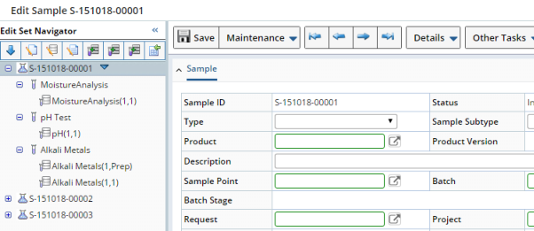
Selecting multiple SDIs opens an "Edit Set" if the Navigator
Policy is configured to do so (see Navigator
Policy → Using the Edit Set Navigator).
An "Edit Set" allows the selected items and their details to be
edited individually or by subset from the "Navigator" frame.
|
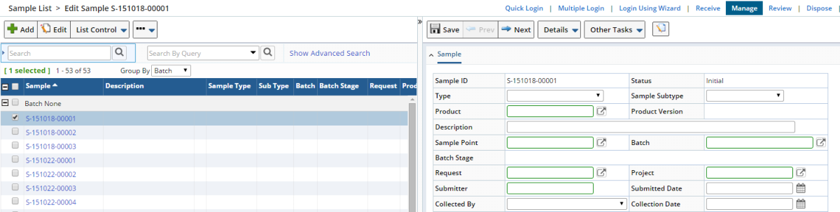
A powerful interface feature called the "List/Maint
Mode" loads the Maintenance page into the same window as the List page.
Selecting an item on the List page opens the corresponding Maintenance page
in a "Detail" frame at the right (or bottom if you prefer). The frames
can be resized by dragging, and the Detail frame can be closed by clicking ">>"
at the top of the splitter bar. To temporarily override this behavior, hold
"Alt" while you click the button (such as "Alt + Edit").
If a single SDI is selected as shown below, the Maintenance page for that SDI
loads into the right frame. If multiple SDIs are selected, a multi-SDI grid
loads into the right frame.
The List page in the left frame is responsive, updating as the Maintenance
page changes in the Detail frame. When you add a new SDI in the Detail panel
and Save it, the new SDI is added to the List page. Also note that the "Return
To List" and "Close" buttons in the Detail frame are replaced
by "Prev" and "Next", which display the previous and next
SDI in the List, respectively. A warning message is shown if you navigate to
another row when the prior row has unsaved changes.
Any List page can be configured to operate in List/Maint Mode by setting these
properties:
| • |
Setting the "Detail Panel Position" and "Initial Size"
properties of the MaintenanceList
Page Type to specify the desired characteristics. |
| • |
Setting the "Show in Detail Panel" property of the advancedtoolbar
Element to "Yes" for the desired buttons (typically "Add",
"Edit", and "View"). |
With regard to Lookup pages and Dialogs:
| • |
Where possible, Lookup pages open in a Browser window rather than a LabVantage
dialog. |
| • |
In most cases, the Search Bar is not shown initially and has the basic
search at the top of the list. |
| • |
Where possible, Lookups use a "Select and Return" button with
a checkbox for multiple items, radio button for single items. |
| • |
LabVantage dialogs are used for modal requirements. |
| • |
With regard to LabVantage "alert" dialogs, the default API
call sapphire.alert('Information Message') will render an information dialog.
We also provide an error dialog by using the call sapphire.alert('An
Error', 'error'). |
|
|
|
As an extension of the List and Maintenance
page functionality previously described, the "Quick Create SDI"
feature offers several shortcuts to creating and maintaining SDIs.
Maintenance page fields that lookup certain Master Data SDIs and use
Ajax technologies are configured OOB to open a QuickCreateSDI page, which
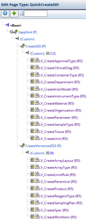
is based on the QuickCreateSDI Page Type. Pages provided OOB that are configured for Quick Create SDI are defined
by the nodes of the QuickCreateSDI Page Type shown at the left. Note that these nodes provided OOB are subject to change, so make certain
you check the nodes that are actually defined on your system. |
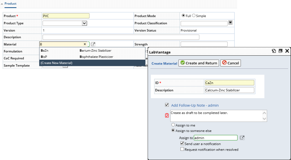
As an example, consider editing a Product Maintenance page. As shown in the
Page Type node hierarchy above, one of the pages configured for Quick Create
SDI is LV_CreateMaterial (R5). In the Product Maintenance page, typing into
the "Material" field auto-suggests Materials based on existing Material
SDI. At the bottom of the list is a (Create New Material) option. Clicking this
opens a QuickCreateSDI page where you can provide an identifier for the new
Material and optionally add a Follow-Up
Note. "Create and Return" creates the new Material.
The Follow-Up icon is displayed on the List page. List page Queries also provide
filtering by SDIs "Having Open Followups" and the User-centric "My
Followups" query.
The example above is configured using the maint
Element in the LV_CreateMaterial (R5) page. This functionality is also configured
OOB for details defined by the sdidetailmaint
Element and sdclinkmaint Element.
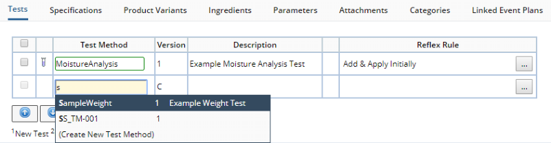
Referring back to the Page Type node hierarchy above, one of the pages configured
for Quick Create SDI is LV_CreateWorkitem (R5), which creates a versioned Test
Method. The sdidetailmaint Element provides the same functionality here for
adding Tests. Note that a blank row is inserted for your convenience in adding
new items.
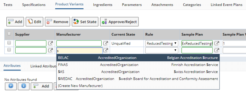
Another page configured for Quick Create SDI is LV_CreateOrganization (R5),
which creates a Manufacturer for (in this case) a Product Variant. The sdclinkmaint
Element provides the same functionality here for adding Manufacturers. Once
again, a blank row is inserted to easily add new items.
Here is a summary of properties used to configure QuickCreateSDI pages with
links to the relevant Page Type and Elements:
Throughout LabVantage, Master Data is typically created and configured from
the bottom upward as shown in the previous examples. For example, creating a
Product with associated Tests and Specifications requires creating these associated
SDIs prior to creating the Product.
"Master Data Setup" is a feature that offers an alternate "top-down"
approach. For example, you can create the Test Methods and Specifications while
you are creating the Product. When editing the Product, you can then manage
the Master Data hierarchy of SDIs related to the Product.
For details concerning this feature, see Navigator
Policy → Master Data Setup.
LabVantage 8.x fully complies with HTML5 and Standards Mode. See your Release
Notes for more information regarding compliance with these standards.