Buttons
|
Button properties:
| Property Name | Description | | Identifier | Identifier of the button. This is required for buttons of type "Action
Button" (below). | | Type | Button type:
| Standard | Use this in conjunction with Standard Button Properties to
perform standardized functions such as save and reset. The JavaScript
required to invoke these operations is defined in standardbuttons.js. | | Action | Use this in conjunction with Action
Button Properties to call System Actions. The Action Button
Properties pass property values to the Action. As with all Actions,
if you define output properties, the outputs of one Action can
be the input to another. This requires the Identifier property
(above). We provide the JavaScript for Action Button functionality...
you need not supply one unless you need a User Button (below). | | User | Use this in conjunction with User Button Properties to make
your own buttons. You must write the JavaScript, put it in a
.js file, and specify the file using the Includes property. | | Task | Use this in conjunction with Task Button Properties to execute
Standalone Workflow Tasks. |
| | First Validation | First JavaScript function called onClick.
CoC and ESig dialogs open when the JavaScript function returns
"true". This is ignored for user-defined buttons that do not have Coc and
ESig enabled, r.g., initialValidation(). | | First Validation Selection | If no JavaScript function is specified by "Frist Validation" (above),
you can use this to specify the button behavior:
| At Least One | At least one item in the page must be selected to run the
button. | | Only One | Only one item must be selected to run the button. | | At Least Two | At least two items in the page must be selected to continue. | | None | No items must be selected to run the button. | | Not Required | Selection checking is not required and therefore any number
of items can be selected. |
If left blank, the "First Validation" JavaScript will be executed
(depending on the type of button). | NOTE: | | For backward-compatibility with LabVantage
versions prior to R5.1 (DM0502), this property uses the selected
value only if the "First Validation" JavaScript function has
not been specified. As stated above, it also defaults to the
default script for the button type if no values are selected. |
| | Second Validation JavaScript | Second JavaScript function called (after the JavaScript specified
by "First Validation" onClick).
CoC and ESig dialogs open when the JavaScript function returns
"true". This is ignored for user-defined buttons that do not have Coc and
ESig enabled, r.g., initialValidation(). | | Deferred Callback Javascript | Use this when you do not want to automatically open the ESig or
COC dialog immediately after clicking a button or operation. For example,
you may want to open a lookup or some other preprocessing window,
then wait for that window to be closed before opening the ESig or
COC dialog. In this case, specify the name of the JavaScript callback
function here, and invoke it from the child window before closing
it.
The syntax is simply the name of the function, e.g., postLookup. When you specify a Deferred Callback JavaScript, clicking the button
first calls the Initial Validation JavaScript (above) if one is
specified. If an Initial Validation JavaScript is not specified,
the Deferred Callback JavaScript is executed. The JavaScript containing
the call to open the ESig or COC dialog is rendered on the page
with the name specified in this property. So, when you click this
button, the Initial Validation JavaScript opens a lookup window.
When an item is selected in the lookup, it calls the Deferred Callback
JavaScript function as its lookupcallback, which then opens the
ESig or COC dialog. | | Deferred Callback Form | Identifier of the form in the page containing the hidden field named
keysfromlookup. The contents of this field is passed to the button
Action, e.g., submitdetail. | | Server Side Validation URL | Ajax operation class to use when validating a button click. We
recommend extending the DefaultErrorRenderer class. | | Save Button Activity | See Concerning Save Button
Activity below.
| | Visual Properties | Visual properties of the button:
| Property Name | Description | | Text | Text displayed on the button. If you leave this blank, the
button displays "Text Not Defined". | | Image | URL of the image displayed on the button. When choosing an
image for a button, you can choose an image from an Image Library
lookup by clicking the emoticon or file folder. When choosing
from the Image Library (as opposed to choosing a file), you
need not specify both a large and small image. The image size
will be adjusted accordingly. | | Large Image | If "Ribbon style" is "Large", this is
the image to use for the 32x32 button. This property can be
left blank if you chosen the image from the Image Library as
shown above. | | Flat Image | Flat button image. This image overrides "Image"
and "Large Image". | | Show | Yes (default) shows the button. "Show" supports Expression-Based
Properties. However, in this context, the Groovy expression will not support primary objects. For example, you will not be able to use something like primary.sampledesc == 'Test'?'Y':'N'. Primary values are not supported in the Advanced Toolbar Show EBP. | | Group | If "Display style" is "Ribbon", indicate
the Group to which this button belongs. | | Drop Down Group | Renders the button as a sub-menu under a dropdown Group button.
This is supported in the "Modern" menu only. | Width | Width of the button in pixels. The default is the width of
the text on the button. | | Ribbon style | If "Display style" is "Ribbon", indicates
whether the button icon is "Large" (32x32) or "Small"
(16x16). | Appearance | Options to select the appearance of the button. If you leave
this blank, it defaults to standard. | | Tip | Help text that appears during mouseover event. This defaults
to the button text. | Margin | Margin of the button in pixels. | | style | Choose a style, or specify a CSS if you need to define button
style using a stylesheet. | Highlight | Yes (default) highlights the button on mouseover. The CSS
defines this. | | Mode | Specifies if the function is available as a button, Operation,
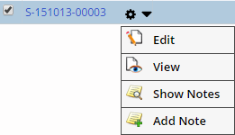
or both. | | List Inline Operation | Configures a toolbar button to show as an inline context-type
menu as in the example below:
| | Show in Detail Panel | Determines if the page selected using the "List Inline
Operation" above opens in a Detail Panel (see LabVantage
User Interface → List and Maintenance Pages). This
property is applicable only if the button has a "Link URL"
defined in "Standard Button Properties" below. If
this property is set to Yes, the Link URL of this button is
loaded in the Detail Panel. |
| | Keyboard Shortcut | Defines keyboard shortcuts (also see Keyboard
Shortcuts below):
| Property Name | Description | | CTRL Key Character | Single character used with Ctrl key. For example, entering A defines
a hotkey of Ctrl + A.
You can also specify a JavaScript key code
prefaced with # (such as #221 equals "]"). | | CTRL Key With Shift Key | If set to "Yes", the Shift key will have to be
held along with the Ctrl-key combination defined above. For
example, the above Ctrl-A would then be Shift-Ctrl-A. |
| | Electronic Signature | Electronic Signature (ESig) properties:
| Property Name | Description | | Esig Required | Determines ESig behavior (defaults to "Not Required"
if left blank):
| Option | Description | | Required | Executes an ESig prompt following a button onClick event. | | Not Required | Does not execute an ESig prompt following a button onClick
event. | | Requires Reason Only | Executes an ESig prompt following a button onClick event.
However, the prompt asks for only an Audit Reason. | | Custom | Allows Esig functionality to be set by custom JavaScript
using the Esig API calls to dynamically change the Esig
mode for buttons based on User activity. See Esig
JavaScript API below. |
| | Message | Specifies the "Statement of Signing", which is passed into
the ESig page and appears at the top of the Esig prompt.
This support variables such as [sdcid] and [keyid1], but
only if all required variables are passed to the Esig page
from button the button was clicked. This happens automatically
for Standard and Action buttons, since all variables are in
a hidden form that is posted to the ESig page. For User buttons,
use JavaScript to populate hidden form fields with required
variables. This would be posted to the ESig page by the getEsig()
JavaScript (which we provide). | | Audit Reason RefType | Reference Type containing your own custom Audit Reasons to
be displayed on the ESig page. | | Esig Page | Identifier of the ESig page. | | Esig Form | ID of the HTML form posted to the ESig page. This form has
hidden fields corresponding to the variables used in the Message
property. For example, if the Message property is set to "You
are hereby authorizing a [operation] operation on [sdcid](s)
[keyid1]", the form on the ESig page must have hidden fields
for operation, sdcid and keyid1 (populated with values). | | Set Audit Reason Callback | JavaScript function called when the ESig page opens (after
the signature is captured). This function sets the ESig Audit
Reason in the Esig form, which is eventually saved in the database.
This defaults to setEsigReason. | | Reason Prompt Option | Esig Reason prompt options like:
| Property Name | Description | | Required? | "Yes" will require you to add an Esig (audit) reason
on the Esig form. If none of the options are selected,
then by default it is not required. | | Type | Esig reason prompt options. Defaults to Free Text Reason. |
|
| | Chain of Custody | Chain of Custody properties:
| Property Name | Description | | COC Required | Yes executes COC functionality following a button onclick
event. By default, COC is disabled. | | COC Page | Identifier of the COC page. This defaults to COCForm. | | COC Form | ID of the HTML form posted to the COC. This form has hidden
fields necessary to open COC page. This property is mandatory...
it defaults to sdiedit. |
| | Standard Button Properties | Defines the behavior of buttons used for common functionality:
| Property Name | Description | | Function | Type of Standard button displayed. If the Initial Validation
JavaScript property is left blank, each Standard button calls
a default Initial Validation JavaScript function (defined in
standardbuttons.js). Standard buttons and their JavaScript functions:
| Maintenance List page | | Standard Button | JavaScript Function | | Add | addSDI() | | Edit | editSDI() | | Copy | copySDI() | | View | viewSDI() | | Delete | deleteSDI() | | Accept | accept() | | Maintenance Form page | | Standard Button | JavaScript Function | | Save | save() | | SaveAsTemplate | saveAsTemplate() | | ReturnToList | cancelAndReturnToList() | | CloseRefresh | closeAndRefreshPopup() | | Cancel | cancelPopup() | | Reset | reset() | | Miscellaneous | | Standard Button | JavaScript Function | | Report | launchReport() |
| | Link URL | URL of the page that opens when the button is clicked. | | Target | Name of the window in which the child page opens in response
to an onclick:
| Value | Opens in... | | _self | Same window | | _parent | Caller window | | _blank | New window | | _top | Browser window |
| | Store Selection | "Yes" Stores a selection made on the List page when performing
an Add or Edit on the selection. This is useful for Lookups,
i.e., you can add a new item, then return it with the previously
selected items in a selected state. |
| | Action Button Properties | Action buttons execute Actions on the same page as the button.
For example, in a "Receive" page, if you click the Action button "Receive
Now", all pending SDIs are received and the page is refreshed, thus
displaying all received SDIs in the list (list_iframe).
| Property Name | Description | | Action Button Form | Clicking an Action button executes an Action only if the Action
has input properties. A form (with values in hidden fields)
passes the properties to the Action. You can specify your own
form here, If you want to use the form we provide, the default
is submitdata. | | Release Locks | When the link is clicked, a value of "Yes" (default) releases
all data locked by the page. If the link opens a child page,
locked data are not released. | | Success Message | Message displayed when the actionblock is successfully executed.
This supports variables (such as [sdcid] [keyid1]) from the
request, or from the Action's Output Properties. | | Fail Message | Message displayed when the actionblock fails. This supports
variables (such as [sdcid] [keyid1]) from the request, or from
the Action's Output Properties. Use the variable [error] to
view details concerning the distasteful event. | | Target | Window in which the page containing the code to run the Action
button opens. If you leave this blank, it defaults to _self
(the same window). | | Link URL | URL of the page displayed after the Action successfully executes.
This supports variables such as [sdcid] and [newkeyid1] from
the request, or from Action output properties. | | Actions |
Actions executed following onclick of an Action button:
| Property Name | Description | | Identifier | Unique identifier for this item, rendered as an ID
attribute in the HTML tag. | | Action | Identifier of the Action. | | Version | Version of the Action. | | Asynchronous | Specifies whether the Action runs asynchonously or synchronously.
All asynchronous Actions execute after the synchronous
actions, regardless of the order in which the Actions
are listed in the Properties. This allows the outputs
of synchronous actions to be used as inputs to asynchronous
actions. | | Delay (seconds) | If the Action runs asynchonously, this is the delay
in seconds. For example, entering n means the Action will
execute n seconds after it is added to the ToDo List. | | Input Properties | Input properties of the Action:
| Property Name | Description | | Identifier | Unique identifier for this item, rendered as an
ID attribute in the HTML tag. | | Property ID | Identifier of the Action input property. Specify
only the property id (without brackets or any other
text), such as sdcid or keyid1. You can also use
the output properties of other Actions for the same
Action button. | | Value | Value of the Action input property. Examples:
Sample (if the value is known) [sdcid] (if the value of the property sdcid
must be retrieved from the request). If using variables (for example, [propname]),
a field called action_propname must exist in the
form specified by the Action Button Form property
(above). If using variables, specify only the identifier.
For example, specify [keyid1], not [action_keyid1]. |
| | Output Properties | Output properties of the Action. You can use these
values as inputs to other Actions within the same Action
Block.
| Property Name | Description | | Identifier | Unique identifier for this item, rendered as an
ID attribute in the HTML tag. | | Property ID | Identifier of the Action input property. Specify
only the property id (without brackets or any other
text), such as sdcid or keyid1. | | Variable | Variable name (such as [newbatchid]) to store
the property value at the actionblock level.
For example: Action: AddSDI Input properties: sdcid=Batch and batchdesc=mybatchdesc Output properties: newkeyid1=[newbatchid] This uses makes it possible to use sdcid=Sample,
sampledesc=mysample, and batchid=[newbatchid]
as inputs to a second AddSDI Action. |
|
|
| | User Button Properties | Defines properties for user buttons:
| Property Name | Description | | JavaScript | JavaScript function to call for an onclick button event. The
function must be in a .js file, which must be specified by the
Includes property of the Page Type. | | Release Locks | When the button is clicked, a value of "Yes" (default) releases
all data locked by the page. If the link opens a child page,
locked data are not released. |
| | Task Button Properties | Defines properties for Standalone Workflow Tasks that are executed
from a button:
| Property Name | Description | | Task Definition | Opens a dialog where you can select and define the Standalone
Workflow Task to execute from this button. | | Release Locks | When the button is clicked, a value of "Yes" (default) releases
all locked data when executing the Task. "No" maintains
locks while executing the Task. | | Target Window | This defaults to _self (the current window). Use _blank to
open a new window, or use the name of a specific named window
or iframe. |
| | Security | Associates the button to the SDC
Operation defined for the SDC. The button can then performs the
SDC Operation for selected or current SDI. Also see Departmental
Security and SDC Access, Job
Types, and SDI
Security for examples.
| Property Name | Description | | Operation | SDC Operation that the button performs. Shows SDC Operations
for only the selected SDI. If not specified, full SDC Access
is granted. | | Failure JavaScript | JavaScript that executes if all selected SDIs are not authorized
SDC Access. You can access the failed SDIs using this.failedsdis.
You can access the successful SDIs using this.passedsdis. |
| | Check Out Option | When Change Control is enabled, this determines whether or not to require Check Out when the button is clicked. |
|
