Introduction |
|
|
Control Charts are an effective tool for evaluating QC Batch results. A visual display of data over time helps to identify patterns and trends within the data. LabVantage lets you generate these charts using a variety of options.
Generating the Chart |
|
|
Begin at LIMS → AQC → QC Batch Review, the QC Batch Review list page displays.
|
|
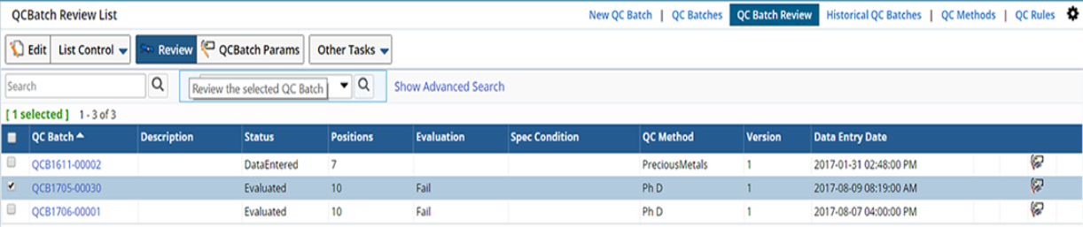
Select a QC Batch and click "Review". On the QC Batch Review page, in the QC Batch Sample Types tab, select a QCSample Type, then click "View Control Charts ".
|
|
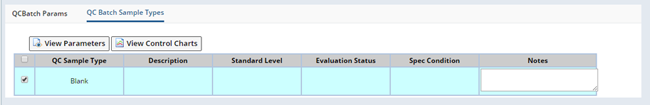
In the Control Chart page, choose a "Data Set" and "Parameter", then click "Refresh".
|
|
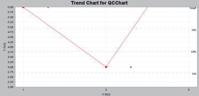
This generates the chart, showing a common set of Data Items that are derived from current and past QC Batches:
|
|
Chart Details |
|
|
General |
This shows Data Sets and their corresponding Parameters.
| Field | Description | ||||
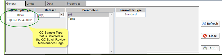
| QC Sample Type | Selected QC Sample Type.
|
||||
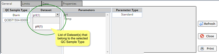
| DataSet | Data Sets that belong to the selected QC Sample Type.
|
||||
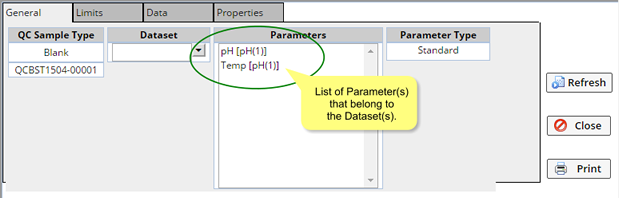
| Parameters |
Parameters that belong to the Data Sets:
|
||||
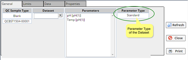
| Parameter Type | Parameter Type of the Parameter selected above.
|
To plot the Control Chart:
| 1. | Select the "Parameters" above. You can plot only 5 Parameters. |
| 2. | Click "Refresh". |
Limits |
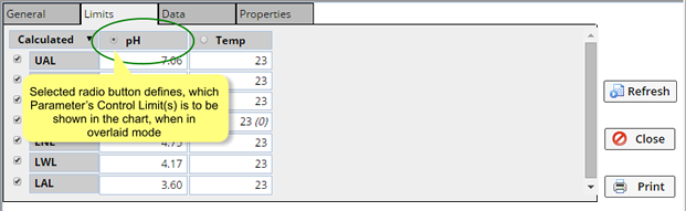
This shows the value of each Control Limit and Target line for all available Parameters.
By default, all Control Limits and Target lines are plotted. However, you can remove Control Limits to plot by unchecking the desired Control Limits.
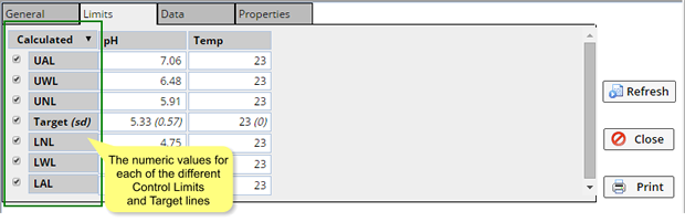
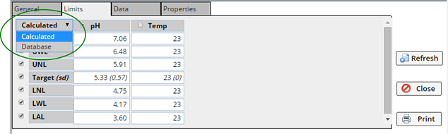
There are two options for deriving values for each Control Limit and Target:
| Option | Description |
| Database | Shows values entered for Target and Standard Deviation in Define Additional Parameters of the QC Method Maintenance page. |
| Calculated | Shows calculated values derived from the values entered in the Data Entry page for the current and historic QC Bacthes of the selected QC Sample Type. |
To plot the Control Chart:
| 1. | Select either the "Database" or "Calculated" option. Based on this selection, the corresponding values are plotted. The Target and the Control Limits are plotted in the graph using the displayed values. |
| 2. | Click "Refresh". |
Data |
This shows information about plotted data.
This tab displays QC Batch Id, Sample Id, Batch Item Position, and Date.
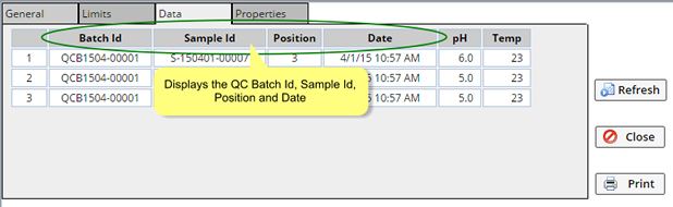
Also shown are values of Data Items in Data Sets for the current and historic QC Batches that contain the selected QC Sample Type. These are the entered data.
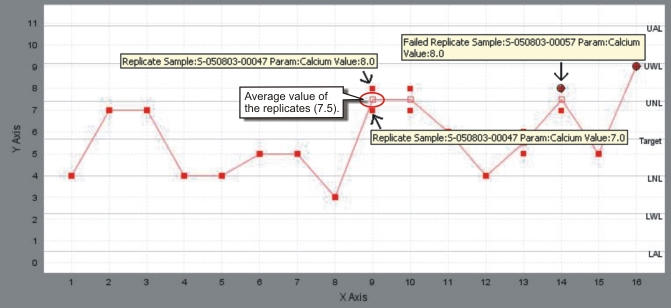
Replicates are averaged and plotted. For example, if values of Replicates are "7" and "5", the average "6" is plotted.
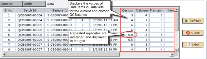
However, the chart shows the original values of the Replicates, as well as the average value.
If a Data Item fails evaluation, the foreground color of the cell is red.
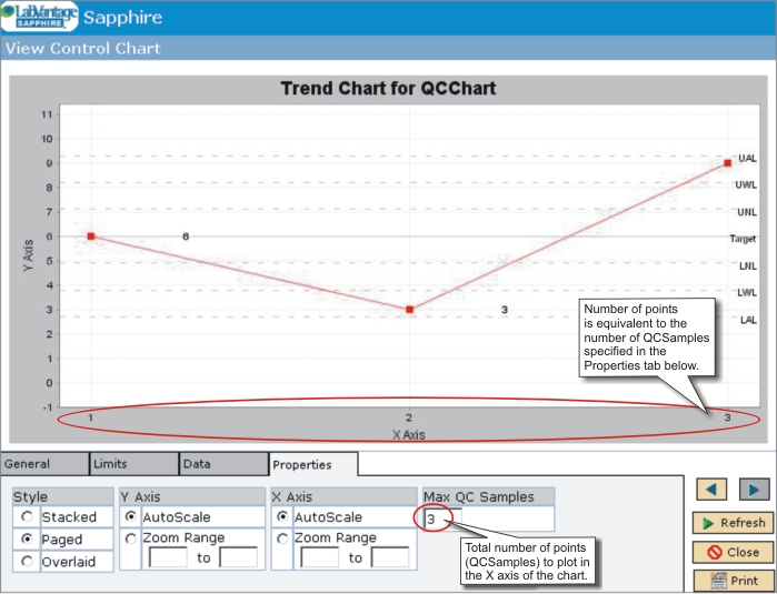
The number of QC Batches plotted is controlled by the count of QC Samples specified in the "Number of QC Samples" section of the "Properties" tab (below).
Properties |
This shows plot properties and allows them to be edited.
| Properties | Description |
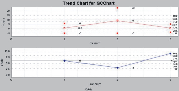
| style | Presentation style of the plot.
Options: Stacked Multiple plots are individually displayed for each Parameter in the same screen.
Paged Multiple plots are individually displayed for each Parameter
in separate screens. The buttons
Overlaid Multiple traces (line graphs) are displayed on the same plot.
|
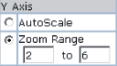
| Y Axis | Range of the Y axis. You must define this only for the
"Overlaid" option.
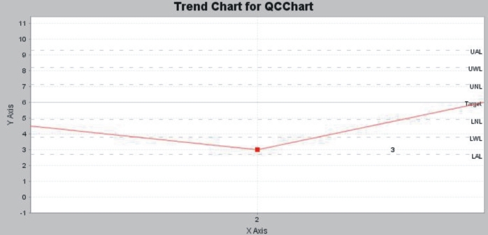
There are two options to display the range of the Y axis: Auto Scale - The full range of data and Control Limits are displayed. The control limits are displayed until +/- 4 sd.
Zoom Range - A specified range of data and Control Limits. This lets you zoom and view only a specified range of the chart. For example, if you want to see the points from 2 to 6 in the Y axis, enter these values.
|
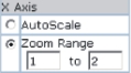
| X Axis | Range of the X axis.
There are two options to display the range of the X axis: Auto Scale - The entire range of data points is displayed.
Zoom Range - A specified range of data points. This lets you zoom and view only the specified range. For example, if you want to see the points from 1 to 2 in the X axis, enter these values.
|
| Number of QC Samples | Total number of points (QC Samples) to plot along the
X axis.
The number of points plotted is based on the count of QC Samples specified here.
|
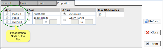
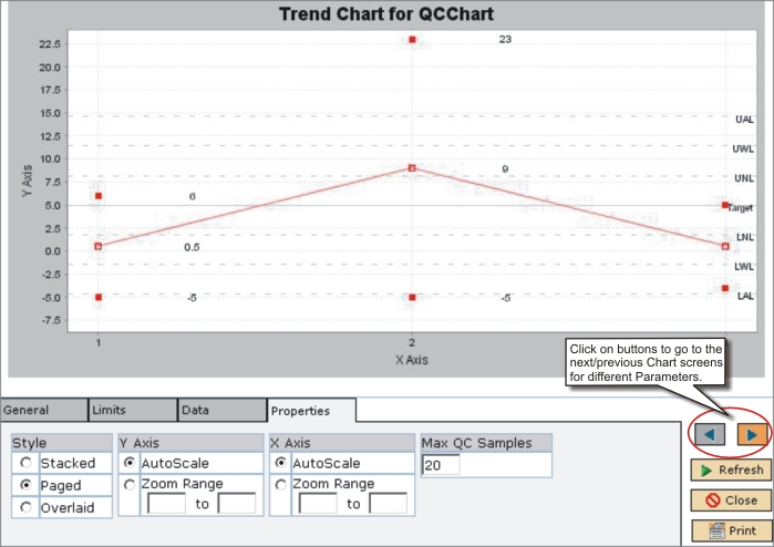
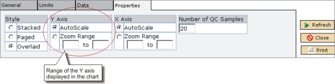

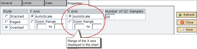
To plot the Control Chart:
| 1. | Select the "style", "Y Axis", "X Axis", and "Number of QC Sample" options. |
| 2. | Click "Refresh". |