Overview
Top
|
|
Editor styles |
Content |
||||||||||||
|
Overview |
|
|
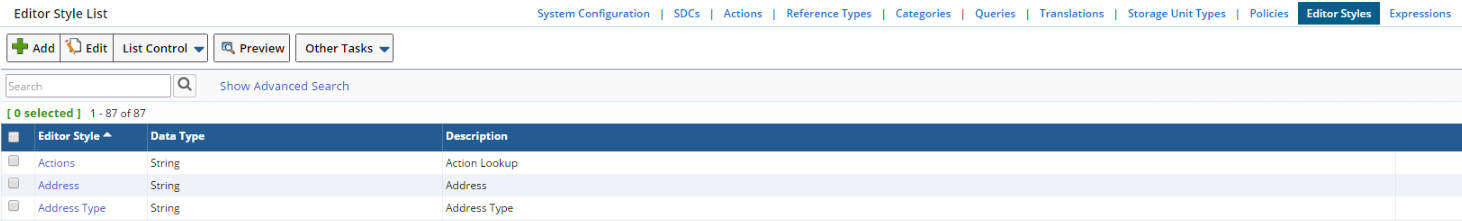
"Editor styles" let you define input fields that can be associated with an Attribute or Event Type. These are maintained through the Editor style List page (System Admin → Configuration → Editor styles):
|
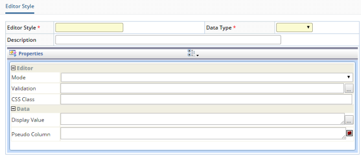
Adding or editing an Editor style opens the Editor style Maintenance page:
|
| Field | Description | ||||||||||||
| Editor style | Identifier for the Editor style. | ||||||||||||
| Description | Text that appears in the Description column of the Editor style List page. | ||||||||||||
| Data Type |
LabVantage Data Type defined for the Editor style:
The Data Type chosen here determines which Editor styles will be available in the Editor styles lookup for Attributes. For example, if you choose "String", only "String" Editor styles will be available in the lookup. |
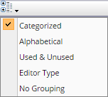
The Properties frame dynamically loads properties according to the selected Editor "Mode" and "Data Type". You can group and sort the display order of Field properties according to your requirements:
|
| Sorting | Groups/Sorts Fields by... |
| Categorized | Areas of functionality. |
| Alphabetical | Ascending alphabetical order. |
| Used & Unused | Used and unused Fields. |
| Editor Type | Editing classifications such as string, list, yes/no, collection. |
| No Grouping | No grouping or sorting is applied. |
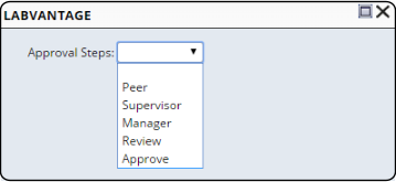
The "Preview" button on the List and Maintenace pages lets you preview the rendered editor, as in this example of a dropdownlist:
|
Modes |
|
|
Input |
| Description |
The "input" mode is equivalent to an HTML <input> tag of type="text".
| Editor |
| Property | Description |
| Mode | input |
| Validation | See Validation. |
| CSS Class | See General Use Properties. |
| Data |
| Property | Description |
| Display Value | See General Use Properties. |
| Pseudo Column | See General Use Properties. |
Lookup |
| Description |
The "lookup" mode provides a text field with capability to open a LabVantage lookup page and find a value of "string" Data Type. The SDC or Reference Type can be specified at the Editor style level or at the Attribute level.
| Editor |
| Property | Description |
| Mode | lookup |
| Validation | See Validation. |
| CSS Class | See General Use Properties. |
| Lookup |
| Property | Description | ||||||||||||||||||||
| HRef | URL to which the Lookup icon is linked. Use the URL browser
in the dialog for building the required Request Controller syntax, e.g.,
rc?command=page&page=SampleList You can also pass field ids into the lookup page, e.g., rc?command=page&page=SampleList&queryid=ByProject¶m1=[projectid] |
||||||||||||||||||||
| Tip | Help text displayed on mouseover. | ||||||||||||||||||||
| SDC Id | SDC to use for a custom Lookup page.
If you have specified a Lookup Page, this is ignored. If you have not specified a Lookup Page, the SDC is obtained from the HRef attributes. |
||||||||||||||||||||
| RefType | Reference Type used for the lookup. | ||||||||||||||||||||
| Restrictive Where | Optional restrictive where clause that either combines with the provided List page's restrictive where clause, or is used as the primary restrictive where clause on the default Lookup page. | ||||||||||||||||||||
| Default Query | Default query applied on the Search bar. | ||||||||||||||||||||
| Query From | Identifier of the database table to query. | ||||||||||||||||||||
| Query Where | SQL where clause. Do not enter the word "where" (enter only the clause). | ||||||||||||||||||||
| Selector Type | Selector used to choose items from the Lookup page (checkbox,
radiobutton, or none).
You need an Accept button to return these. If you do not specify a value, the Lookup page uses either the provided List page's set value, or the new List page's defaults. Multiple items are returned semicolon-delimited. |
||||||||||||||||||||
| Lookup Columns | Defines columns displayed on the Lookup page:
|
||||||||||||||||||||
| Dialog Type | Window in which the Lookup page opens (LabVantage modal dialog or the browser's default dialog). | ||||||||||||||||||||
| Dynamic Lookup | Configures the lookup field as a Dynamic Lookup. |
| Data |
| Property | Description |
| Display Value | See General Use Properties. |
| Pseudo Column | See General Use Properties. |
Dropdowncombo |
| Description |
The "dropdowncombo" mode generates a dropdown list (equivalent to the HTML <input> tag of type="select" that inserts a form control), but the field is an editable "input" field. The SDC or Reference Type can be specified at the Editor style level or at the Attribute level.
| Editor |
| Property | Description |
| Mode | dropdowncombo |
| Validation | See Validation. |
| CSS Class | See General Use Properties. |
| Data |
| Property | Description |
| Display Value | See General Use Properties. |
| Pseudo Column | See General Use Properties. |
| Dropdown SQL | SQL statement that provides the retrieved data. If two columns are selected, the first column is the real value and the second column is used as the Display Value. |
| Dropdown RefType | Reference Type that provides the retrieved data. |
| Dropdown SDC Id | SDC that provides the retrieved data. |
Dropdownlist |
| Description |
The "dropdownlist" mode generates a conventional dropdown list (equivalent to the HTML <input> tag of type="select" that inserts a form control). The SDC or Reference Type can be specified at the Editor style level or at the Attribute level.
| Editor |
| Property | Description |
| Mode | dropdownlist |
| Validation | See Validation. |
| CSS Class | See General Use Properties. |
| Data |
| Property | Description | ||
| Display Value | See General Use Properties. | ||
| Translate Value | Determines if the value is translated into the user's language. | ||
| Pseudo Column | See General Use Properties. | ||
| Dropdown SQL | SQL statement that provides the retrieved data. If two columns are selected, the first column is the real value and the second column is used as the Display Value. | ||
| Dropdown RefType |
Reference Type that provides the retrieved data.
|
||
| Dropdown SDC Id | SDC that provides the retrieved data. | ||
| Query From | Identifier of the database table to query. | ||
| Query Where | SQL where clause. Do not enter the word "where" (enter only the clause). | ||
| Query Order By | SQL order by clause. | ||
| Value Column | SDC column from which to retrieve the data value. | ||
| Display Column | SDC column from which to retrieve the text displayed above the dropdownlist. |
Checkbox |
| Description |
The "checkbox" mode is equivalent to HTML <input> tag of type="checkbox". As is the case when using an HTML "input" tag, you specify two values.
| Editor |
| Property | Description |
| Mode | checkbox |
| Validation | See Validation. |
| CSS Class | See General Use Properties. |
| Data |
| Property | Description |
| Translate Value | Determines if the value is translated into the user's language. |
| Checked Value | Value to use for the "checked" value. |
| Unchecked Value | Value to use for the "unchecked" value. |
| Pseudo Column | See General Use Properties. |
| Check Value RefType | Reference Type that provides the data for the checkbox. If this returns more than two values, the field is rendered as a dropdown list. |
Radiobutton/Vertical and Radiobutton/Horizontal |
| Description |
These are equivalent to HTML <input> tag of type="radiobutton". Radiobutton/vertical arranges the radio buttons vertically within the column. Radiobutton/horizontal arranges the radio buttons horizontally within the column.
| Editor |
| Property | Description |
| Modes |
radiobutton/vertical
radiobutton/horizontal |
| Validation | See Validation. |
| CSS Class | See General Use Properties. |
| Data |
| Property | Description |
| Display Value | See General Use Properties. |
| Translate Value | Determines if the value is translated into the user's language. |
| Pseudo Column | See General Use Properties. |
| Radio Value RefType | Reference Type that provides the retrieved data. |
| Radio Value SDC Id | SDC that provides the retrieved data. |
Datelookup |
| Description |
The "datelookup" mode generates a LabVantage date lookup (date field with capability to open a search window and find a value of "date" Data Type).
| Editor |
| Property | Description |
| Mode | datelookup |
| Validation | See Validation. |
| CSS Class | See General Use Properties. |
| Data |
| Property | Description |
| Display Value | See General Use Properties. |
| Pseudo Column | See General Use Properties. |
Password |
| Description |
The "datelookup" mode is the equivalent of the HTML <input> tag of type="password". This displays asterisks for each entered character.
| Editor |
| Property | Description |
| Mode | password |
| Validation | See Validation. |
| CSS Class | See General Use Properties. |
| Data |
| Property | Description |
| Display Value | See General Use Properties. |
| Pseudo Column | See General Use Properties. |
Inputarea |
| Description |
The "inputarea" mode is the equivalent of the HTML <textarea> tag. This displays multi-line text with row and column options.
| Editor |
| Property | Description |
| Mode | inputarea |
| Validation | See Validation. |
| CSS Class | See General Use Properties. |
| Rows | Equivalent to the "rows" attribute of the HTML <textarea> tag. |
| Columns | Equivalent to the "cols" attribute of the HTML <textarea> tag. |
| Data |
| Property | Description |
| Display Value | See General Use Properties. |
| Pseudo Column | See General Use Properties. |
Common Properties |
|
|
General Use Properties |
These are general-use properties common to all Modes:
| Property | Description |
| CSS Class | Class in the CSS used to display the style. The default CSS is WEB-CORE/stylesheets/sapphire.css. |
| Display Value | Values displayed in place of the corresponding retrieved values. Separate each with a semicolon. For example, suppose you retrieve the names "JDrake" and "GSmiley" from the CreateBy column, and want to replace their names with their initials. You would then specify a Display Value of JDrake=JD;GSmiley=GS. This works only if you replace the entire retrieved string (it does not work on partial strings). |
| Pseudo Column | A "pseudocolumn" is a column that is rendered on the page, but does not exist in the SDC. This renders the HTML code you enter here. Do not choose a database columnid when specifying a pseudocolumn. |
Validation |
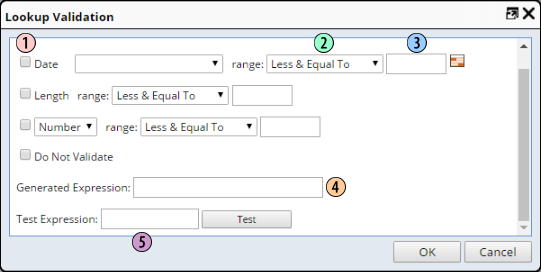
The Validation dialog lets you define Validation Rules for entered data.
|
| 1. | Validation Type |
| 2. | Range |
| 3. | Value |
| 4. | Expression |
| 5. | Test |
| Validation Type |
The "Validation Type" defines the Data Type that will be validated:
| Validation Type | Validates: |
| Date | Value of the LabVantage Date (D) Data Type. |
| Length | Integer length of the the LabVantage String (S) Data Type. |
| Number | LabVantage Number (N) Data Type. |
| Integer | |
| Decimal |
Regarding validation of Date (LabVantage Date (D) Data Type):
| • | Date validation is configured on "Date and Time" and "Date Only" Editor styles OOB to allow automatic date validation by the maintattribute Element. |
Regarding validation of Number/Integer/Decimal (LabVantage Number (N) Data Type):
| • | Number validation is configured on the "Number" Editor style OOB to allow automatic number validation by the maintattribute Element. |
| • | Checking the "Do Not Validate" option disables validation of the Number Data Type. This is provided to allow custom business rules to process special numeric input. |
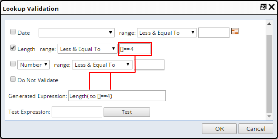
| Range, Value, Expression, and Test |
These fields are where you define the Validation Rules. Each Validation Rule creates a "Generated Expression". If more than one rule is defined for any range, the "Generated Expression" delimits each rule with a semicolon. The "Example Expressions" below use "Length" for the Validation Type. Dates cannot be relative and cannot be semicolon-separated lists.
Expressions are independent of Data Type.
| Range | Value1 | Value2 | Example Expression (using "Length") | |
| Greater Than | 4 | Length([]>4) | ||
| Greater & Equal To | 4 | Length(4 to ) | ||
| Less Than | 4 | Length([]<4) | ||
| Less & Equal To | 4 | Length( to 4) | ||
| Equals | 4 | Length([]==4) | ||
| Inclusive Between | 4 | 6 | Length(4 to 6) | |
| Exclusive Between | 4 | 6 | Length([]>4 and []<6) | |
| Expression | Use this if you want to edit an existing expression
or input your own. Enter an expression in the Value box(es), and the expression
is generated for that value:
|
|||
To test the Validation, enter a value in the "Test Expression" field, then click "Test". A dialog notifies you whether validation has passed or failed.