gwtdataentrygrid
Element Properties
|
| Property Name |
Description |
| SDC |
Identifier of the SDC for which data are entered. |
| Entry Field Width |
Width of the data entry input field in pixels (defaults to 100). Set to
zero to hide the field. |
| Entry Field Column Id |
To edit any column in SDIDataItem or SDIData other than the data entry
column, specify the ColumnId here.
This is used to configure the AnalystAssignment (gDEGridAssignAnalyst)
and InstrumentAssignment (gDEGridAssignInst) inside pages for Data Entry. |
| Data Item
Display Rule |
Executes server-side filtering to determine how data are displayed. You
can choose a predefined rule or define one using a Groovy expression.
Predefined Rules | Value | Description | | Default | Display depends on Data Type. | | Readonly | Non-editable. | | Exclude | Excluded (filtered out). |
Example of Groovy Expression Also see Using
the Availability Flag below. sdidata.s_datasetstatus=="Completed"
sdidata.s_datasetstatus=="Canceled"
sdidata.availabilityflag=="N"
primary.samplestatus=="Completed" ? "readonly" : "default" |
Supported objects: | • | Any SDIDataItem column or any column defined in the Columns
collection. | | • | primary (must be defined in the Columns collection). | | • | sdidata (must be defined in the Columns collection). | | • | User-defined. |
|
| Max Data Item Limit |
Maximum number of Data Items allowed to render to the client. when this
limit is reached, the item count message will be displayed in red. This
does not prevent an open-ended query from retrieving large Data Sets from
the database (server). A reasonable number can be 5000. |
| Show Approval |
Determines whether or not Data Set Approval can be conducted (defaults
to No).
When set to Yes, all Data Set key columns (Keyid1, ParamListIid, ParamListVersionId,
VariantId, Dataset) must be configured in the Row
header column collection. Note that SDCId is excluded, and KeyId2/KeyId3
are excluded only if they are null. This supports all features of Approval
Types. Data Set Approval changes are persisted by calling EditDataApproval Action.
The Action call triggers a reevaluation of overall Data Set status
by calling GetApprovalFlag. The result is persisted to SDIData.ApprovalFlag,
which indicates the current overall Approval status by evaluating the
Approval Rules. Note that prior to LabVantage
R5.1 (DM0502), LabVantage evaluated overall
approvalstatus of the Data Set. |
| Data Set Status Alert Rule |
When Show Approval is set to Yes, allow a
Groovy expression to mark the Data Sets to be alerted by placing an alert
icon next to the Data Set Number. The expression should return either an
empty string or an alert message. The message will be shown as a tip when
you mouseover the alert icon.
In this example, the alert icon is shown when a message returns: sdidataitemdataset.findRow( "hasaudittedchanges=1" )>=0
? "Has Auditted Changes, " : "") + (sdidataitemdataset.findRow( "speccondition=Fail" )>=0
? "Has Specifications which Fail, " : "") + (sdidataitemdataset.findRow( "s_acoverriddenflag=Y"
) >=0 ? "Analyst has Overriden Certification, " : "") + (sdidata. S_ICOVERRIDDENFLAG=="Y" ? "Used Instrument
with Overriden Certification" : "") |
| Refesh
Page After Saving |
Determines whether or not to refresh the page after saving. Set to Yes
only if:
Custom Post-Data Entry SDC
Rules are adding additional Data Sets/Data Items... or... You are modifying any column value in the Row
header or Column header that must be immediately reflected. |
| Live Limit Check |
Determines whether or not to delay the request for a Spec Limit Condition
check as the user is entering data. This
property overrides the same property in the DataEntryPolicy. |
| Initial Show Detail |
Determines whether to show or hide the detail panel on initial load. |
| Initial Detail Height |
Height of the detail panel in pixels on initial load. |
| Default Detail Tab |
Default detail tab to show on initial load. |
| Read Only |
Determines whether or not the entire Data Entry iframe page (both the
Data entry grid and the Detail panel) is readonly. For dynamic setting,
this supports the Request Parameter parameter readonly, i.e., readonly=Y
or readonly=N. |
| Auto Popup Instrument Connection |
Determines whether or not to automatically open the Instrument Connection
window onFocus of a parameter field that is mapped to an InstrumentFieldId. |
| Options After Instrument Fill |
Determines where cell focus is trnaferred after data are automatically
entered form an Instrument. "Stay" maintains focus in the current
cell, "Move Right" and "Move Down" change focus to the
right or downward. |
| Error Status Option |
Determines the operations allowed on a Data Item when the Data Item has
an error status of Value_Rejected:
| Value | Allowed operations if Data Item status is Value_Rejected | | Allow Save and Release | "Save" and "Release" can be performed. | | Do not Allow Release | "Save" can be performed, but "Release"
cannot. | | Do not Allow Save | "Save" cannot be performed. |
This is useful when handling
Absurd Limits defined in Limit Rules. |
| Save Validation Options |
Determines whether to allow "Save" or "Save and Release"
when one or more Mandatory Data Items has not been entered:
| Value | Operations prevented when one or more Mandatory
Data Items has not been entered | | Do Not Allow Save with Empty Mandatory Items | Save. | | Do Not Allow Save and Release with Empty Mandatory
Items | Save and Release. |
|
| Visual Policies to Apply |
Lets you choose a subset of Data
Entry Policies to apply (defaults to all Policies). If the same visual
cues are used for multiple attributes, the first match applies.
| Property Name | Description | | Applicable Id | Identifier of the Data Entry Policy property to apply. | | Show | Determines whether or not to display the visual cue for the defined
Data Entry Policy. |
|
| Column header |
Collection of columns to be used as crosstab column headers.
| Property Name | Description | | Background Color | Background color fo the column headers. | | Columns | Specifies attributes of the column headers.
| Property Name | Description | | Column Id | Column Id. | | Link URL | Specifies attributes of a hyperlinked Column Id (above):
| Property Name | Description | | HRef | Destination of the link, specified as a call to the
Request Controller (also
see Variables for
additional syntax rules and guidelines). | | Target | Name of the window in which the linked page opens.
You can enter any name here, and the new window (browser
instance) will automatically assume that name. If you
do not specify a target, the linked page opens in the
current window. | | Tip | Popup text displayed on mouseover. |
| | Display Reference Type | Reference Type that defines the icon displayed. "Display
Reference Type" overrides the Display
Value configuration. Display Value takes effect only if
the icon is not found in the Reference Type. | | Display Value | Values displayed in place of the corresponding retrieved values.
Separate each with a semicolon. For example, if you retrieve
values from the createby column, you could specify JDrake=JD.
All values retrieved as JDrake would then be displayed as JD.
This works only if you replace the entire retrieved string (it
does not work on partial strings). | | Pseudocolumn | A "pseudocolumn" is a column that is rendered
on the page, but does not exist in the SDC. Do not choose a
database columnid when specifying a pseudocolumn. If you want
to access this pseudocolumn using a JavaScript function or another
pseudocolumn, specify an identifier of your own choice.
This value you enter can be HTML or a Variable.
For example: | • | If you enter an HTML image tag, then specify a link
(using the Link URL property above), the image becomes
a hyperlink. | | • | If you use a variable, the variable must point to one
of the columns defined by the Column
Id property for the Primary Columns. In this case,
you can hide the actual column so that only the pseudocolumn
is displayed. For example, you could specify Date:
[moddt] to display the date and time a Sample was
last modified (such as Date: 8/1/2003 15:36:24),
but only if you have previously chosen moddt as
one of the columns to be rendered. |
| | Show | Shows or hides the column. | | Translate Value | "Yes" translates all values in the column header
(see Translating
Properties in section 2 (Properties
Overview). |
| | Sort by Data Set User Sequence | Determines if items are sorted by the Data Set User Sequence (SDIData.UserSequence).
The default is Yes. | | Sort by Data Item User Sequence | Determines if items are sorted by the Data Item User Sequence (SDIDataItem.UserSequence).
The default is Yes. |
|
| Maintain KeyId1 Order |
"Yes" sorts the grid header in the order of the KeyId1 list
that is passed in from request parameters. This is honored if KeyId1 is
the first column in either the column header or row header collection.
"No" sorts the grid header in the order retrieved by the query. |
| Row header |
Collection of columns to be used as crosstab row headers. This must specify
a particular set of key column if Data Set Approval is enabled (see Show
Approval).
| Property Name | Description | | Background Color | Background color fo the row headers. | | Columns | Specifies attributes of the row headers. | Property Name | Description | | Column Id | Column Id. | | title | title of the column. | | Link URL | Specifies attributes of a hyperlinked Column Id (above):
| Property Name | Description | | HRef | Destination of the link, specified as a call to the
Request Controller (also
see Variables for
additional syntax rules and guidelines). | | Target | Name of the window in which the linked page opens.
You can enter any name here, and the new window (browser
instance) will automatically assume that name. If you
do not specify a target, the linked page opens in the
current window. | | Tip | Popup text displayed on mouseover. |
| | Display Reference Type | Reference Type that defines the icon displayed. "Display
Reference Type" overrides the "Display Value"
configuration (below). Display Value takes effect only if the
icon is not found in the Reference Type.
| | Display Value | Values displayed in place of the corresponding retrieved values
(see Display Value above). | | Pseudocolumn | Column that is rendered on the page, but does
not exist in the SDC (see Pseudocolumn
above). | | Width | Width of the row header in pixels. | | Show | Shows or hides the row header. | | Translate Value | "Yes" translates all values in the row header
(see Translating
Properties in section 2 (Properties
Overview). |
| | Sort by Data Set User Sequence | Determines if items are sorted by the Data Set User Sequence (SDIData.UserSequence).
The default is Yes. | | Sort by Data Item User Sequence | Determines if items are sorted by the Data Item User Sequence (SDIDataItem.UserSequence).
The default is Yes. |
|
| Columns |
Specifies attributes of the Data Item columns. This supports the syntax
primary.columnid and sdidata.columnid,
as well as nested selects.
| Property Name | Description | | Column Id | Column Id. | | Mode | Specifies how the input form control works:
| Value | Description | | readonly | Equivalent to readonly attribute of HTML input tag. In readonly
mode, the value can be replaced with the Display Value (including
HTML image tags). This is the default. | | retrievedata | Retrieves the value in the column but does not render it on
the page. |
| | Width | Width of the column in pixels. | | Display Value | Values displayed in place of the corresponding retrieved values.
Separate each with a semicolon. For example, if you retrieve values
from the createby column, you could specify JDrake=JD. All values
retrieved as JDrake would then be displayed as JD. This works only
if you replace the entire retrieved string (it does not work on partial
strings). |
|
| Toolbars |
Specifies attributes of the Toolbar.
| Property Name | Description | | Operation | Choose from the list of Toolbar Operations for which you want to
set attributes. For descriptions, see Data
Entry Pages → Editing Features → Toolbar. If the Operation
is "Custom", the Custom JS Function
is executed.
| NOTE: | The "Named Filter"
Operation lets you create predefined Data Item filters that
can be applied using a dropdown displayed in the Data Entry
grid. The first filter defined is the default. An "All"
filter is always provided, which effectively reverses the filtration
and shows all Data Items. When using "Named Filter",
the Select Match Attribute must
be a column in the column header or row header (with a specified
"Select Match Value"). The example below displays
a dropdown that provides two choices: Display "pH Test
Only" (displays only pH Tests), or "All" (displays
all Tests). "All" is always offered as a choice.
| Operation | = | Named Filter | | title | = | pH Test Only | | Select Match Attribute | = | paramlistid | | Select Match Value | = | pH |
The example below uses a NOT operator. This displays a dropdown
that provides two choices: Display "No pH Test"
(blocks the display of pH Tests), or "All" (displays
all Tests). | Operation | = | Named Filter | | title | = | No pH Test | | Select Match Attribute | = | paramlistid | | Select Match Value | = | !pH |
The example below filters on two Tests, offering choices
of "pH and Appearance" and "All": | Operation | = | Named Filter | | title | = | pH and Appearance | | Select Match Attribute | = | paramlistid;paramlistid | | Select Match Value | = | pH;Appearance |
See the example under the "Show" icon in the Data
Entry Page Toolbar. |
| | title | Text used to identify the operation. | Select Match
Attribute | Column (typically in SDIData or SDIDataItem) that will
affected by the Toolbar's "Select" function for a specific column
value. For example, to add "Initial" to the Select list and have this
filter the Data Sets to show only those with an "Initial" status:
| Select Match Attribute | = | SDIData.s_DataSetStatus | | Select Match Value | = | initial |
| Select Match
Value | | Show | Shows/hides this operation. | | Image Icon | Image to display for the operation. | | Group Name | Toolbars with the same Group Name are rendered together in a group.
| | Custom JS Function | JavaScript to execute when the Operation
is "Custom". |
|
| Details |
Specifies attributes of the Detail Panel.
| NOTE: | To install a custom Detail tab:
| 1. | Add a Detail tab to this collection. | | 2. | Set the "Type" to "Custom". | | 3. | Set the URL to the custom page. This supports token replacement.
If there are no tokens in the URL, the full set of Data Item
key-value pairs for the focused cell is submitted.
As decribed in the "Request Filter" collection
in the Security Policy,
the Addheaders filter in the OOB LabVantage application deployment
descriptor (web.xml) includes the X-Frame-Options HTTP response
header. This header is set to SAMEORIGIN, which allows only
the current site to render a page in a <frame> or an
<iframe>. All other sites are blocked from framing the
content in the browser. This means that Attachments to SDIs
of type "External URL" will likely not be rendered. | | 4. | Set the "Apply To" property to:
| • | "Primary" to reload if the Primary changes. | | • | "Dataset" to reload if the Data Set changes.rst. | | • | "Dataitem" to reload if the Data Item changes. |
|
|
| Property Name | Description | | Tab title | Text on tab. | | Key title | Item key title inside the tab. This supports Data Item key token
replacement. Use (none) if no title is required. | | Show | Determines if the tab is shown or hidden. | | Type | Result set returned in the tab (primary, dataitem, dataset, or custom).
Use with "Form Columns" and "Apply To" below. | | URL | URL to the Lookup page for column links. | | Form Columns | For Type = primary, dataitem, or dataset: Number of columns to show
(by default) for each row. | | Apply To | For Type = custom: Specifies how to reload the Detail tab when cell
focus changes. Possible values are primary, dataset, or dataitem.
For example, "primary" reloads the Detail tab only when primary data
changes. | | Columns | Specifies attributes of the Details columns.
| Property Name | Description | | Column Id | Identifier of the column. | | title | Text displayed to identify the column. | | Mode | Specifies how the input form control (generated HTML input
tag) works (See Mode above). | | Column Span | Columns over which to apply an HTML <colspan>. | | Display Value | Values displayed in place of the corresponding retrieved values
(see Display Value above). | | Pseudocolumn | Column that is rendered on the page, but does
not exist in the SDC (see Pseudocolumn
above). | | Lookup URL | Specifies the page used as the Lookup Page that opens when
you click a hyperlinked title defined by the URL property (above):
| Property Name | Description | | HRef | URL of the Lookup Page, specified as a call to the Request
Controller. For syntax rules and guidelines, see Request
Controller and Variables. | | Tip | Popup text displayed on mouseover. | | SDC Id | SDC to use for a custom Lookup page.
If you have specified a Lookup Page, this is ignored. If you have not specified a Lookup Page, the SDC is
obtained from the HRef attributes. | | Restrictive Where | Optional restrictive where clause that either combines
with the provided List page's restrictive where clause,
or is used as the primary restrictive where clause on
the default Lookup page. | | Default Query | Default query to apply on the search bar. | | Query From | Value of the From clause for the Lookup page. | | Query Where | Value of the Where clause for the Lookup page. | | Selector Type | Checkboxes or radio buttons.
You need an Accept button to return these. If you do not specify a value, the Lookup page uses
either the provided List page's set value, or the new
List page's defaults. Multiple items are returned semicolon-delimited. | | Lookup Columns | Columns that are either merged with the List page specified
by the HRef property, or (if not specified by the HRef
property) used to define a new List page:
| Property Name | Description | | Identifier | If you are overriding/merging with an existing
List page, specify the same identifier as the column
on the List page. Otherwise, this creates a new
column. | | Column Id | If merging with an existing List page, if no match
can be found for the identifier, this tries to match
on a column id. If a match is still not found, a
new column is created. | | title | title of the column. | | Mode | Specifies how the column is populated:
| Display Only | Show the value, but do not populate
the column. | | Return Only | Populate the column, but do not show the
value. | | Display and Return | Show the value and populate the column. | | Hidden Only | Hidden fields. |
| | Display Value | Value displayed in place of the corresponding
retrieved value (see Display
Value below for example). | | Pseudo Column | See Pseudo Column
below for example. | | Map to Column | If you return more than one column, use this to
specify the destination of the returned values. |
| | Dialog Type | Specifies if the Lookup will be a LabVantage dialog
or a browser window. |
| | Drop Down SQL | SQL query that retrieves data if the Mode
is dropdownlist. If two columns are selected, the first is the
real value, the second is used as the display value. | | Date Format | Specifies format if the Mode is
datelookup. | | Translate Value | "Yes" translates all values in the columns (see Translating
Properties in section 2 (Properties
Overview). | | Always Allow Edit | "Yes" allows the column to be edited regardless
the status of the Sample, Data Set, or Data Item (this property
is available for those three details). |
|
|
| Synchronize AQC status |
Determines whether or not to synchronize AQC status after saving data
(defaults to Yes). |
| Synchronize Primary Status |
Determines whetheror not to synchronize the status of the primary SDI
after saving data (defaults to Yes). |
| Primary Status Column |
Identifier of the column that represents the status of the primary SDI. |
| Secondary SDC |
This allows configuration of a secondary SDC's data to be displayed together
with a primary SDC's data in read-only mode. This is useful if summary aggregate
information must be displayed in the Data Entry page, as summary information
is typically in a parent SDI that is related to the SDI with Data Sets that
are shown in the Data Entry page.
| Property Name | Description | | SDC Id | The secondary SDC Id. | | KeyId1
KeyId2 KeyId3 | For each primary key, this is an expression to retrieve secondary
data based on the primary. For example (using a Product's KeyId1),
to retrieve the parent Product as secondary for ProductIngredient,
the expression would be primary.s_productid. | | Column Mappings | This maps secondary SDI columns to primary SDI columns. Although
only key column mappings are necessary, other columns should be mapped
if referenced in the Data Entry grid.
| Property Name | Description | | Secondary Column | The secondary SDI column. | | Map to Primary Column | The primary SDI column to which the secondary column will
be mapped. |
|
|
| Allow Delete Column |
"Yes" allows a User to delete (and restore) a column in the
Data Entry grid. Clicking a column header displays a delete icon (x). Clicking
the icon deletes the column from the grid. Clicking "Refresh"
will re-render all deleted columns. See Data
Entry Pages → Column and Row Removal. |
| Allow Delete Row |
"Yes" allows a User to delete (and restore) a row in the Data
Entry grid. Clicking a row header displays a delete icon (x). Clicking the
icon deletes the row from the grid. Clicking "Refresh" will re-render
all deleted rows. See Data
Entry Pages → Column and Row Removal. |
| Grid Top Filter |
Configures a client-side filter based on the data retrieved and placed
on the top of the Data Entry grid.
| Property Name | Description | | Show | Determines if the filter is shown. | | Apply Initially | Determines if the filter is applied onLoad. This allows the grid
to be automatically filtered by the first item. | | Defined Filters | Defines the filtered items.
| Property Name | Description | | Filter by header Column Ids | One or more ColumnIds from the row or column header (semicolon-separated). | | title | title to show before the filter. | | Filter Data Display Format | If multiple columns are used with this filter, this allows
a display format to be defined rather than a semicolon-separated
list of ColumnIds. For example, if the column is paramlistid;paramlistversionid;variantid,
the display format can be [paramlistid]([paramlistversionid],
[variantid]). |
|
|
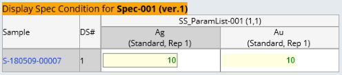
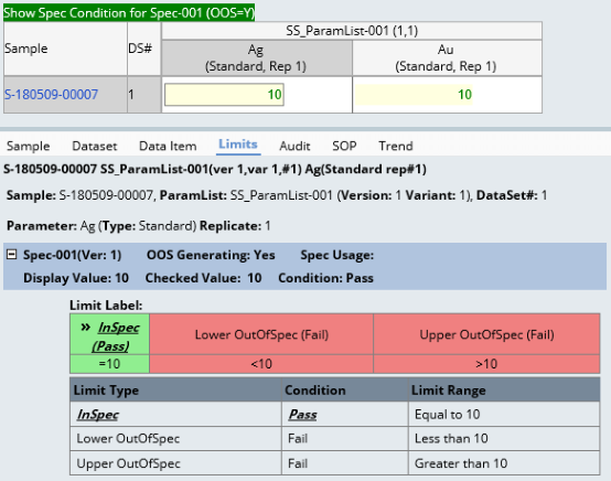
| Grid Top Spec Display HTML |
This lets you customize the display of a Specification that is passed
into the Data Entry page using the Request Controller command-parameter
syntax shown in the following example:
rc?command=page&page=DataEntry&keyid1=S-180509-00007&specid=Spec-001&specversionid=1 The Spec Condition resulting from the evaluation of the passed-in Specification
is displayed according to the Spec Condition's visual cue, and the "Spec
Condition Display Option" in the Data
Entry Policy is ignored. The Specification is displayed above the
Data Entry grid to indicate that the visual Spec Condition is for the
specific passed-in Specification. The "Grid Top Spec Display HTML" property lets you configure
the header of the passed-in Specification. This allows the tokens replacements
[specid], [specversionid], and all other Specification primary columns.
For example: <span style="background-color:green">Show
Spec Condition for [specid] ([specdesc])</span> Note that only the passed-in Specification is shown in the grid and detail. |
Rule for Column and Row headers
|
When configuring the Column header and Row header properties, keep in mind
that each cell actually defines a combination of a Row header, Column header,
and cell. Also, each cell must reference a single Data Item. Therefore, the
combination of any Row header and Column header value must resolve to a single
Data Item. An error is generated if this is not the case.
header Sorting and Grouping
|
header columns are sorted in the order defined by the relevant property, with
the exception of Parameter Lists and Parameters:
The gwtdataentrygrid Element provides the JavaScript functions listed below.
Most are self-explanatory (except where noted).
The AutoFillTransmasterTemp table is supported with client-side translation.
A beforeunload event fires an Ajax call to save the untranslated textids (if
any have been collected), and the Auto
fill temporary translation table property in the System
Configuration is set to "Yes".
Using the Availability Flag
|
However, when the Workitem has both "Preparation" and "Procedural"
Parameter Lists:
The ApplySDIWorkitem Action sets the AvailabilityFlag when calling the AddDataSet
Action.
When saving without refreshing OOB, the gwtdataentrygrid Element calls 4
post-save Actions in the same database transaction. Therefore, any dataset or
primary record status change as a result of these 4 Actions will work with Data
Entry pages.
By default, Data Entry pages hosting the gwtdataentrygrid Element do not refresh
the grid after saving. You should expect any values updated by post-save Actions
(such as setting Data Set status) to be updated on the UI without refreshing
the entire page if those values are configured as readonly or image icons in
the additional columns in the grid cell. However, if those values are part
of the Row headers or Column headers, they will not be updated without refreshing
the page after saving. In the latter case, it is strongly recommended that the
page configuration set the Refresh Page After
Saving property to Yes to reflect the changes after saving.
During Data Entry, some configurations may require entering/returning text
that either describes numeric data or explains why it could not be entered.
Such text is referred to as a "non-numeric tag" (or "NNT").
For example, assume that a value <5 is considered to be BDL (below detection
limit). If the numeric data value is 4, you may want to make BDL a non-numeric
tag in order to enter BDL rather than 4 or enter 4 and return BDL. See Using
Non-Numeric Tags for an example of this.
These methods to support ESig-related functionality are available on pages
that use the gwtdataentrygrid Element:
For example, you can write a custom button validation function for Data Entry
as: