Adding Custom Properties
Top
|
|
Web Page Designer Advanced Operations |
Content |
|
|
Adding Custom Properties |
|
|
| NOTE: | The Standard edition of Web Page Designer does not let you add custom properties. |
Property Definition Editor |
When creating your own custom Page Types, Elements, and Layouts, the Property Manager provides the "Property Definition Editor", opened by clicking "Property Definition". This editor lets you specify properties appearing in the <Root> node of the actual Property Tree (and thereby in all of its children), and how these properties will be displayed in the Property Tree, which the person configuring the page will use to set property values.
|
|
Each property-value pair can be one of three "Property Types" (below):
A "Simple" Property Type defines a single property-value pair:
The following example shows how the editor might display three Simple Property Types:
| Property | Value |
| title | Sample Maintenance Page |
| sdcid | sample |
| columnid | sampleid |
A "Collection" Property Type defines a set of Property Lists:
Collections are used to create multiple items of the same kind, such as multiple columns or buttons. For example, the property "columns" is a "Collection" Property Type. It creates multiple table columns to display a list of Samples. In the Property Definition Editor, you define one set of properties. The resulting Property List then lets you add duplicate sets of properties (as shown below) and add the required values to each.
| Property | Value | ||||||||||||||||||||||||
| columns (collection) |
Column 1
Column 2
Column 3
|
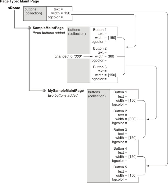
When dealing with Collections, you will notice that the <Root> node show only one set of properties, while its children show as many sets as you have added. This is because the purpose of the <Root> is to pass default values to its children, not to provide actual values for use in a specific Page Type, Element, or Layout. In the example below, the <Root> node provides the default width of a button. Three buttons have been added to the "SampleMaintPage" node, each inheriting its width from the <Root> node. One of the buttons has been changed to a width of "300". When the "MySampleMaintPage" node is added, it inherits the three buttons and their widths from the "SampleMaintPage" node. However, when two buttons are added to "MySampleMaintPage", they inherit their widths from the <Root> node.
A "Property List" Property Type consists of a group of "Simple" Property Types, e.g.,
colors
textcolor = black
bgcolor = white
buttoncolor = red
This Property Type is used solely to support internal functionality.
Display Options |
The following Display Options determine how each Property List is displayed:
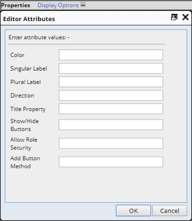 |
| Option | Description |
| Color | Background color of the title field for each property. This is also the button color for Collections (see Collection under Property Types below). |
| Singular Label | Text used to denote a single item in a Collection. |
| Plural Label | Text used to denote multiple items in a Collection. |
| Direction | "Across" displays Collections horizontally.
"Down" displays Collections vertically. |
| Title Property | Property that will be used as the title for each Property List in a Collection. |
| Show/Hide Buttons | "Y" or "N" shows or hides buttons. |
| Allow Role Security | "Y" allows Role-level security on Property Lists. |
| Add Button Method | See Customizing Buttons below. |
String Editors provide more specialized attributes for entered strings:
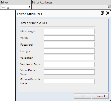 |
| Option | Description | ||||
| Max Length | Maximum length for the input field. | ||||
| Width | Width (in pixels) of the input field (defaults to 150). | ||||
| Password | Y makes the input field a password input field. | ||||
| Encrypt | Y encrypts the stored password value. This is typically done when the
Password property is set to Y.
When saving a property (in the root node or any other node), the property value is encrypted before being stored in the database. Using a plain text editor, the effect looks like this: Before saving:
After saving:
The PropertyList class method getDecrypedProperty( propertyid ) returns the decryped property value (or the property value if it detects that the value is not encrypted). |
||||
| Validation |
Regular expression against which the input is validated. Examples are:
|
||||
| Validation Error | Message displayed if validation fails. | ||||
| Show Paste Value | Y exposes a button to paste the current value into selected property lists across a collection. You can alternativelu use Y:propertyid, where propertyid is the name of the parent collection. | ||||
| Groovy Variable Code | Registered Groovy variable code to show variables available for a Groovy expression. |
When working with List and Maint Elements, the "Add Button Method" option lets you customize the functionality of an"Add" button associated with a Collection Property Type. Provide a JavaScript function that will be called when the "Add" button is clicked, plus a semicolon-delimited list of properties to pass into the funtion. The property values are filled first from the top Property List, followed by the current Property List.
 |
Examples:
|
|
Out-of-the-box, these Page Types and Elements define the specified JavaScript functions for the "Add Button Method":
| Page Type or Element |
"Add" Button Functionality |
Description |
| Page Types:
Elements: |
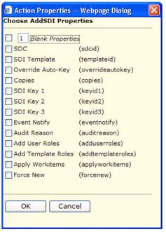
Opens a dialog that lets you choose Action properties. |
Executes these functions in WEB-CORE\modules\webadmin \scripts\editors.js: Input Properties: lookupActionPropertiesIn ( fieldname, props ) Output Properties: lookupActionPropertiesOut ( fieldname, props ) Implemented "out-of-the-box" as: lookupActionPropertiesIn;actionid
|
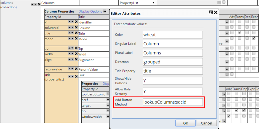
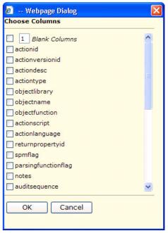
| Elements: | Opens a dialog that lets you choose SDC columns. |
Executes this function in WEB-CORE\modules\webadmin \scripts\editors.js: lookupColumns ( fieldname, props ) Implemented "out-of-the-box" as: lookupColumns;sdcid |
You can also define your own button functionality. Here are some guidelines concerning how to do this:
|
Enter the name of the JavaScript function that will be called when the Add button is clicked (omit the parentheses). You can also specify a semicolon-delimited list of properties to pass into the function. This looks for the function in the WEB-CORE\modules\webadmin\scripts\editors.js file of your Web Application. For example... lookupMyColumns;sdcid calls the lookupMyColumns() function and passes the sdcid into it. |
|
Write your JavaScript function in editors.js. Here is an example (no need to use this particular example... editors.js already contains a lookupColumns function):
|
|
Write your JSP. The page should return a "values" attribute, as in the following example: function close() {var vals = new Array(); vals["values"] = "p1=xxx;p2=yyy|p1=aaa;p2=bbb"; window.returnValue = vals; event.returnValue = false; window.close(); } This example adds two new Property Lists: Property List 1: p1 and p2 are set to xxx and yyy. See WEB-CORE\modules\webadmin\editorlookup_columns.jsp for a functional example. |
|
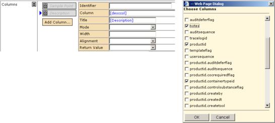
Test the new "Add Column" button by clicking it. In the new modal dialog that opens, choose the new columns to add:
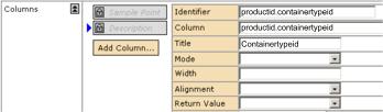
This fills in the columnid and all property values it has been able to determine based on the selections in the modal dialog:
|
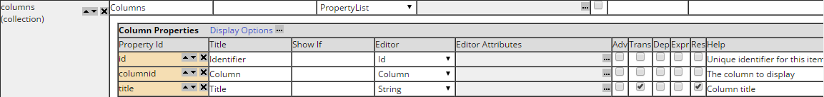
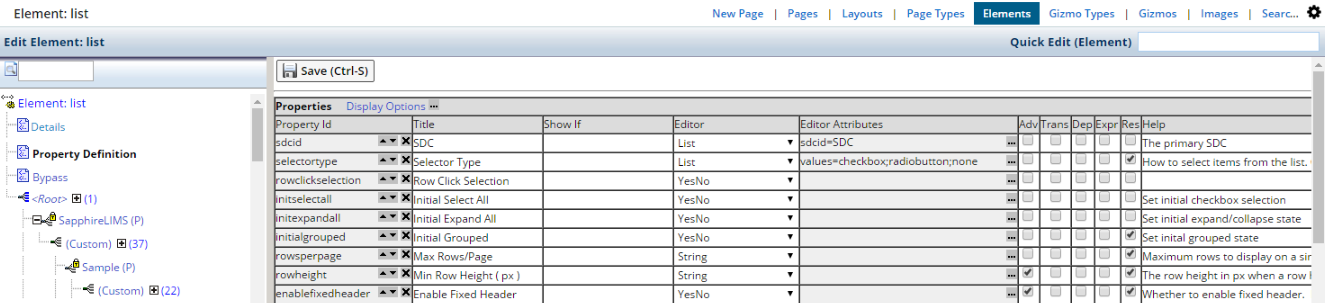
To add or edit a property, specify information under the following column headings in the Property Definition Editor.
| Property Id | Identifier of the property. Any pointer to this property must point to this value, whether referenced in the Web Page Designer or during manual coding you perform on a custom JSP. |
| Title | Label (name) used to identify the property in the Property Configuration Editor. |
| Editor | Specifies how the Property Configuration Editor displays the entry field for the property, based on the type of data that will be entered as the property value. See Editor Attributes below for a description. |
| Editor Attributes | Dictates behavior of the Editor. See Editor Attributes below for a description. |
| Adv | See Declaring Advanced Properties below. |
| Trans | See Translatable Properties below. |
| Dep | See Deprecating Properties below. |
| Help | Text appearing in the popup that opens on mouseover. |
|
The checkbox at the left appears on properties. Checking this declares a property as "Advanced". |
Use your own judgment to declare any property as "Advanced" when you want to hide it in certain situations.
Advanced can be applied to a simple property, property list or an entire collection. Marking a property list (or collection) as "Advanced" automatically propogates to properties (or properyt lists) within that parent property list (children will be hidden if the parent is hidden).
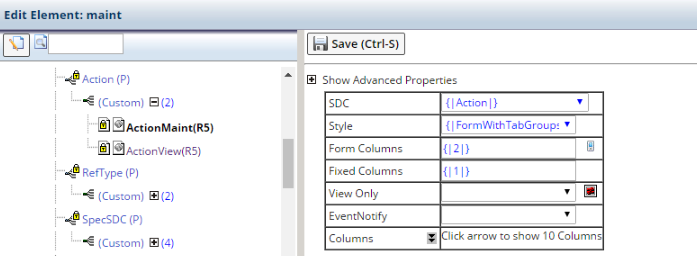
The Property Definition Editor displays Show Advanced Properties in the Root:
 |
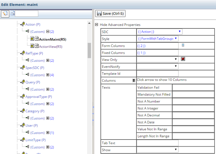
The Advanced Properties will be hidden in the Root's children unless you click Show Advanced Properties. In the example below, View Only is the Advanced Property.
 |
|
The checkbox at the left appears on certain properties. |
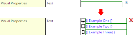
Checking this enables translation of the entire text string entered as the value for this property for all child nodes (descendents) of the <Root> node. This feature marks a Property in the PropertyManager as "translatable".
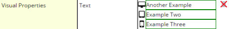
If this is not checked ( ),
the person configuring your properties can still conduct translations in the
Property Manager by enabling it in the <Root> node of the Property Tree,
or conduct full or partial translations using double curly braces to control
the translated portion of the string.
),
the person configuring your properties can still conduct translations in the
Property Manager by enabling it in the <Root> node of the Property Tree,
or conduct full or partial translations using double curly braces to control
the translated portion of the string.
|
The checkbox at the left appears on properties. Checking this deprecates a property. |
|
|
When viewed in the PropertyManager (described in the Basic Principles section), deprecated properties are displayed with a striked-through property title, as shown in the example at the left. |
|
The checkbox at the left appears on properties. Checking this allows you to use "Expression-Based Properties". For more information, see Expression Based Properties in the Properties Overview section. |
|
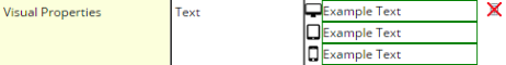
The checkbox at the left appears on properties. Checking this indicates that the property can vary by display resolution. |
When "Res" is checked, properties appear nominal by default until you click the "mobile" icon.
 |
The value then expands to three editors. Each represents a different device: "Desktop", "Tablet", and "Phone". These devices and their corresponding resolutions are defined by the "GUI Modes" property collection in the GUI Policy. These demonstrations use generic example text to demonstrate the mechanics of the editors. Note that the original value is replicated for convenience.
 |
Clicking the "X" reverts to a single value, preserving the "desktop" value for convenience.
 |
Inherited values have this appearance:
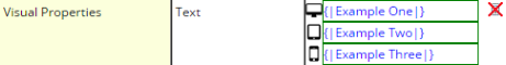 |
Changing a single value overrides inheritance for the other two values as well.
 |
Clicking the "X" collapses this down to a single value.
 |
Deleting this value returns to the inherited triple value.
 |
|
The entry field at the left appears on properties. Entering test here displays the text as tooltips onMouseOver. |
The PropertyTree database table contains a deprecatedflag column. If you set the value of this column to Y, in the wizard for creating a DDP (described in the Basic Principles section), the list of Page Type and Layout pages shows deprecated ones at the end of the list with the page title striked-through. You must set this using a database update statement (you can not set this using the Web Page Designer interface).
You can choose from the following Editors, which let you specify what the Property List displays, as well as what it will accept as input.
| Editor | Description and Editor Attributes | ||||||||||||||||||||||||||||||||
| String | Accepts a text string as input.
You can use Java Regular Expressions to check values entered into String input fields. Example syntax for possible search patterns defined by a RegEx:
|
||||||||||||||||||||||||||||||||
| Long String |
Generates an input field equivalent to the HTML textarea tag.
|
||||||||||||||||||||||||||||||||
| Link | Lets you choose a destination page and target window in syntax recognized by the Request Controller. | ||||||||||||||||||||||||||||||||
| File | Lets you choose a file in a lookup window. Use this to find a file using
absolute paths to any folder to which you have access. For specifying relative
paths within your Web Application, use the Web File attribute (below).
|
||||||||||||||||||||||||||||||||
| Web File | Lets you choose a file in a lookup window. Use this to find a file using
relative paths within your Web Application. For specifying absolute paths
to any folder to which you have access, use the File attribute (above).
|
||||||||||||||||||||||||||||||||
| SDCColumn | Displays a select list containing SDC columns.
|
||||||||||||||||||||||||||||||||
| YesNo | Displays a select list containing "Yes" and "No" values. | ||||||||||||||||||||||||||||||||
| List | Displays a select list with contents specified by the following attributes:
|
||||||||||||||||||||||||||||||||
| ReadOnly | Displays a write-protected input field. | ||||||||||||||||||||||||||||||||
| Validation | Opens default validation properties (same as the maint Element Validation Core properties described in Part 2 of this document). This has no attributes. | ||||||||||||||||||||||||||||||||
| PropertyTreeNodes | Displays a select list of defined ProperyTree Nodes.
|
||||||||||||||||||||||||||||||||
| TabColumn | You can use this by referencing either SDCs or database tables.
Opens a dialog that lets you choose a column name from the Result Set associated with an SDC.
Opens a dialog that lets you choose a column name from any database table. The following two properties are mutually exclusive, i.e., you can retrieve all columns by referencing a table name or another property name:
|
You can copy a property value and paste it across multiple collection items as follows:
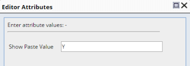
| 1. | In the Attribute Editor for the property you want to copy, set "Show
Paste Value" to Y:
|
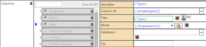
| 2. | Select one or more collection items:
|
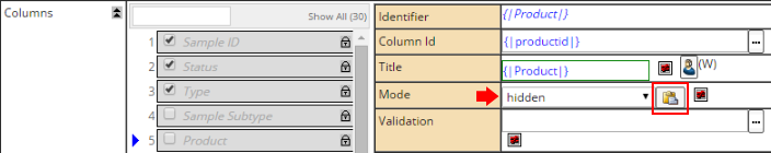
| 3. |
Set the value of one of the properties in a collection item (the collection
item does not have to be one of those you just selected). Click the paste
icon as shown below. The value is copied to all selected members of the
collection.
|
Atop each set of properties are one or more symbols that let you control some aspects of the property, such as changing the order in which items are rendered on the Element or Page. For descriptions, see Property Controls in topic Properties Overview.
"Required Elements" are Elements available for use by a Page Type. You can also make a Required Element "mandatory", meaning each DDP created from the Page Type will always have the Element. The List Page Type is an example of a Page Type having Required Elements that are mandatory. A List Page Type requires a "List" Element (to show the SDIs) and a "Search" Element (to execute the query that retireves the SDIs).
Making a Required Element mandatory is a convenience and assurance feature. Each time someone adds a page based on this Page Type, the wizard will always add these Element nodes when creating the page.
The following controls let you define and maintain Required Elements:
| Control | Functionality |
| Add Element |
Adds an Element. When prompted, enter the identifier of the Element on
your JSP and select the Element Type (see Adding Elements in the section
Working with JSPs).
After the element is added, check Mandatory to stipulate that it be included on all DDPs made from the Page Type. |
| Save and Synchronize Pages | Saves changes you have made, plus services pages that may be out of synch with this Page Type. It forces a synchronize, i.e., adds or removes Elements to or from all pages using this Page Type Property Tree. |
| Save | Stores only changes you have made, but does not force a synchronize. |
This is an editing area for the XML source files that define the Property Tree. This feature is currently intended for use only by LabVantage Solutions, Inc. developers.
The following controls provide a cursory interface for XML files in the editing area:
| Control | Functionality |
| Refresh | Reloads the XML (unsaved changes are not stored). |
| Save | Stores changes you have made. |
| Synchronize | Adds or removes Elements to or from all pages using this Page Type Property Tree (same functionality as "Save and Synchronize Pages" in "Required Elements" above). |
| Copy to File | Copies the currently loaded XML from the editing area to the file you specify. |
| Load from File | Loads XML from the file you specify into the editing area. |
Working with JSPs |
|
|
|
This section contains information relevant to generating your own JSPs, whether you will use the JSP as the basis for a DDP, or simply register it as a custom JSP.
This section refers to some aspects of LabVantage Custom Tags. See the LabVantage Custom Tag Reference for more detail concerning their functionality and attributes.
JSTL Objects |
Concepts |
JSTL objects play a key role in the contexts of both DDPs and custom JSPs:
For each node in each Property Tree, the Request Controller makes an instance of a JSTL object available for use by a JSP. The diagram below shows the JSTL object instances created for one node in each of the example Property Trees shown in the Example Application near the beginning of the Basic Principles section of this document. Each object provides the reconciled Property List for the specified node.
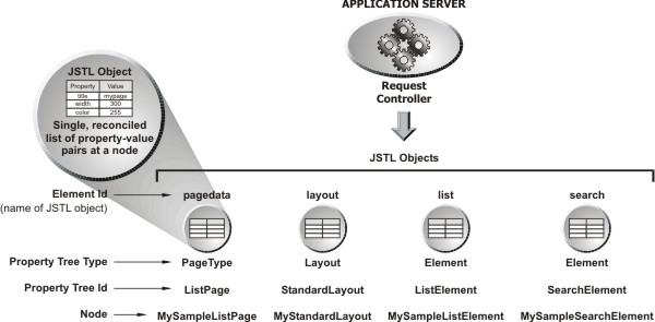
The "Element Id" is the name of the JSTL object that provides property-value pairs. An Element Id uniquely identifies an Element on a page. In the example above, the JSTL objects build the DDP "MySampleListPage".
| Element Id | Provides values for... |
| pagedata | Page Types |
| layout | Layouts |
| list | List Elements |
| search | Search Elements |
The WebPagePropertyTree table associates each Element Id to the node from which it inherits property values. If the page is a one of the DDPs supplied with the Web Page Designer, the records would look something like the following example:
Example WebPagePropertyTree Table for DDP
| WebPageId | PropertyTreeId | ExtendNodeId | ElementId |
| SampleList | ListPage | MySampleListPage | pagedata |
| SampleList | StandardLayout | MyStandardLayout | layout |
| SampleList | ListElement | MySampleListElement | list |
| SampleList | SearchElement | MySampleSearchElement | search |
In this table:
"WebPageId" is the identifier of the page.
"ExtendNodeId" is the parent node of the "Element Id".
"ElementId" is the name of the JSTL object. Each Element in this column inherits from the node in the ExtendNodeId column.
In DDPs you create using the Page Types, Elements, and Layouts supplied with the Web Page Designer:
| • | The Element Ids (JSTL object names) are implicit values assigned by the tool when you create the page, Layout, and Elements. |
| • | DDPs access a "pagedata" JSTL object. This provides values to the Page Type. |
If the page is a custom JSP, the records would look a bit different:
Example WebPagePropertyTree Table for Custom JSP
| WebPageId | PropertyTreeId | ExtendNodeId | ElementId |
| SampleList | StandardLayout | MyStandardLayout | layout |
| SampleList | ListElement | MySampleListElement | ListElement01 |
| SampleList | SearchElement | MySampleSearchElement | SearchElement01 |
In custom JSPs:
| • | You must add a LabVantage Custom Tag to render each element you add to the page. The Element Id is the identifier of the element rendered by the tag (in other words, the "elementid" attribute of the tag). This also applies when you add Elements to a Page Type you have created based on a custom JSP (see Creating Page Types, Elements, and Layouts for more details). |
| • | Unless you have used a custom JSP to create your own Page Type, there is no pagedata object. If you use your custom JSP as the basis for a custom Page Type, your custom JSP becomes a DDP, thereby using the pagedata object to provide values to the page. |
| • | The layout JSTL object is an implicit value for both DDPs and registered custom JSPs. |
When working with a custom JSP, you can use a JSTL tag to retrieve a property value at a node. You need specify only the Element Id and the Property Id. You need not drill-down through the Property Tree as you would using methods called on an instance of the PageTagInfo class. Additionally, you can avoid Java breaks as you would when switching between Java and JSP/HTML. Using PageTagInfo to get a value defined by the ElementId "ListElement01", you would have to code:
pageinfo.getPropertyList( "ListElement01" ).getProperty( "title" );
Using a JSTL tag, you could display the information by simply coding:
<c:out value="${ListElement01.title}"/>
This information becomes helpful when you have to get property values from Elements (see Drilling Down Through Properties below).
Drilling Down Through Properties |
The previous section showed how you can use JSTL to get the value of a first-level property provided by a JSTL object. Now consider the following excerpt, which shows properties for the Maint Element defined by the Element Id "SampleMaintElement" (the following information holds true for PageTypes, Elements, and Layouts).
| sdcid | Sample | ||||||||||||||||||||||
| style | Form | ||||||||||||||||||||||
| columns |
|
||||||||||||||||||||||
You can retrieve values for first-level properties as noted in the previous section. For example:
SDC = <c:out value="${SampleMaintElement.sdcid}" />
gets the value and displays:
SDC = Sample
All column values are avialable from the JSTL Object as an array. To drill down to the second-level properties (the columns in each Collection), iterate through the array. For example:
Columns = <c:out value="${SampleMaintElement.columns}" />
gets the array values and displays:
Columns = [{title=Samples, columnid=s_sampleid, mode=lookup, link={}}, {title=Date Created, columnid=createdt, mode=readonly, link={}}]
To get individual values in the array, iterate through it. For example:
Column Ids:
<c:forEach items="${SampleMaintElement.columns}" var="col">
<c:out value="${col.columnid}" />
</c:forEach>
gets the columnids and displays:
ColumnIds: s_sampleid createdt
Variables Used with JSTL Objects |
As shown in the previous section Concepts, the WebPagePropertyTree table holds records associating each WebPageId to a Property Tree, node, and ElementId. The PropertyTree table holds additional information, associating the "Property Tree Type" (Page Type, Element, or Layout), and the "Objectname". "Objectname" is a variable representing the thing that drives the JSTL object. For example, suppose you want to specify a JSP asosciated with a specific layout. If the page is a DDP, you would specify the layout JSP in the page tag as follows:
<sapphire:page layout="${layout.objectname}">
Using the Standard Layout as an example, the following record in the PropertyTree table associates the JSP used to interpret the Layout properties to the Property Tree (columns irrelevant to this discussion have been omitted):
| PropertyTreeId | PropertyTreeType | Objectname |
| StandardLayout | Layout | \WEB-CORE\layouts\standard\standardlayout.jsp |
You can use the following variables with JSTL objects.
| Variable | Example using a JSTL out Tag |
| nodeid |
<c:out value="${$MyElement.nodeid}" />
Displays the identifier of the node, where "MyElement" is the name of your Element. |
| objectname |
<c:out layout="${layout.objectname}" /> Displays the identifier of the layout Element. Note that the JSTL object name "layout" is used here. This is an implicit value. Since the tool generates the layout, it recognizes the identifier "layout", and does not require the specific identifier you assigned to it. |
| propertytreeid | <c:out value="${$MyElement.propertytreeid}" /> |
| propertytreetype | <c:out value="${$MyElement.propertytreetype}" /> |
| webpageid | <c:out value="${$MyElement.webpageid}" |
Additional Functionality |
For details and examples concerning the use of JSTL objects in your code, see the LabVantage Custom Tag Reference and Creating Page Types, Elements, and Layouts.
Creating Page Types, Elements, and Layouts |
|
|
|
Before proceeding, make certain you have read all information previously presented.
Creating Page Types |
"Creating a Page Type" means "converting an existing custom JSP into a Page Type". You can then add multiple DDPs based on the Page Type.
Example Using Page Properties |
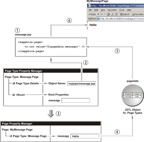
The following example shows how to make the simplest possible Page Type, which we call "Message Page". The resulting DDP simply displays a message ("Hello"). The illustration accompanying the example shows only information relevant to explaining the Page Type creation process, eliminating irrelevant text on each screen.
A suggested order in which to create a Page Type:
| a. | Begin by creating a JSP in a text editor (1, below). As shown, this page has a JSTL out tag that displays the "message" property of the "pagedata" object. As introduced in the section JSTL Objects, "pagedata" is the JSTL object that provides properties to Page Types. This means that all properties retrieved from the "pagedata" object are at the "page level", meaning they are properties of the Page Type, rather than an associated Element or Layout. |
| b. | In the Web Page Designer, the process of adding a Page
Type begins in the Page Type Property Manager. We have named the Page Type
"Message Page". Two points of interest:
|
| c. | Create the Page Type by following the instructions to the end of the Page Type wizard. |
| d. | Using the same wizard as previously described for use with the Core Page Types, you then add a page ("MyMessagePage") based on the "Message Page" Page Type (3). Enter a value of "Hello" for the "message" property. |
| e. | When you load "MyMessagePage" from your Web Application, message.jsp gets the property value from the "pagedata" JSTL object (4 and 5), then generates the HTML (6). |
Example Using Element Properties |
If you want the Page Type to contain Elements:
For simplicity, the next example uses two ready-to-use features of the LabVantage Java API: the (Core) List Element and the sdilist LabVantage Custom Tag. We use these to create a custom List Page.
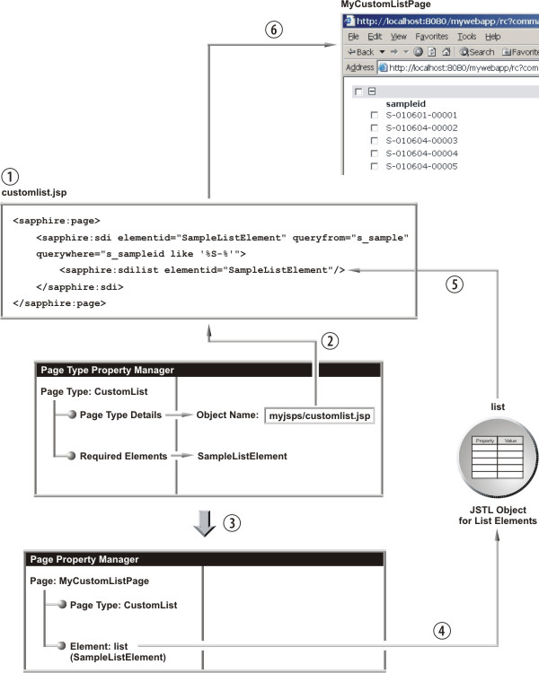
| a. |
First, create a JSP (1, below) with an sdilist tag that points to an
existing List Element. In the example below, it points to "SampleListElement":
CustomListPageType (customlist.jsp) <sapphire:page> <sapphire:sdi elementlist="SampleListElement" queryfrom="s_sample" querywhere="s_sampleid like '%S-%'"> <sapphire:sdilist elementid="SampleListElement"/> </sapphire:sdi> </sapphire:page> |
| b. | As in the previous example, add a Page Type ("CustomList") and specify the object name (customlist.jsp) as shown in step 2 below. |
| c. | Your users can now add pages based on this Page Type (3). This time the "list" JSTL object handles property values (4 and 5), and you can retrieve them as you would any other Element as shown in the previous section JSTL Objects. |
Creating Elements |
You can create your own Element and add it to your JSP. This is basically a three-step process:
Step-by-Step |
The diagram below shows how everything works together using a simple Java class to generate the HTML "Hello" followed by the value of a property called "name" that is defined in the Element.
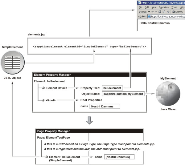
| a. | Create the Java Class
Begin by creating a Java class: |
| 1. | Create a custom package in the java\classes directory of the application server to hold the class. |
| 2. | In your custom package, create the Java class for your Element and make it an extension of the BaseElement class (BaseElement is in the sapphire.pageelements package - see the Javadoc). In this example, the Java class uses "name" as a variable when returning the HTML (this is shown in the code example further on in this section). |
| b. | Add the Element
Next, create an Element in the Web Page Designer: |
| 1. | After clicking "New Element", you must supply the Property Tree Id (you are prompted to "Enter the Property Tree identifier"). This is "helloelement" in the diagram below. This identifies the type of JSTL object that provides property-value pairs to the JSP. |
| 2. | Next, the Element Property Manager opens. For the Object Name, specify the package and class in Java dot notation. In our example, the package and class are sapphire.custom.MyElement (we provide the code in a separate expalanation further on in this example). Then, add a property called "name", and give it a default value. |
| c. | Add a Page
Then, add a page to use this Element. The methodology differs depending on whether this is a DDP or a custom JSP: |
| 1. | DDP
To use the Element on a DDP, you must add the Element to the Page Type. When creating the Page Type:
|
| 2. | Custom JSP
When registering the JSP:
|
| d. | Setup the JSP
Now, setup your JSP to generate the Element by inserting a <sapphire:element> tag. The two tag attributes of note:
|
Example Source Files |
The code below shows the source file supporting our example class (MyElement.java) and the JSP (elements.JSP). To show a few more features, the code is slightly more complex than the previous example.
| • | Line 6 of MyElement.java shows that the class for the Element is an extension of the BaseElement class (BaseElement is in the sapphire.pageelements package - see the Javadoc). |
| • | The getHTML() method (beginning at line 7) returns the HTML of the Element. Line 8 creates a new instance of StringBuffer() to join together all of the HTML. |
| • | After retrieving the value of the "name" variable in line 9, getHTML() returns "Hello" + name, or "Hello world" if "name" has no value. This is rendered by the element tag <sapphire:element> in line 7 of elements.jsp. |
| • | Lines 16 through 35 demonstrate something not in our diagram (otherwise the diagram would be so complex you would not want to look at it). If you use the element tag within an sdi tag, the element tag can use the data retrieved by the sdi tag. Lines 19 through 20 execute a full table query, while line 24 executes the query in the sdi tag (lines 10 through 12 of elements.jsp). |
MyElement.java
| 1 |
package sapphire.custom.test; |
| 2 |
import sapphire.pageelements.BaseElement; |
| 3 |
import sapphire.accessor.QueryProcessor; |
| 4 |
import sapphire.util.DataSet; |
| 5 |
import sapphire.tagext.SDITagInfo; |
| 6 |
public class MyElement extends BaseElement { |
| 7 |
public String getHtml() { |
| 8 |
StringBuffer html = new StringBuffer(); |
| 9 |
String name = element.getProperty( "name" ); |
| 10 |
if ( name != null && name.length() > 0 ) { |
| 11 |
html.append( "Hello " + name + "<br/>" ); |
| 12 |
} |
| 13 |
else { |
| 14 |
html.append( "Hello world<br/>" ); |
| 15 |
} |
| 16 |
SDITagInfo sdiInfo = getSDIInfo(); |
| 17 |
DataSet ds; |
| 18 |
if ( sdiInfo == null ) { |
| 19 |
QueryProcessor qp = getQueryProcessor(); |
| 20 |
ds = qp.getSqlDataSet( "SELECT * FROM s_sample" ); |
| 21 |
html.append( "Data from query<br/>" ); |
| 22 |
} |
| 23 |
else { |
| 24 |
ds = sdiInfo.getQueryData( "primary" ).getQuerydata(); |
| 25 |
html.append( "Data from sdiInfo<br/>" ); |
| 26 |
} |
| 27 |
html.append( "<table>" ); |
| 28 |
for ( int i = 0; i < ds.size(); i++ ) { |
| 29 |
html.append( "<tr>" ); |
| 30 |
html.append( "<td>" + ds.getString( i, "s_sampleid" ) + "</td>" ); |
| 31 |
html.append( "<td>" + ds.getString( i, "sampledesc" ) + "</td>" ); |
| 32 |
html.append( "</tr>" ); |
| 33 |
} |
| 34 |
html.append( "</table>" ); |
| 35 |
return html.toString(); |
| 36 |
} |
| 37 |
} |
elements.JSP
| 1 |
<%@ taglib uri="/WEB-INF/tlds/sapphire.tld" prefix="sapphire" %> |
| 2 |
<%@ taglib uri="/WEB-INF/tlds/c.tld" prefix="c" %> |
| 3 |
<sapphire:page> |
| 4 |
<table> |
| 5 |
<tr valign="top"> |
| 6 |
<td> |
| 7 |
<sapphire:element elementid="simpleelement" type="HelloElement"/> |
| 8 |
</td> |
| 9 |
<td> |
| 10 |
<sapphire:sdi sdcid="Sample" queryfrom="s_sample" querywhere="sampledesc like '%Blue%'"> |
| 11 |
<sapphire:element elementid="simpleelement" type="HelloElement"/> |
| 12 |
</sapphire:sdi> |
| 13 |
</td> |
| 14 |
</tr> |
| 15 |
</table> |
| 16 |
</sapphire:page> |
Creating Layouts |
"Creating a Layout" means "using a custom JSP as the framework for a Layout". Typically, you would want the custom JSP to both specify the Layout and insert a page into the Layout. You will need to:
Example Layout |
The file "customlayout.jsp" will be the object used for the Layout. This example goes something like this:
Create the JSP
When you add this layout to a page, the Layout inserts the body of that page's <sapphire:pagecontent> tag into the <sapphire:pagearea> tag in customlayout.jsp (see the description of pagearea and pagecontent tags in the LabVantage Custom Tag Reference for more details).
Lines 7 through 13 test to determine if the List Page contains a pagecontent tag with the identifier "content". If pageareadefined is false, the layout displays "No Content". If true, the contents of the List page are inserted within a scrollable div at lines 16 through 18.
customlayout.JSP
| 1 |
<head> |
| 2 |
<meta http-equiv="Content-Type" content="text/html; charset=iso-8859-1"> |
| 3 |
<link rel="stylesheet" href="<c:out value="${layout.stylesheet}"/>" type="text/css"> |
| 4 |
</head> |
| 5 |
<body> |
| 6 |
<table cellpadding="20" cellspacing="0" width="100%" height="100%"> |
| 7 |
<sapphire:pageif test="pageareadefined" name="toolbar"> |
| 8 |
<tr> |
| 9 |
<td nowrap> |
| 10 |
<sapphire:pagearea name="toolbar" undefinedtext="No Content"/> |
| 11 |
</td> |
| 12 |
</tr> |
| 13 |
</sapphire:pageif> |
| 14 |
<tr bgcolor="<c:out value="${layout.bgcolortop}"/> valign="top" height="80%"> |
| 15 |
<td nowrap> |
| 16 |
<div style="overflow:auto; height: 100%" > |
| 17 |
<sapphire:pagearea name="content" undefinedtext="No Content"/> |
| 18 |
</div> |
| 19 |
</td> |
| 20 |
</tr> |
| 21 |
<tr bgcolor="<c:out value="${layout.bgcolorbottom}"/> height="*"> |
| 22 |
<td> |
| 23 |
<img src="<c:out value="${layout.image}"/>"> |
| 24 |
</td> |
| 25 |
</tr> |
| 26 |
</table> |
Create the Layout and Create Properties
Next, create a Layout in the Web Page Designer:
| a. | After clicking "New Layout", you must supply the Property Tree Id (you are prompted to "Enter the Property Tree identifier"). This is "MyLayout" in the diagram below. Note that (as explained in the section JSTL Objects) the name of the JSTL object that handles Layout properties is "layout" ("layout" is an implicit value). |
| b. | Next, the Layout Property Manager opens. For the Object Name, specify the JSP (in our example, customJSP/customlayout.jsp). |
| c. | Then, use the "Property Definition Editor" to add the properties referenced in lines 3, 14, 21, and 23 of customlayout.JSP. |
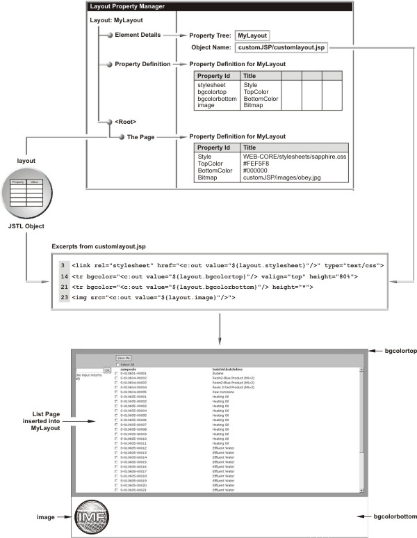
Add a Page
Next, add a page, then add this Layout to the page. We have added a List Page DDP, which contains the <sapphire:pagecontent> tag with the identifier "content". The result is shown above: an applied stylesheet, separate background colors for the top and bottom of the page, our List Page inserted into the Layout, and an image.
Extending Layouts with Custom Page Types |
The previous example arranges a List Page (based on a core List Page Type) within a Layout to provide the basic concepts involved in creating your own Layouts. Extending this idea, you could nest multiple pages within a Layout by adding you own Page Type (previously described in Adding Page Types). Suppose you wanted two List Pages in your Layout... one to list Samples, the other to list Projects:
In the custom JSP on which you base the Page Type, insert two pagecontent tags (<sapphire:pagecontent>), each with a unique identifier. For example, the body of one pagecontent tag could have an element tag that renders a list of Samples (the "name" attribute of the tag could be "samples"). The body of the other pagecontent tag could have an element tag that renders a list of Projects (the "name" attribute of this tag could be "projects). Each element tag would point to an appropriate List Element.
In the JSP on which your Layout is based, you could insert each pagecontent body into a different pagearea by matching the "name" attributes (one pagearea tag would have the "name" attribute set to "samples", the other set to "projects".
Choosing Layouts when Creating New Pages |
When creating a New Page (as shown in Creating a DDPs and Registering a Custom JSP in the Basic Principles section (Part 1) of this document), you can make your custom Layout available for use by displaying an image in the Choose Layout Style page of the page wizard. To do this:
| a. | Create an image (in GIF format) to represent your Layout. |
| b. |
Name the image file according to the format
layout_id.gif where id is the Property Tree Id for the Layout. |
| c. | Store the image file in the same folder as your Layout JSP, as specified by the Object Name in the Layout Details of the Layout Property Manager. |
The image will appear in the Choose Layout Style page each time you create a new page.
Creating Custom Wizards |
|
|
|
Overview |
Functionality |
You can create your own custom wizard that lets users step backward and forward through pages. We supply the following to help you do this:
| • | A built-in "wizard controller" that interprets a sequence of pages you specify in an XML file (as described in Defining the Wizard below). You can conditionally branch to and loop through these pages, each of which is called a "step" in the wizard. |
| • | An API (described in this section) that allows each page to store information as property-value pairs while the user steps through the wizard. Typically, the final page in the wizard performs some database-related task based on information gathered. |
Among the features provided by the controller and API (and described in this section), the following list summarizes what will probably be the most-used:
| • | Each page (step in the XML file) can store properties using a client-side parent.setProperty( "id", "value" ) JavaScript function call nested within a next() function defined in a page. The next() function is automatically executed when the user clicks the Next button. This is described in The next() Function below. |
| • | All properties stored are submitted to subsequent pages; they are therefore available through the JSP request object. |
| • | Keyboard support lets the user press Enter or Shift-Enter in place of the Next or Back buttons. You can disable this for specific pages. |
| • | A Cancel button lets the user abort the wizard at any time. You can temporarily disable the Cancel button for specific pages. |
| • | After completion of the final page (step), the wizard can automatically navigate to a specified URL. Alternatively, the final page can display some summary information, and the user can then close the wizard manually by clicking the Finish button. |
| • | A debug option lets the developer view the list of properties gathered thus far by the wizard. |
Page Requirements |
A page must contain two items in order to work within a wizard:
| • | A <sapphire:wizard /> tag (described in The wizard Tag below). |
| • | A next() JavaScript function (described in The next() Function below). |
Defining the Wizard |
The XML File |
An XML file stores the series of pages that make up the wizard. Following is an example of a wizard that creates a new page.
<wizard title="Create a new page." >
<step id="content" src="rc?command=file&file=webadmin/wiz_choosecontenttype.jsp" help="Choose one of the options:">
<return value="serverjsp" nextstepid="pagedetails"/>
<return value="existingpageptree" nextstepid="pageptreepolicy"/>
</step>
<step id="pageptreepolicy" src="rc?command=file&file=webadmin/wiz_chooseptreenode.jsp&prefix=page&" help="Choose the page-type node that best matches your requirements."/>
<step id="pagedetails" src="rc?command=file&file=webadmin/pagedetails.jsp&mode=add" help="Enter the final details and then click Finish to create the page."/>
<step id="elementnodes" src="rc?command=file&file=webadmin/wiz_chooseelementptreenodes.jsp" help="Choose the element nodes."/>
<step id="layout" cancel="false" src="rc?command=file&file=webadmin/wiz_chooselayout.jsp&prefix=layout" help="Choose a layout style for your page." />
<step id="layoutnode" src="rc?command=file&file=webadmin/wiz_chooseptreenode.jsp&prefix=layout&" help="Choose the layout node that best matches your requirements." />
<step id="createpage" src="rc?command=file&file=webadmin/wiz_createpage.jsp" help="Please wait. Generating page..."/>
</wizard>
The wizard has a primary title ("Create a new page") and a series of steps. Each step can have the following attributes:
| Attribute | Description |
| id | Unique identifier for the step. |
| src | URL for the page to be loaded. |
| help | Text displayed in the wizard header. |
| nextstepid | Identifier of the next step. If this attribute is missing, the wizard advances to the next step in the list. |
| cancel | A value of true disables the cancel button while the page is being rendered (see Additional Controls below). |
The next() Function |
When a user clicks the Next button, the wizard calls a next() JavaScript function in the current page. All pages in the wizard must include a next() function, except for the following two kinds of pages:
| • | The final page, in which case there is no next page. |
| • | Pages that do not wait for user input, but automatically move to the next page by calling the parent.skip() function. |
The return value from the next() function is important. You can use it to control the flow of the wizard. For example:
| • | Typically you would have the next() function return a non-empty string such as "OK". This tells the wizard to advance to the next step. In fact, if a page does not contain a next() function, clicking the Next button returns "OK". |
| • | A page will often use client-side validation to ensure suitability of entered information. If validation detects errors, the page can stop the wizard from moving on to the next step by simply returning null. |
| • | Occasionally, you might have to branch the wizard based on information entered in the page. Note in the wizard xml example above that the first step leads to a branch to either the "pagedetails" or "pagetreepolicy" step. You can similarly branch by inserting <return> tags into the xml as shown, and have the next() function return a sting matching the value attribute of the tag. |
The next() function of the first page in the above example could look something like the following, which defines control logic based on the user's selection:
function next() {
var selectedoption = getSelectedOption();
if ( selectedoption == null ) {
alert( "Please choose one of the source options." );
return null;
}
parent.setProperty( "contenttype", selectedoption.id );
if ( selectedoption.id == "serverjsp" ) {
return "serverjsp";
}
else if ( selectedoption.id == "existingpageptree" ) {
var selectedptree = getSelectedPTree();
if ( selectedptree == null ) {
alert( "Please choose one of the page types." );
return null;
}
else {
parent.setProperty( "pageptreeid", selectedptree.id );
return "existingpageptree";
}
}
}
The wizard Tag |
The <sapphire:wizard /> tag has two optional attributes:
| Attribute | Description |
| enternext | A value of "true" (default) provides keyboard support for moving forward or backward through the wizard. A value of "false" disables such keyboard support. |
| autofinish | A value of "false" (default) replaces the Next button with
a Finish button. You can include this on the last page in the wizard to
indicate that the wizard should automatically navigate to another page.
A value of "true" disables this replacement feature, but you can
always force a value of "false" within the page using the following
JavaScript:
<script> autofinish=false </script> An example of when this may be necessary is if you want to display errors to the user. |
Controlling the Wizard |
Launching a Wizard |
The Request Controller delivers the wizard harness using the command parameter "wizard" (as described in Calling the Request Controller). The parameter-value pair for the wizard defines the URL of the wizard xml file. For example, to launch the wizard defined in mystuff/newpage.xml:
rc?command=wizard&wizard=mystuff/newpage.xml
You can pass additional attributes into the wizard to control where the wizard goes if the user clicks the Cancel button or when the wizard is finished. These attributes are typically posted to the Request Controller servlet. A way of doing this is to create a JSP containing a form to submit values of hidden fields into the wizard. For example, this page might contain:
<form id="wizard" action="rc?command=wizard&wizard=mystuff/newpage.xml" method="POST">
<input name="wizardcancel" type="hidden" value="rc?<%=request.getQueryString()%>">
<input name="wizardcanceltarget" type="hidden" value="top">
<input name="wizardcomplete" type="hidden" value="rc?<%=request.getQueryString()%>">
<input name="wizardcompletetarget" type="hidden" value="top">
<input name="debug" type="hidden" value="N">
<input type="submit" value="Zubmeet ze furm">
</form>
You would then load this page. When you submit the form, it starts the wizard and passes all of these values into it for use by the wizard pages.
Two noteworthy items:
| • | The input with the control name "debug" can (for example) show or hide a button that displays the current list of stored properties. |
| • | This example uses the getQueryString() method to return the query string that is contained in the request URL. |
Additional Controls |
Enabling the Wizard Progress Bar
You can enable the Wizard Progress Bar in the left frame of the wizard, as well as jump back to previous steps in the wizard. To enable the Wizard Progress Bar, add this tag to the wizard XML file:
<wizard title="Create a new page." progressbar="true" progressbarjumping="true" >
Setting the attribute progressbarjumping to "true" lets the user jump back to previous steps in the wizard by clicking on a link in the Wizard Progress Bar.
You can also reset the Wizard Progress Bar (that is, restore all text to black up to the page to which you have jumped) by executing the JavaScript function resetProgressBar(). For example, if you are on step 5 of a wizard and you execute resetProgressBar() when step 2 is clicked, steps 3 through 5 will reset to black. CHECK THIS.
Disabling the Cancel Button
In a step of the wizard XML file, the cancel attribute disables the Cancel button while the page is being rendered and displayed:
<step id="deletedatabase" src="/sapphireconsole/database/deletedatabase.jsp" help="Deleting database" cancel="false"/>
The JavaScript function setWizardCancel() lets you do things if the Cancel button is clicked. For example, you may want to navigate to a page if the wizard is cancelled:
<script>
parent.setWizardCancel('rc?command=file&file=nextpage.jsp');
</script>
Advanced Techniques |
Passing Startup Properties into the Wizard
Any additional parameters sent into the servlet are automatically added as properties before the first page is rendered.
Skipping a Step
Occasionally it may be necessary for a page not to display anything and automatically move to the next step. Use the following JavaScript to do this:
<script>
parent.skip()
</script>
When the skip() function is executed, the wizard automatically passes control to the next step and removes the step from the Back button history.
Dynamically Changing the Complete URL
You can determine the completed URL when the wizard is at the end, rather than specifying it to the Request Controller servlet. For example, you may use the wizard to create an item in the database and, when the wizard is complete, you may want it to navigate to a page that shows that item. Use the following JavaScript to do this:
<script>
parent.setWizardComplete('rc?command=file&file=nextpage.jsp&itemid=<%=itemid%>');
</script>
Setting Properties Back into Fields from the Request Object
Typically, your page will include form elements such as <input> and <select> tags. In your next() function, you can store these values in the wizard using something like:
parent.setProperty( "value1", document.getElementById( "field1" ).value );
Then, in the next page, you can retrieve this value in a script using:
var = parent.getProperty( "value1" );
You may encounter a problem if the user later clicks the Back button to navigate back to this page, and the information needs to filled in again. You can avoid this problem using something like:
<input type="text" id="field1" value="<%=request.getParameter( "field1" ) == null ? "" : request.getParameter( "field1" )%>">
Alternatively, you can use JSTL to deal with this problem:
<input type="text" id="field1" value="<c:out value="${param.field1}" />">
Demonstration Pages
For demonstrations of these features, as well as all new functionality added by our developers, examine the wizard test pages by loading them at the following URL:
/sapphireadmin/rc?command=file&file=WEB-CORE/testpages/wizard/testwizard.jsp
In WEB-CORE\testpages\wizard, you will find examples of a standardized wizard, as well as examples of branching, the progress bar, and suggestions for alternative endings.
Summary of JavaScript API for Wizards |
The following table lists JavaScript functions you can use to control wizards. When the API builds a wizard, these functions are installed in the "wizard bar" (the iframe, located at the bottom of the window, containing the wizard control buttons). Call each function on the parent object as shown in the previous examples, e.g.,
parent.function()
| Function | Description | ||||||
| Get/Set Properties | |||||||
| getProperty( id ) | Returns a property value. The id parameter is the identifier you assigned using the setProperty() function below. | ||||||
| getPropertyList() | Returns a property value list (aaa=bbb;ccc=ddd). | ||||||
| setProperty( id, value ) | Sets a property value. The id parameter is the document-wide identifier, not the control name. | ||||||
| Navigation | |||||||
| setWizardCancel( wc ) | After clicking the Cancel button, jumps to the url specified by wc. | ||||||
| setWizardComplete( wc ) | After clicking the Finish button, jumps to the url specified by wc. | ||||||
| Buttons | |||||||
| back() | Equivalent to clicking the Back button. You can put a back() function on your own page to perform a custom back operation, or return NULL to abort the back operation. | ||||||
| cancel() | Equivalent to clicking the Cancel button. You can put a cancel() function on your own page to perform a custom cancel operation, or return NULL to abort the cancel operation. | ||||||
| finish( value ) | Behavior depends on the value parameter:
|
||||||
| jump( index ) | Jumps to a page, where index is the page sequence in the XML file. | ||||||
| next() | Equivalent to clicking the Next button. | ||||||
| skip() | Similar to next() but does not put the current page in the "back" history | ||||||
| Progress Bar | |||||||
| resetProgressBar() | Resets the progress bar. This is useful when looping the wizard. Put this function before the return of the next() function that makes the jump. This highlights the next page. | ||||||
Passing Parameters to Wizards |
You can pass additional request parameters to a wizard page, then access the request parameter from the page within the wizard.
To do this, modify the wzInvokeWizard Page Type (implemented by WEB-OPAL/wizards/invokewizard.jsp) to pass the parameters and include them as hidden form fields in the wizard form.
Pages based on wzInvokeWizard use the "invoke_wizard.jsp" page to function. This jsp has a "form" named "wizard". This form has hidden variables. Whenever the user invokes the wizard or navigates through it, this form is submitted into a target iframe, i.e., present in the same "invoke_wizard.jsp" named wiz_iframe.
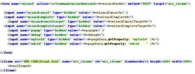
|
On form submission, the pages specified in the XML file are executed one-by-one, and allparameters are passed into that page.
To send extra request parameters to the inner page, those parameters must be included in the "wizard" form in the "invoke_wizard.jsp" page, then submitted. This is the code that performs the inclusion:
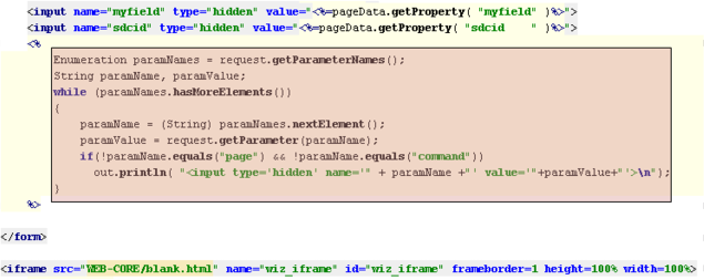
|
This code passes all provided request parameters to the inner wizard frame. These parameters can be retrieved either by "request.getParameter()" or "pageinfo.getProperty()" methods.
Recall that the variables wizardcancel, wizardcomplete, wizardcanceltarget, wizardcompletetarget, popup, debug, myfield, and sdcid are also sent to the inner page.
