These types of Objects can be placed on the Form, along with definitions
of their properties and behaviors:
| • |
Datasources
If the Form Type is "Worksheet", Data Sources let you bind Fields
to actual records in the database. See eForm
Worksheet Principles. |
| • |
Fields
These are typically input fields based on HTML input tags, with properties
that define display, operation, and processing capabilities. |
| • |
Groups
Related Fields can be placed into one or more Groups that can be hidden
or disabled, and have their own validation rules. |
| • |
Sections
A Section represents an HTML div, table or table row on the form. Sections
can be hidden, disabled, or be made repeatable to allow dynamic forms
(similar to JavaScript swaps). |
| • |
Elements
An Element is an object with dynamic properties (such as a hyperlink that
can be shown or hidden). |
| • |
Pages
A Form can have multiple Pages. |
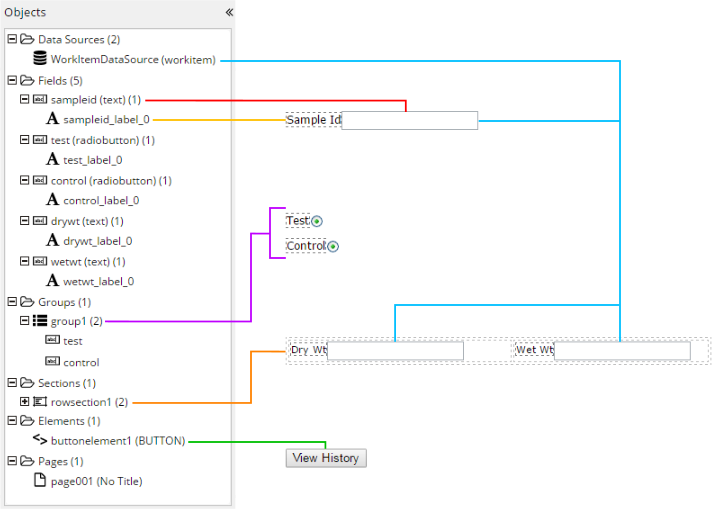
The Objects frame shows a tree view of these Objects (below). The tab order
of Fields in the Form is defined by the order of these Fields in the Object
frame.
| Objects
|
Identified by...
|
| Data Sources |
Worksheet
Type (see eForm Worksheet Principles). |
|
Fields
|
| • |
All Fields:
Fields (n)
where
| n |
= |
Number of Fields on the Form. |
|
| • |
Each
Field:
Id_Type
(n)
where
| Id |
= |
Identifier of the Field. |
| Type |
= |
Data Type of the Field. |
| n |
= |
Number of Labels associated with this Field. |
|
| • |
Each
item associated with a Field:
Id_Type
(n)
where
| Id |
= |
Identifier of the item. |
| Type |
= |
Data Type of the item. |
| n |
= |
Number of other items associated
with this item. |
|
|
|
Groups
|
| • |
All Groups:
Groups (n)
where
| n |
= |
Number of Groups on the Form. |
|
| • |
Each
Group:
Id
(n)
where
| Id |
= |
Identifier of the Group. |
| n |
= |
Number of items associated with
the Group. |
|
| • |
Each
item associated with a Group:
Id
(n)
where
| Id |
= |
Identifier of the item. |
| n |
= |
Number of other items associated
with this item. |
|
|
|
Sections
|
| • |
All Sections:
Sections (n)
where
| n |
= |
Number of Sections on the Form. |
|
| • |
Each
Section:
Id
(n)
where
| Id |
= |
Identifier of the Section. |
| n |
= |
Number of items associated with
the Section. |
|
| • |
Each
item associated with a Section:
Id
(n)
where
| Id |
= |
Identifier of the item. |
| n |
= |
Number of other items associated
with this item. |
|
|
|
Elements
|
| • |
Each
Element:
Id
(n)
where
| Id |
= |
Identifier of the Element. |
| n |
= |
Type of Element. |
|
|
|
Pages
|
Clicking a Page puts the focus on that Page and renders
the Page properties.
The Page title is shown next to the Page. |
| Insert/edit
link
|
Inserts or edits a hyperlink anchor tag:
| URL | LabVantage URL (Request Controller command). | | Text to display | Text shown for the hyperlink. The style of the hyperlink
is blue underlined text. | | title | Text displayed on the Tooltip. | | Target | Target browser window. Choices are "None"
(current window) or "New Window". |
|
| Anchor |
Inserts a named anchor tag:
| Name | HTML "name" attribute of the anchor tag. |
|
| Insert/edit
image |
Opens a dialog that says you can drag over your image
file or click to select a file from a Windows file dialog.
| Normal Image | | | Source | Shows the data:url (inline) image URL generated
by TinyMCE. | | Image description | Text displayed on the Tooltip. | | Dimensions | Width and height of the image in pixels. Leave blank
for auto-sizing. | | Constrain proportions | When checked, the original aspect ratio is preserved
when resizing. When not checked, the aspect ratio can be changed
when resizing. |
Clicking an image displays a shortcut toolbar with these buttons: Rotate
Counterclockwise | Rotates the image 90 degrees counterclockwise.
| Rotate
Clockwise | Rotates the image 90 degrees clockwise. | Flip
Vertically | Overturns the image 180 degrees about the vertical
axis. | Flip
Horizontally | Overturns the image 180 degrees about the horizontal
axis. | Edit
Image | Opens the TinyMCE image editor. See https://www.tinymce.com/docs/demo/image-tools/. | Insert Drawing | Opens the TinyMCE drawing plugin, which offers basic
artwork tools similar to a very simple vector drawing app. | Image Options | Opens the same dialog as Insert/edit
image. | Promote
To Element | See Form Builder
Elements. | Revert To Original | Restores the image as it was before editing. |
|
| Horizontal
line
|
Inserts an <hr /> tag (horizontal rule). |
| Special
character
|
Opens a dialog from which you can choose characters other
than alphanumeric. |
| Insert/edit
panel
|
Inserts or edits an HTML div:
| div | | Width | Width of the div in pixels. Leave blank for auto-sizing. | | Height | Height of the div in pixels. Leave blank for auto-sizing. | | Border Width | CSS value for the width of the border. | | Border style | CSS border style (None, Dotted, Dashed, Solid, Double,
Groove, Ridge, Inset, Outset). | | Border Color | CSS value for the color of the border. | | Content Editable | When checked, contents of the div are editable in
the Form Builder. When not checked, the contents of the div are
read-only. |
Clicking a div displays a shortcut toolbar with these buttons: Make div
Section | See Form Builder
Sections. | Save As
Formlet | See Insert
Formlet and Form Builder
Sections. | Refresh
Formlet | See Insert
Formlet. | Lock div
Section | If the div has been made a Section (using "Make
div Section" above), this prevents editing the content of the
div. This overrides the "Content Editable" property. | Unlock div
Section | If the div has been made a Section (using "Make
div Section" above), this allows editing the content of the
div. This overrides the "Content Editable" property. |
|
| Insert/edit Group Box |
Inserts an HTML fieldset:
| Fieldset | | Legend | Fieldset legend. | | Tip | Text displayed on Tooltip. | | Width | Width of the fieldset in pixels. Leave blank for
auto-sizing. | | Height | Height of the fieldset in pixels. Leave blank for
auto-sizing. |
|
| Insert/edit
Button
|
Inserts an HTML button:
| General | | Text | Text displayed on the button. | | Color | Color of the button. |
| Section | | Section Id | Identifier os the Section affected by an onClick
event. | | Action | "Add Section" and "Delete Section" adds or removes
the Section onClick. |
| Script | | Script | JavaScript to execute onClick. |
There are no properties in the lower left frame for Buttons. Clicking a button displays a shortcut toolbar with these buttons: |
| Insert HTML |
Inserts HTML content into the Form.
The shortcut toolbar will be whatever the Form Builder can provide
for the rendered HTML. For example, if the HTML builds a table, you
will get the Table shortcut toolbar when you click the table. |
| Import From Word |
Opens a dialog that says you can drag over your file or
click to select a file from a Windows file dialog.
This uses the same shortcut toolbar as the Insert/edit
panel menu item. |
| Formats |
|
| headings |
Allows selection of standardized heading styles (similar to Microsoft
Word headings). |
| Inline |
Applies inline HTML element styles (Bold, Italic, Underline, Strikethrough,
Superscript, Subscript, and Code brackets). |
| Blocks |
Applies block HTML element styles (Paragraph, Blockquote, div, and Pre). |
| Alignment |
Aligns the selected object with respect to the page (Left, Center, Right,
and Justify). |
| Insert Table |
Opens a graphical grid that lets you click and drag to
specify the number of rows and columns. |
| Table properties |
Determines table properties for the table that has focus:
| General | | Width | Width in pixels or percent (leave blank for auto). | | Height | Height in pixels (defaults to auto). | | Cell spacing | Cell spacing. | | Cell padding | Padding for all cells. | | Alignment | None, Left, Center, Right. | | Class | Offers predefined CSS classes to be applied to the
table formatting. |
| Advanced | | style | CSS property-value pairs to apply as custom styles. | | Border color | Color of the table border. | | Background color | Background color of the table. |
Clicking within a table displays a shortcut toolbar with these buttons: Table
Properties | Opens the Table properties dialog as described
above. | Delete
Table | Deletes the entire table. | Insert Row
Before | Inserts a row above the selected row. | Insert Row
After | Inserts a row beneath the selected row. | Delete
Row | Deletes the selected row. | Insert Column
Before | Inserts a column to the left of the selected column. | Insert Column
After | Inserts a column to the right of the selected column. | Delete
Column | Deletes the entire column. | Make Table
Section | See Form Builder
Sections. | Make Row
Section | See Form Builder
Sections. |
|
| Table Layout |
Allows table column widths to be set to fixed values
or auto-sized.
To set column widths to fixed values, check "Fix Table Layout",
then specify column widths using the "Cell → Cell Properties"
menu item. To auto-size columns, uncheck "Fix Table Layout". |
| Delete table |
Deletes the table that has focus. |
| Cell |
Determines cell properties for the cell that has focus:
| Cell Properties | Determines cell formatting.
| General | | Width | Cell width in pixels or percent (leave blank
for auto). | | Height | Cell height in pixels (leave blank for auto). | | Cell Type | None applies no specific formatting.
Cell applies no specific formatting. header cell makes text bold. | | Scope | Determines the scope of properties (None,Row,
Column, Row group, Column group). | | H Align | Determines horizontal alignment within the
cell:
None applies no specific formatting. Left, Center, and Right align the cell content accordingly. | | V Align | Determines vertical alignment within the
cell:
None applies no specific formatting. Top, Middle, and Bottom align the cell content accordingly. |
| Advanced | | style | CSS property-value pairs to apply as custom
styles. | | Border color | Color of the cell border. | | Background color | Background color of the cell. |
| | Merge cells | Merges the selected cells according to the specified
number of rows and columns. | | Split cell | Splits the selected cell. |
|
| Row |
Determines row properties for the row that has focus:
| Insert row before | Inserts a row before. | | Insert row after | Inserts a row after. | | Delete row | Deletes the row. | | Row properties | Determines row formatting.
| General | | Row type | Row formatting type (header, body, Footer). | | Alignment | Alignment within row (None, Left, Center,
Right). | | Height | Height in pixels (defaults to auto). |
| Advanced | | style | CSS property-value pairs to apply as custom
styles. | | Border color | Color of the row border. | | Background color | Background color of the row. |
| | Cut row | Cuts the row. | | Copy row | Copies the row. | | Paste row before | Pastes the row above the row that has focus. | | Paste row after | Pastes the row below the row that has focus. |
|
| Column |
Determines column properties for the column that has
focus:
| Insert column before | Inserts a column to the left of the column that
has focus. | | Insert column after | Inserts a column to the right of the column that
has focus. | | Delete column | Deletes the column. |
|
|
Add Page
|
Performs the Add Page menu operation. |
|
Restore last draft
|
Uses the TinyMCE autosave plugin to restore the last
draft of the Form.
For more information, see the TinyMCE documentation at http://archive.tinymce.com/wiki.php/Plugin:autosave. |
|
Undo
|
Reverses changes made during the current editing session. |
|
Redo
|
Repeats changes that were reversed by "Undo". |
|
Bold
|
Applies bold formatting to the selected text. |
|
Italic
|
Applies italic formatting to the selected text. |
|
Underline
|
Underlines the selected text. |
|
Align left
|
Left-aligns the selected object with respect to the page. |
|
Align center
|
Centrally-aligns the selected object with respect to the
page. |
|
Align right
|
Right-aligns the selected object with respect to the page. |
|
Justify
|
Justifies the selected object with respect to the page. |
|
Insert/edit link
|
Performs the same operation as the Insert/edit link menu item. |
|
Insert/edit image
|
Performs the same operation as the Insert/edit
image menu item. |
|
Insert drawing
|
Opens the TinyMCE drawing plugin, which offers basic
artwork tools similar to a very simple vector drawing app.
This uses the same shortcut toolbar as the Insert/edit image menu item. |
|
Horizontal line
|
Performs the same operation as the Horizontal
line menu item. |
|
Special character
|
Performs the same operation as the Special
character menu item. |
|
Insert button
|
Performs the same operation as the Insert/edit
Button menu item. |
|
Font Family
|
Offers the TinyMCE default fonts (see https://www.tinymce.com/docs/configure/content-formatting/#font_formats. |
|
Font Sizes
|
Offers the TinyMCE default font sizes (see
https://www.tinymce.com/docs/configure/content-formatting/#font_formats. |
|
Text color
|
Determines the color of the selected text. |
|
Background color
|
Determines the background color beneath the selected text. |
|
Bulleted list
|
Inserts an HTML bulleted list with a choice of bullet
styles: Default (same as Disc), Circle, Disc, and Square. |
|
Numbered list
|
Inserts an HTML numbered list with a choice of numbering
styles: Default (Arabic), Lower Alpha, Lower Greek, Lower Roman, Upper
Alpha, Upper Roman. |
|
Decrease indent
|
Outdents the level of the selected object (defaults to
30px). |
|
Increase indent
|
Indents the level of the selected object (defaults to
30px). |
|
LabVantage Fields
|
Inserts a LabVantage Field. See Form
Builder Fields. |
|
Insert Controlled
Field
|
Inserts a predefined Field
Definition. The Edit style depends on the type of Field. |
|
Insert Label
|
See Form
Builder Fields → About Labels. |
|
Insert Formlet
|
Opens a lookup that lets you add a predefined Formlet
Definition to the Form. Formlets are added as Sections.
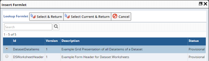
| Select & Return | Inserts the selected Formlet. Use this to insert
an explicit Version. | | Select Current & Return | Inserts the Current Version of the selected Formlet. |
The Version used is saved in the Document. You are then asked how you want to import the Formlet: 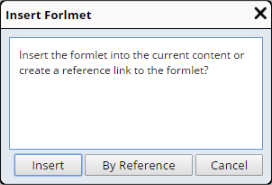
| Insert | | • | Adds a copy of the Formlet to the Form. | | • | If you change the Formlet
Definition, the change will not be reflected in the Form
when the Document is subsequently rendered in the eForm
Manager. | | • | The value of the "By Reference" property is set to "No".
|
| | By Reference | | • | Adds the Formlet as a reference link to the Formlet
Definition. | | • | If you change the Formlet
Definition, the change will be reflected in the
Form when the Document is subsequently rendered in the eForm
Manager. | | • | The value of the "By Reference" property is set to "Yes".
|
|
Whether "Editable in Form" is checked or unchecked (in the Formlet
Definition), you can edit the Formlet to change the Formlet Definition,
in which case the Formlet will be updated in the Form. "Refresh Formlet"
updates the Formlet. "Save As Formlet" saves a copy of the Format with
a different Identifier. Options in the Formlet
Definition determine if the Formlet is editable or can be bound
to a Datasource (see eForm Worksheet
Principles). |
